It’s an immense pleasure for us when authors return for covers for their new books. It’s even more gratifying when indie writers order our premium book cover design again.
So did Cam Sinclair, who has appreciated the benefits of this package in particular:
- Consultation with our creative director
- Two book cover design concepts to choose from
- Heavy photo manipulation, 3D modeling, and digitally painted elements
- Free book promo images
- Discounts from our partners.
Previously, we created the cover design for the first part of his Kraven Kronicles series – Shadow of the Winter Moon. Now it’s time for the sequel Echoes of the Storm. So, let’s take a closer look at the design process.
The story of the book
- Title: Echoes of the Storm
- Author: Cam Sinclair
- Genre: Grimdark Fantasy
- Plot: This is a continuation of the events that occurred in the first book Shadow of the Winter Moon. The story takes place in a huge city called Kraven. It’s a dark and intense tale about violence, wanting things badly, seeking revenge, causing pain to others, mysterious ceremonies, and harsh rulers. But while the first book had two main characters, Echoes of the Storm focuses on the story of one young girl.
- Settings: Roughly Middle Ages but with a touch of Mesopotamia.
How did we see this book cover?
The author’s main requirement was that the cover should include only one female character. The girl should be a little older than in the first part, crouching on a rooftop with a bow over her shoulder or something similar.
In all other aspects, we had to stick to the style and typography of the first book.
Based on the author’s request, our designer created two concepts that suit the overall series design.
Book cover concept #1
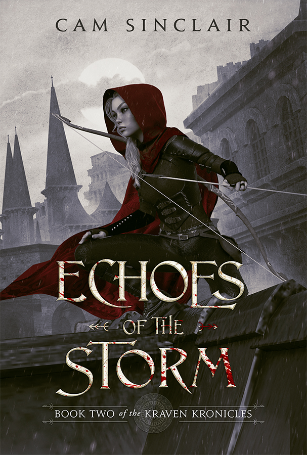
Main character
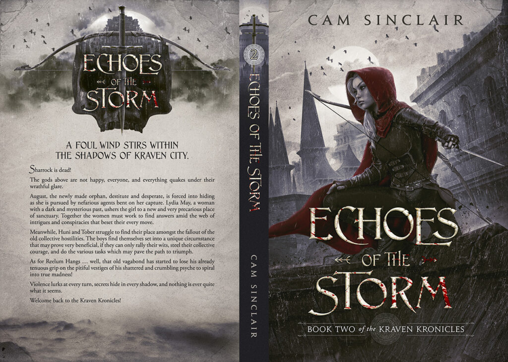
The designer chose a profile view of August to highlight her strong and confident demeanor. She exudes a sense of power and control through her facial expression. August looks toward the environment around her, further emphasizing her commanding presence.
Clothes
August wears a dark red cloak, which serves as a bold and striking color contrast against the muted, gray-toned background. It also suits the series style of the first book.
Bow
Our designer added a bow behind August’s shoulder to enhance her fierce appearance. It highlights that she is skilled in combat and ready to take on any challenge that may come her way.
Typography
We chose the typography style and placed the elements to ensure that they were cohesive with the design of the first book. Thus, they help readers to recognize the series easily.
Book cover concept #2
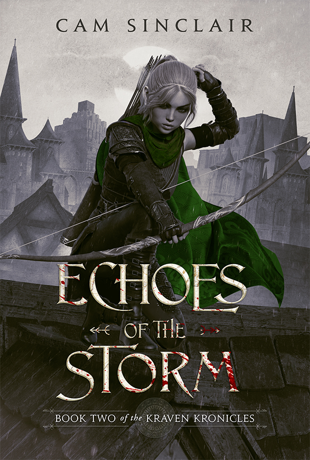
Main character
In the second version, we placed August in a frontal position facing the readers. This pose is more dynamic as the main character reaches for an arrow with her hand, suggesting action and adventure. Moreover, her facial expression is focused and determined, adding to her combative appearance.
Clothes
We chose green as the accent color for this version. It also stands out nicely against the gray-toned surroundings. This hue adds a fresh and invigorating feel to the design, further enhancing its appeal to the target audience.
Color solution
The designer noted that such a color accent can also serve as a solution for future series. Each new book can feature a different hue while maintaining the same style, composition, and typography. This approach would allow for cohesion and recognition throughout the series while allowing new and fresh color palettes.
Typography
We used the same typography style, decorative elements, and effects for this version. It works perfectly for the grimdark fantasy genre.
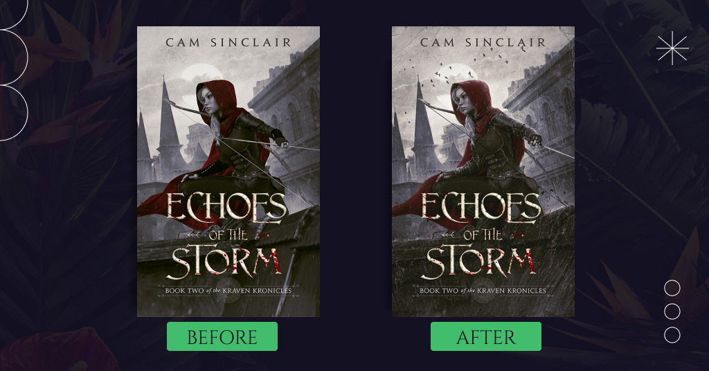
What concept did the author choose?
Cam Sinclair loved both concepts but chose the first one as it was more in line with the first book. The author also asked for some changes:
- The girl should be holding a dagger facing backward instead of an arrow.
- The image should feature the marble effect like the first book cover.
Our designer quickly updated the book cover following the author’s wishes:
Now, let’s enjoy the final look of the full book cover:
Summing up
The final cover design is a perfect continuation of the series, reflecting the overall tone and setting of the story.
Cam Sinclair has picked the concept with red elements, which echoes the cover design of the first book. In this version, August is turned to the readers with her profile view, showing her strength and confidence.
What do you think of this premium book cover design? Tell us in the comments.