How about spending the next ten minutes enjoying our new premium book cover design case study? This service provides authors with many benefits:
- Two book cover concepts to choose from
- A detailed analysis of both versions by our creative director
- Free promo images
- Heavy photo manipulation, 3D modeling, and digitally painted elements.
This time, our designer created an outstanding cover for M. H. Woodscourt’s young adult high fantasy The Blood Fountain. Are you intrigued to explore the process in detail? Let’s start.
The story of the book
- Title: The Blood Fountain
- Author: M. H. Woodscourt
- Genre: Young Adult High Fantasy
- Plot: Prince Jetekesh embarks on a quest to find the legendary Blood Fountain, nestled amidst a valley of red grass and surrounded by an elegant elven castle atop a verdant hill. Accompanied by Kajsa, the ghost wolf, and other allies, he soars on a gryphon’s back, encountering the castle’s majestic archway before facing a crucial test of honor. Upon securing the fountain’s water, Jetekesh leads a battle in a lush green valley, riding a blue ice dragon alongside Blood King Aredel against a formidable black-winged demon. With armies clashing below, they unite to overcome the fiery menace with the aid of a dragon fleet.
- Settings: Medieval England, with strong elven influences.
How did we see this book cover?
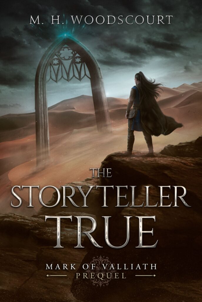
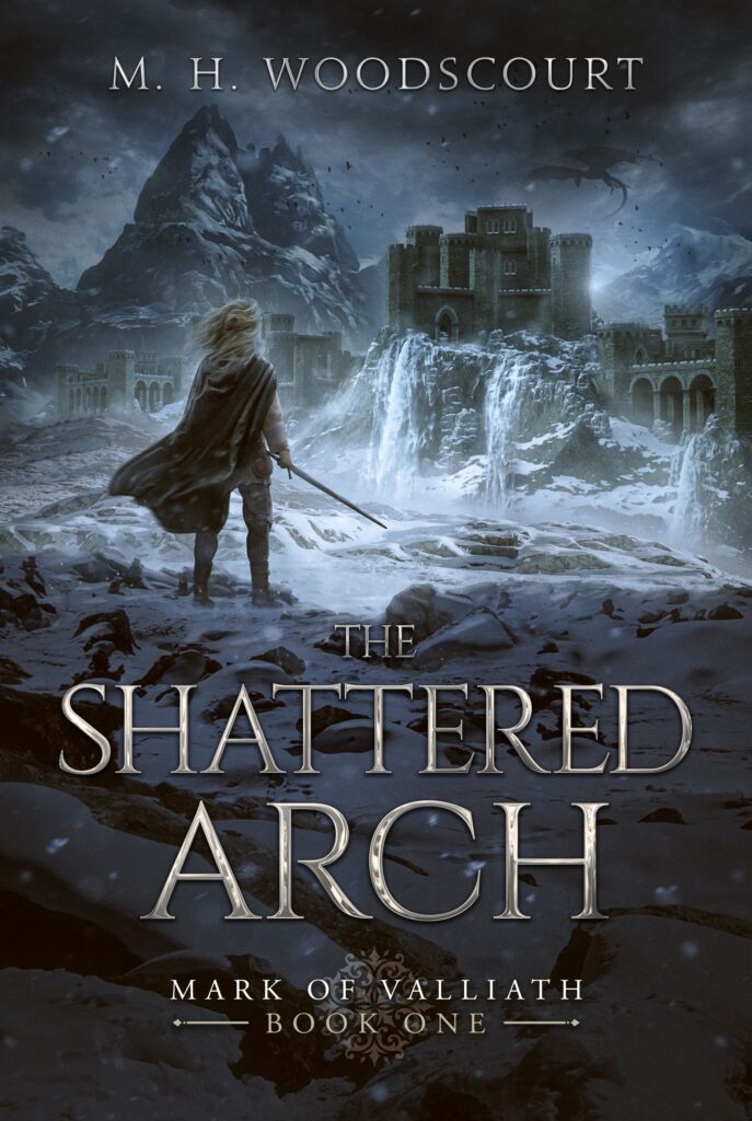
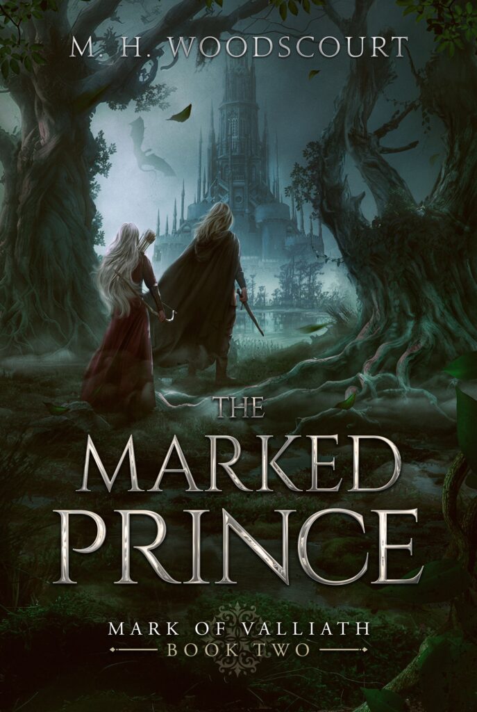
M. H. Woodscourt noted that this book is the final one in the series. Our talented senior designer has already worked on the covers for the previous installments, so he is already fully imbued with the story and atmosphere.
 |
 |
 |
Premium book cover design by Miblart
So, creating a cover complementing the whole series look was vital. After reading the book’s plot and characters’ descriptions, our designer came up with two concepts.
Book cover concept #1
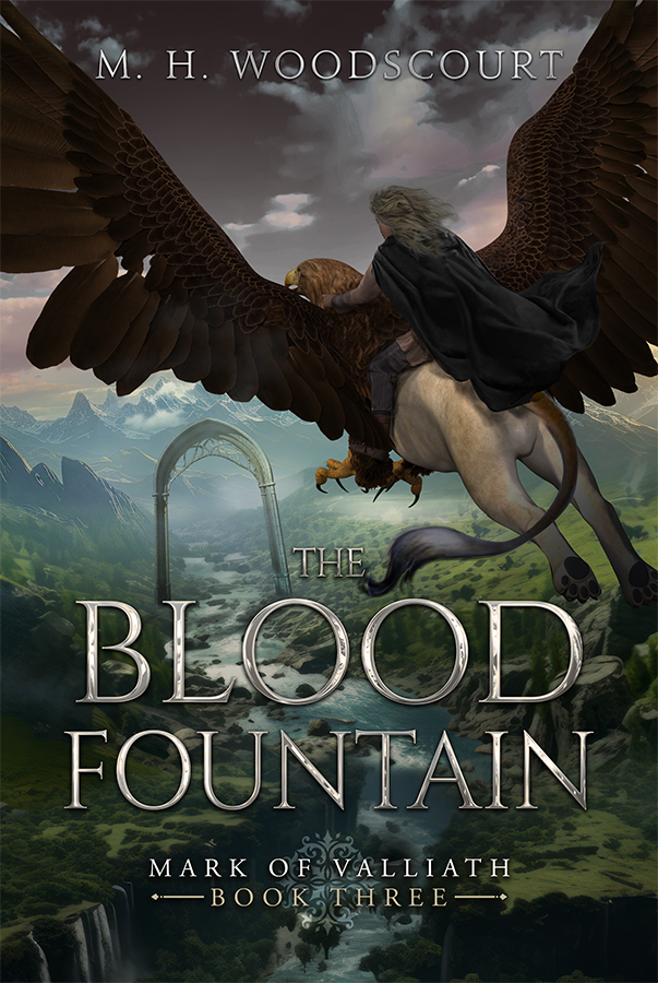
Main idea
The first concept depicts a captivating moment from the book: Prince Jetekesh rides a majestic gryphon as they fly toward an imposing arch. The scene looks dynamic and impressive.
Background
We placed the main characters against a backdrop of awe-inspiring mountains and lush green landscapes. This combination underscores the book’s high-fantasy nature and enhances an epic atmosphere.
Color palette
Our designer used calm and muted colors that harmonized with the previous books in the series. Such hues allow the characters to take the central stage and instantly grab the readers’ attention.
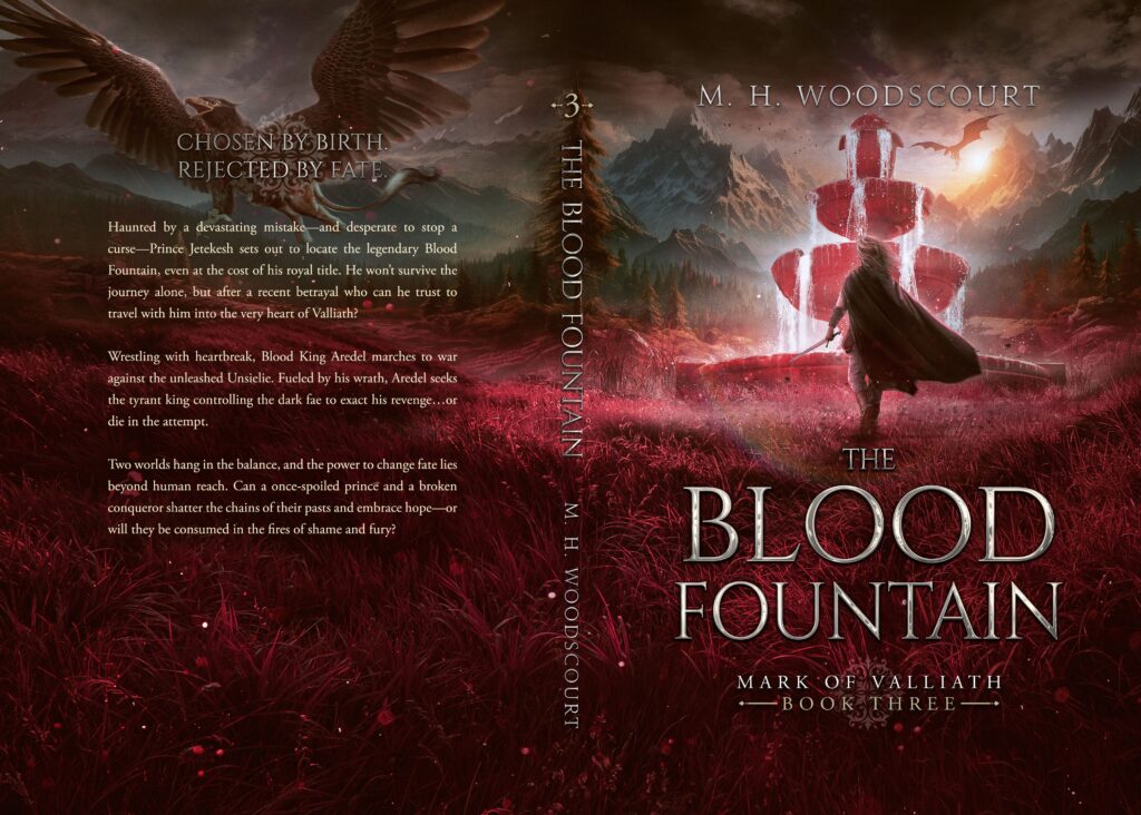
Book cover concept #2
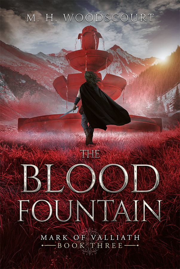
Main idea
In the second version, we decided to focus on a pivotal element of the story – the striking and significant bloody fountain. Our designer also added the protagonist with a blowing cloak, similar to the previous books.
Background
We lowered the horizon line to enhance the fountain’s grandeur, creating an impressive visual impact. There are also majestic mountains bathed in sunlight, adding a sense of adventure and wonder.
Color palette
The red color used for the fountain is exceptionally vibrant and bold. It makes the cover eye-catching and hints at bloody and dangerous adventures within the book’s plot. We also use cold hues for the backdrop to create a striking contrast.
In both versions, the typography style for the book’s title and author’s name maintains consistency with the rest of the series. It gives a sense of fantasy and looks prominent against the whole composition.
What concept did the author choose?
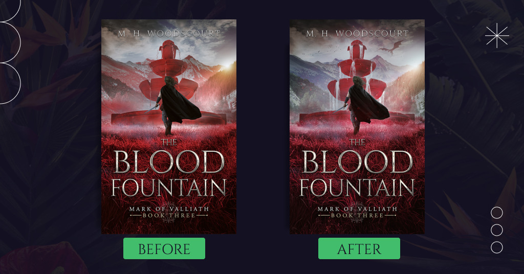
The author enjoyed both concepts but decided to proceed with the second one. M. H. Woodscourt requested for some changes:
- Remove the red hue in the mountain, but keep the sunrise
- Make the author’s name more noticeable as it’s lost in the pale clouds
- Add a dragon silhouette to the sky as in previous covers
- Change the red vibrancy.
Soon, our designer introduced the updated version:
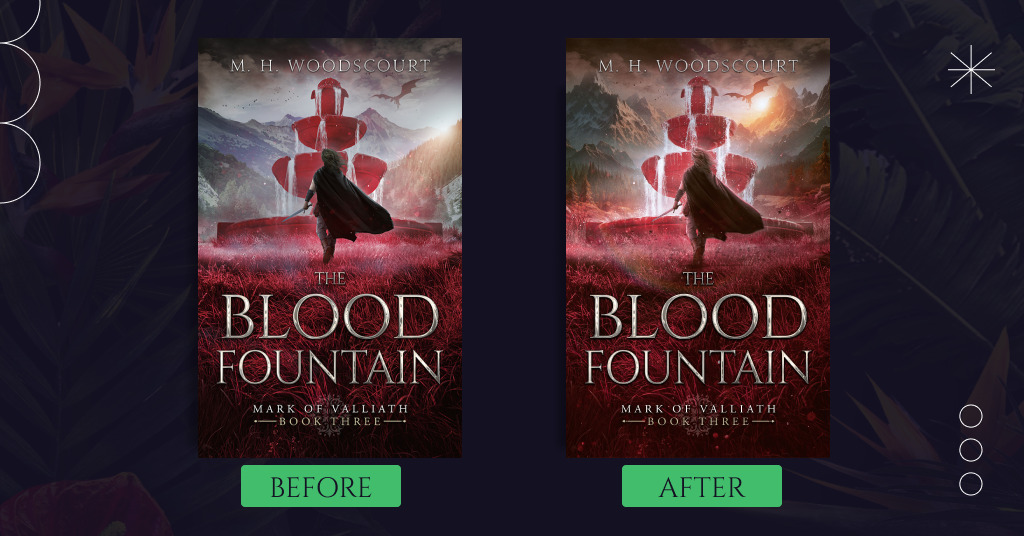
M. H. Woodscourt liked the changes, but she also asked to try a different style of the mountains in the background; for example, add the pine trees or take a different shape.
We made this change, making the mountain view pop and epic. Our designer also enhanced the whole composition with light and effects. You can enjoy the final book cover now:
How about appreciating the full cover look, too? This way, readers can see the richer perspective of the overall scene and setting and notice a gryphon.
Summing up
Our designer has created two fantastic concepts. They differ in their main idea and composition structure, but both perfectly harmonize and complement the previous parts of the series. M. H. Woodscourt chose the version with an impressive fountain in red, as this concept perfectly resonates with the book’s title and hints at the protagonist’s dangerous adventures.
Which version do you like the most? Share your opinion in the comments.