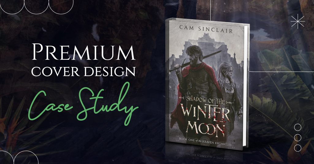
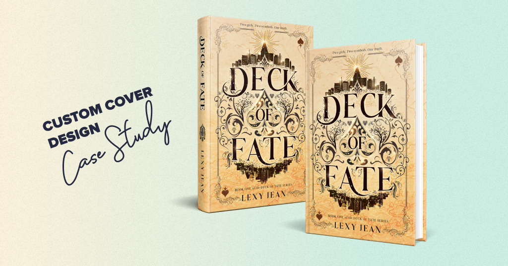
Are you ready to enjoy more results of our new package: Premium book cover design?
By ordering this service, you get a consultation with our creative director, two book cover design concepts to choose from, book promo images, and discounts from our partners. The premium design includes heavy photo manipulation, 3D modeling, and digitally painted elements that will bring your book’s fictional world to life.
Today we want to share a stunning book cover for a fantasy book Shadow of the Winter Moon by Cameron Sinclair.
The story of the book
- Title: Shadow of the Winter Moon
- Author: Cam Sinclair
- Genre: Grimdark Fantasy
- Plot: Set in the gigantic city of Kraven, it is a dark story of violence, lust, revenge, torture, dark rites, and cruel overlords. Kraven city is a mixture of dark ages Europe, Mesopotamia, high Egypt, and Mayan. Think cobblestone streets, dingy taverns, blacksmiths, bustling docks with towering ziggurats, palatial garden mansions, obelisks with hieroglyphs, massive ancient stone constructions, and evidence of a much older, much more advanced but forgotten culture. No guns or modern technology, just swords, horses, basic armor, etc.
- Settings: Roughly Middle Ages but with a touch of Mesopotamia.
How did we see this book cover?
The author didn’t have particular requirements for the book cover. But the client said anything in the grim dark fantasy genre would be good. That means dark, brooding, and so on.
We were impressed by a fascinating book description, so we prepared two radically different design concepts, highlighting the dark and mystical side of both.
The first option features the main characters, and the other is object-based, containing more hidden meanings. Let’s take a closer look at them.
Book cover concept #1
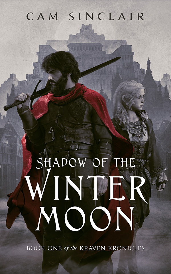
General idea
We highlighted the main characters in the first version. They look in different directions, which creates a tense atmosphere.
Colors
We dressed the protagonist in a red cloak because it adds color contrast and draws attention to the central part. Since dark and gray tones prevail in the entire book cover, a color accent is necessary.
Composition
The composition is classic and robust. We chose a neutral background to avoid distraction. Our designers also placed Kraven city behind the main characters to convey the era and environment in which the events occur.
Typography
We created an atmosphere of dark times using gloomy colors. A fantasy serif font emphasizing the main words suits this version perfectly. We also added a backlight and textures to complete the cover.
Book cover concept #2
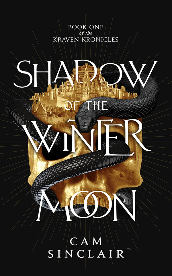
General idea
The second version is more stylized and object-based. Readers can find a lot of hidden metaphors here. The skull and snake attract the central attention. They symbolize violence, lust, revenge, torture, and dark rituals in Kraven city.
Colors
The city that looks like a crown on the skull symbolizes the cruel overlords’ power. The combination of black and gold adds a monarchical effect as well. We chose a dark background to highlight the foreground. The golden light rays direct the viewer’s attention to the central part.
Typography
We combined text with pictures to create a 3D effect. Our designers also added a backlight and textures to this version.
What concept did the author choose?
Cam Sinclair has chosen the first mockup—the version with the main characters in the center. The author liked the font and the placement of the words. However, we are always open to improving our book cover design according to the client’s desires.
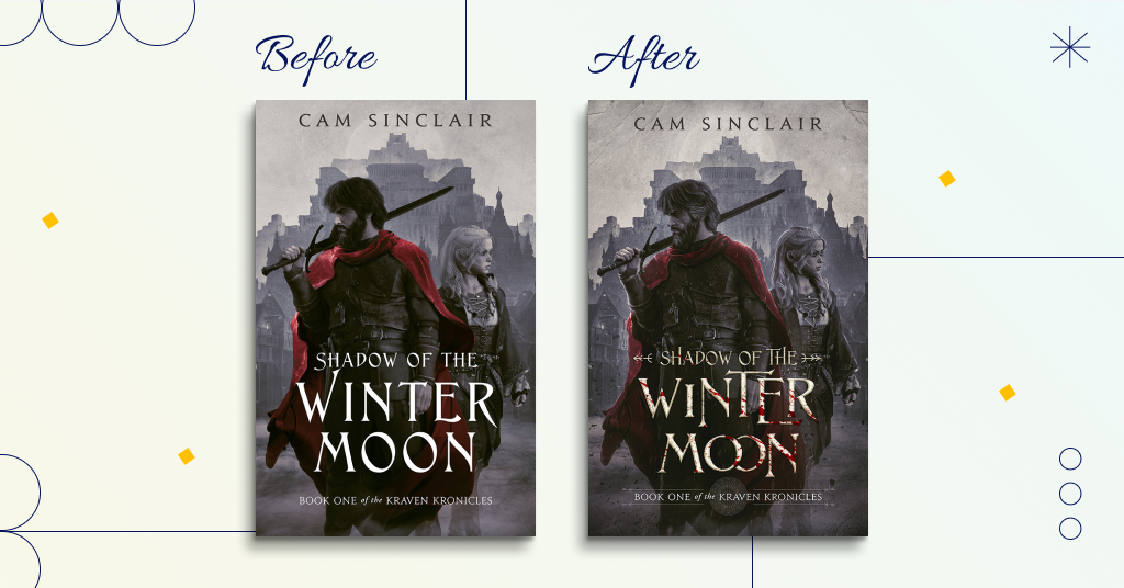
What did the process of further work with the client look like?
We were glad to change the first concept using the author’s comments.
The main character’s age
According to the plot, the male character should look a little older. So we added a little more gray to his beard and hair.
Red cloak
Our designers guessed the red color correctly, but the author wanted to make it a little darker red.
Typography
We also changed the main title—Shadow of the Winter Moon. We made it look marbled and a little blood spattered.
Now you can enjoy the final version of the book cover:
What about marketing materials?
The premium package includes three marketing images for social networks or the author’s website. Cameron Sinclair chose a book release banner, bookmark, and advertising image. Our designer created these materials based on the final book cover version. Let’s see them in detail.
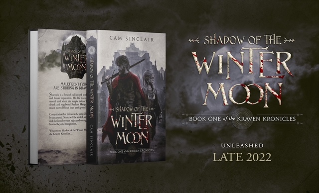
Book release banner
This absolutely stunning banner contains a 3D image of the book from both sides, providing a complete picture of what the printed copy will look like. We also brought out the name of the story and the entire series separately. You can see the release date below. The banner turned out to be very atmospheric, thanks to the background with the moon and the cloudy sky. It simultaneously sets the mood and emphasizes the title of the book.
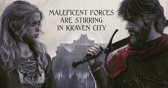
Advertising image
We placed the main characters in this image. Thanks to the close-up, the reader can see their appearance in detail. Behind them is a medieval fortress. And the gloomy sky became an excellent background for the book’s slogan.
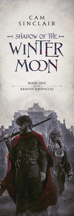
Bookmark
The book cover design is an excellent basis for a bookmark. We separated all the elements and placed them vertically: Author name, book title, series title, and main characters. The gray sky above the protagonists and the fortress is an excellent background for the inscriptions, making them more precise and eye-catching.
Conclusion
The final version of the cover perfectly sets the necessary mood that prevails in the novel.
The author chose the first design concept, with realistic characters and settings in the background. It will help readers better imagine the protagonists and tune in to reading. Considering the author’s wishes, we have made some changes to the selected version. The main character is older, so we added gray locks. Also, our designer changed the style of the name: Made it marble with blood stains.
The final cover is impressive. Did you like this design? Share in the comments.


Verusha
3 years agoThe design is so beautiful! Thank you for sharing your process. It’s fascinating!
Vasylysa
3 years agoThank you! We’re happy you enjoyed it!
J.D. Brink
4 years agoBoth designs are amazing and you still got to use some of the second for the rear of the paperback. Fabulous work and article. It’s nice to see the work you put into the process.
Vasylysa
4 years agoThank you! We’re so happy you like this article and book covers!
Laurisa
4 years agoAbsolutely love this design! So much win about it.
Vasylysa
4 years agoThank you for your kind words!