We figured it’s the perfect time to walk you through a book cover redesign. Are you in?
Indeed, a redesign is an excellent way to breathe new life into your book. A fresh cover can catch the eye of new readers, keep you on trend in your genre, and make your story even more recognizable.
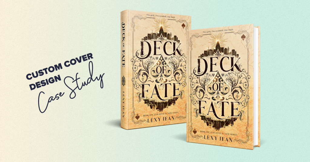
Today, we’re excited to share the new cover we created for Jaci Miller’s epic romantic fantasy Kingdom of Dark Souls. But let’s take it step by step.
Author’s request for book cover redesign
First things first, what is Kingdom of Dark Souls about? It’s the opening book in the Dark Kingdom trilogy, written for readers who crave medieval fantasy, strong yet imperfect heroines, and richly imagined worlds. By the way, the whole series is available on Amazon, so feel free to add these books to your TBR if you’re romantasy fan.
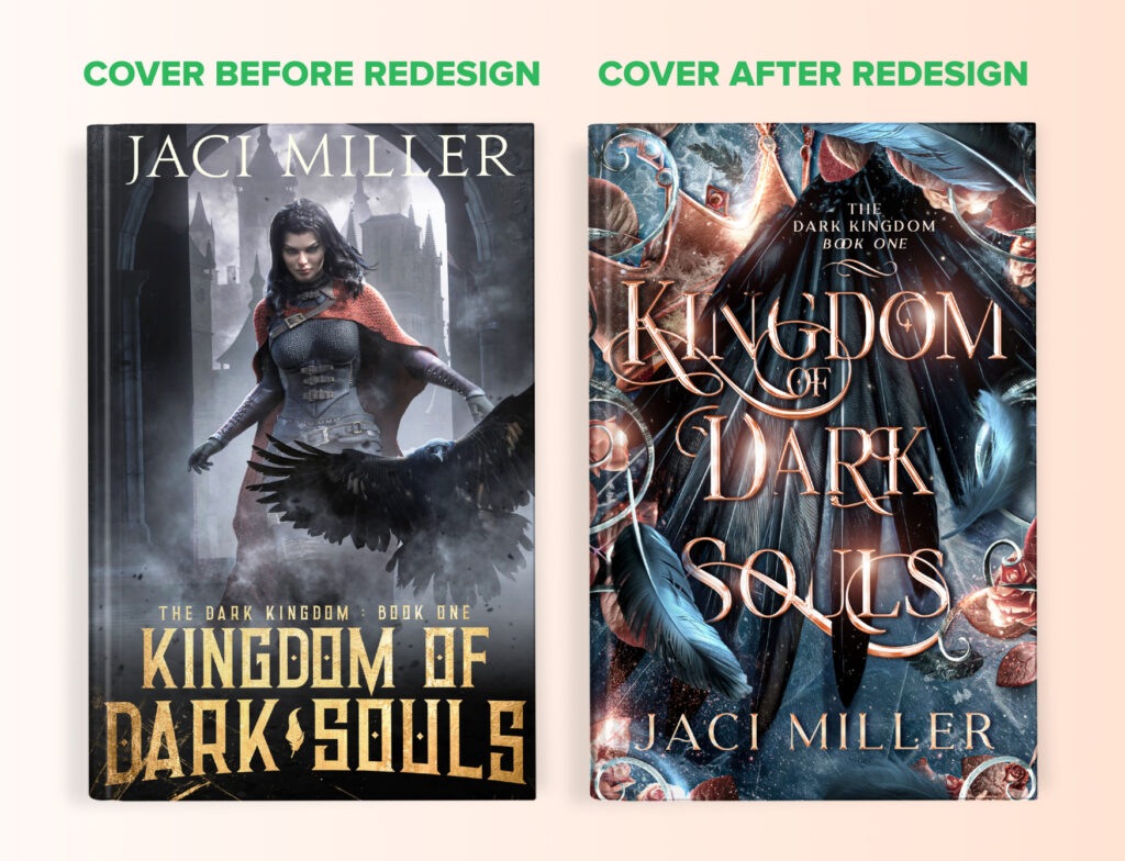
This is what the previous cover of Kingdom of Dark Souls looked like.
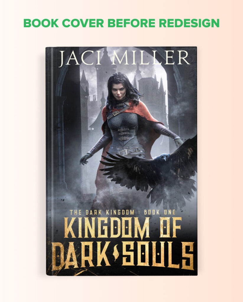
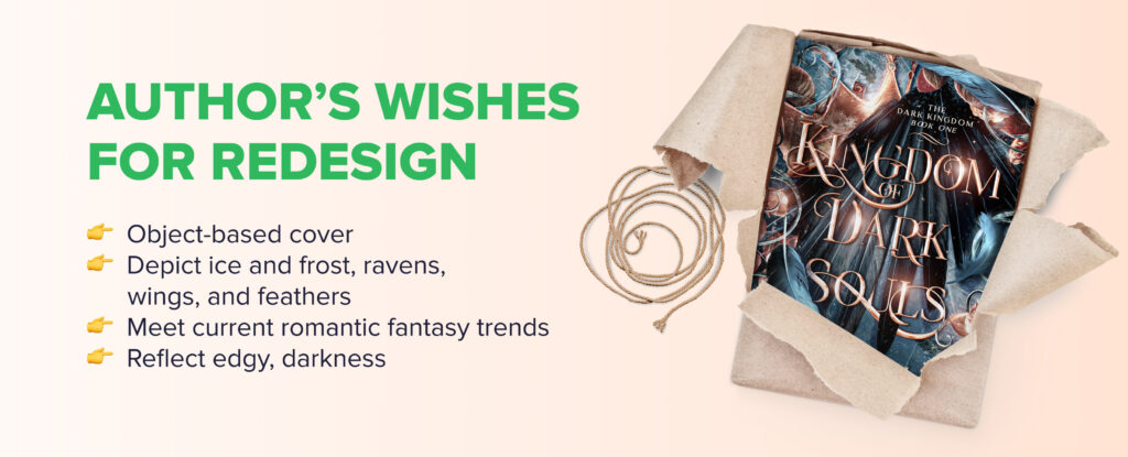
Jaci Miller wanted to refresh her previous design. She decided to switch from a character-based cover to an object-based one, aligning it with current romantic fantasy trends. Indeed, bold covers with a strong central symbol are a defining trend in this genre, instantly recognizable and perfect for catching a fan’s eye within seconds.
The writer hoped the redesign would reflect that darker, edgier tone. Ice and frost, along with raven symbolism, like wings and feathers, play an essential role in her world, so she wanted those elements subtly woven into the design.
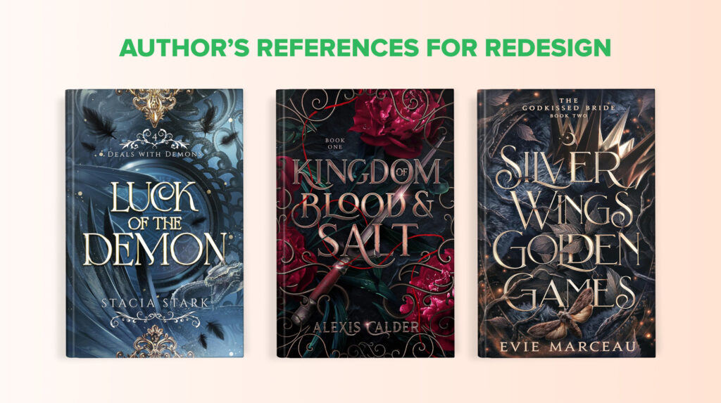
The author also shared several examples of covers in this genre that she really loves. This is incredibly helpful for a designer. It sets the right direction from the start and gives a much clearer understanding of the writer’s vision.
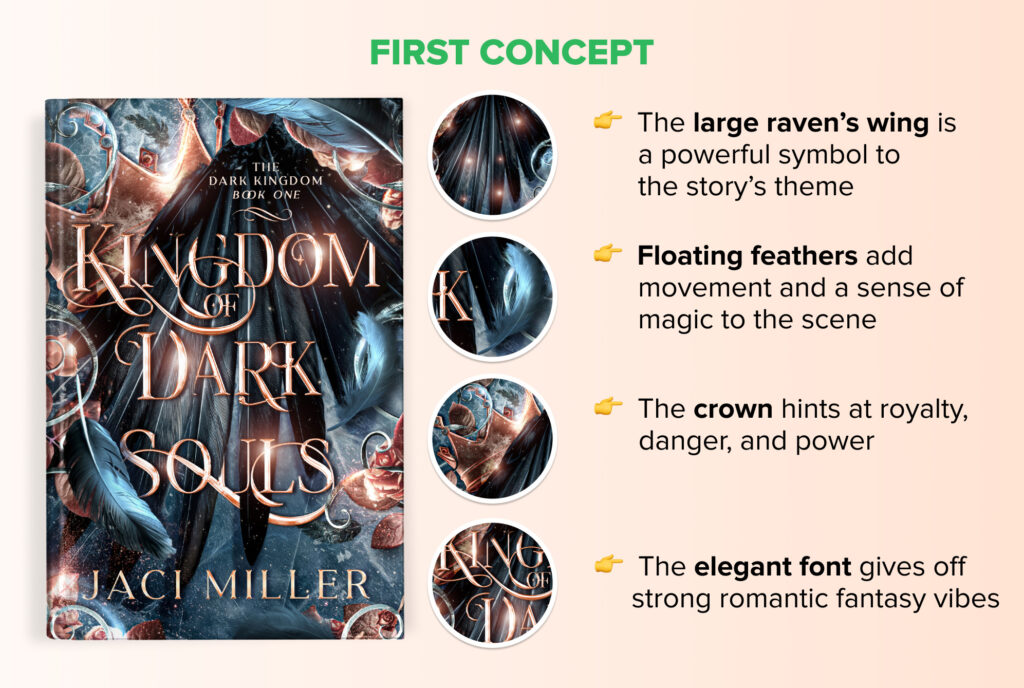
First concept for book cover redesign
After reviewing all the author’s notes and the story’s key symbols, we came up with the first concept.
Our designer focused on the dark tone Jaci Miller envisioned, placing a striking raven’s wing at the center as the main symbolic element. Ice and frost textures create a cold and enchanted atmosphere, while scattered feathers add movement. Ornamental details and rich florals frame the design, hinting at royalty and medieval fantasy themes.
And just in case you’re wondering how to work with a book cover designer to get a perfect first concept, we’ve got a whole article with tips for that.
Book cover redesign revisions
The author loved the concept! It felt on-genre, matched her requests, and the typography and color palette were exactly what she hoped for.
Jaci Miller asked for a few minor tweaks, though. The author’s name felt a bit too high, so she wanted it moved closer to the bottom. She also noticed a couple of feathers that looked slightly blurry and asked to sharpen them.
Our designer updated the cover according to all of the author’s requests.
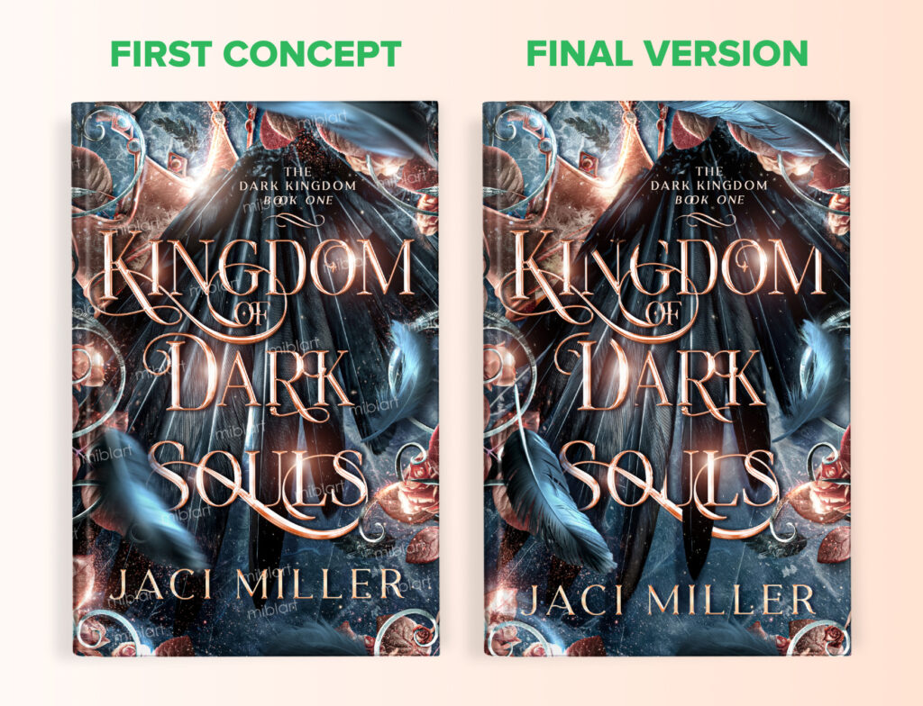
Final version of book cover redesign
And now you can finally enjoy the finished cover. It’s atmospheric, striking, and perfectly tuned to its romantic fantasy mood. The design captures the genre at a glance and draws the right audience in instantly. One look, and readers already want to dive straight into the story!
By the way, feel free to take a look at our blog post on fantasy book covers. It offers even more examples, tips, and inspiration for your next design if you write in this genre.
Wrapping up
That’s the redesign we created, and we hope you enjoyed this little journey through the stages of bringing a new cover to life.
What do you think of the updated cover design? Share your thoughts in the comments!
And if you’re considering giving your own book a fresh new look, we’d be more than happy to help.