If you’ve ever wondered how a premium book cover comes to life, this case study is for you. The package includes a lot more than just a single design:
- Two different concepts created just for your story
- In-depth analysis of each by our creative director
- Extra promo images to share with your readers
- Complex techniques like photo manipulation, 3D details, and digital painting.
For this case study, we’ll show you how we built the dramatic cover for A.V. Lemette’s Airborne Templar, the opening novel in The Holy Blade series. Let’s dive in!
The story of the book
- Title: Airborne Templar
- Author: A.V. Lemette
- Genre: Medieval Fantasy
- Plot: Sergeant First Class Nathan “Nate” Kane stumbles upon a Templar sword during a raid and is thrust back into the 12th-century Crusades. Armed with modern combat skills and a weapon of mysterious power, he joins the legendary Templars and forges bonds with noble warriors and the healer Elara. As Nate rises through the ranks, he faces treachery, forbidden love, and a dark enemy threatening Jerusalem. Caught between returning home or embracing a sacred mission, he must choose his destiny in this epic tale of sacrifice, valor, and timeless fate.
- Settings: Medieval Jerusalem
How did we see this book cover?
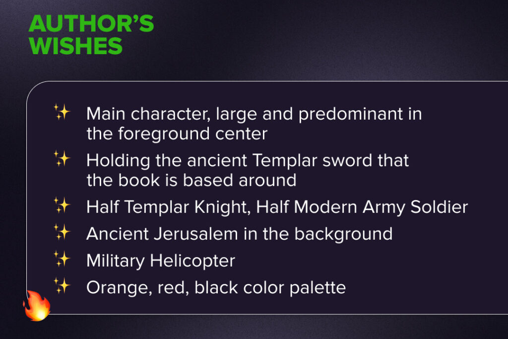
For the cover of Airborne Templar, A.V. Lemette envisioned a striking design with the main character dominating the foreground. He is holding the sacred Templar sword, which was said to have been forged by the Archangel Michael.
The hero is portrayed as half Templar Knight, half modern soldier, symbolizing the clash of eras. Behind him rises the ancient city of Jerusalem, while a military helicopter hints at the modern-day connection. The palette of fiery desert tones (orange, red, and black) underscores the epic and battle-charged atmosphere.
Our designer carefully reviewed all the author’s requests and the book details, then developed two unique cover concepts.
Book cover concept #1
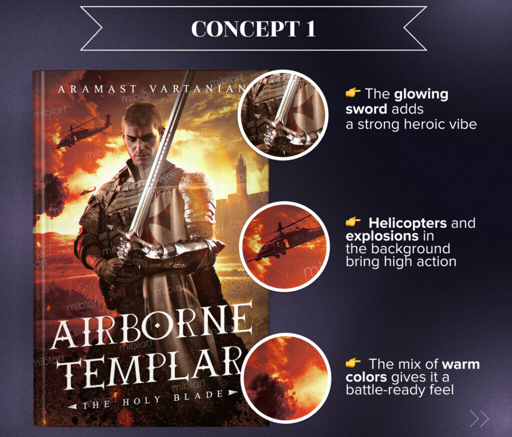
Main idea
The first concept merges historical and modern warfare, reflecting the book’s genre-bending premise. The protagonist appears as both soldier and Templar knight, symbolizing the clash of eras. The sword leads the viewer’s eye from his face down to the title.
Color palette
Warm tones of orange, red, and gold evoke fire, war, and divine power, while the contrast between dark armor, bright flames, and metallic accents creates a dramatic, eye-catching effect. This palette reflects the themes of conflict, sacrifice, and supernatural intervention.
Typography
The medieval-inspired typography reinforces the book’s historical and military themes. The all-caps font adds gravitas and stays readable even in thumbnails, while its placement below the character anchors the design without overshadowing the artwork.
Book cover concept #2
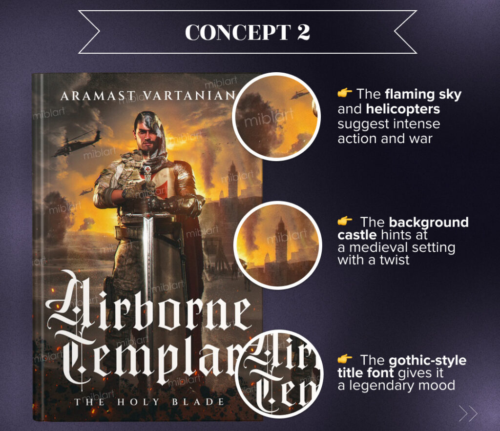
Main idea
The second concept emphasizes the epic clash of eras, blending medieval and modern warfare in a bold visual. Nate Kane stands gripping the Templar sword with both hands, a powerful pose that conveys strength, duty, and a near-mythical purpose.
Color palette
Fiery orange, gold, and deep brown tones set a war-torn atmosphere that echoes the book’s themes. The contrast of glowing embers with the cool metallic armor and sword adds drama, while the palette conveys supernatural energy, perfect for a military fantasy cover.
Typography
The title typography combines medieval-inspired Gothic lettering for Airborne Templar with a simpler serif for The Holy Blade. This pairing balances grandeur with readability, highlighting the historical themes while keeping the design clear.
What premium book cover concept did the author choose?
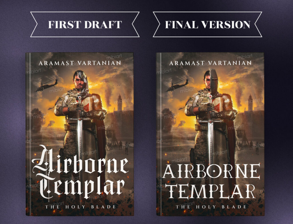
The author was impressed with both concepts but ultimately decided to proceed with the second design. He requested the following changes:
- Replace the open-face look with a full medieval Templar helmet
- Enlarge the sword to make it the dominant focal point
- Apply the font style from concept one and align the text cleanly
- Refine the hand and finger details
- Correct the armor overlap on the chest
Our designer implemented all the requested adjustments, refining the concept, and here’s the result.
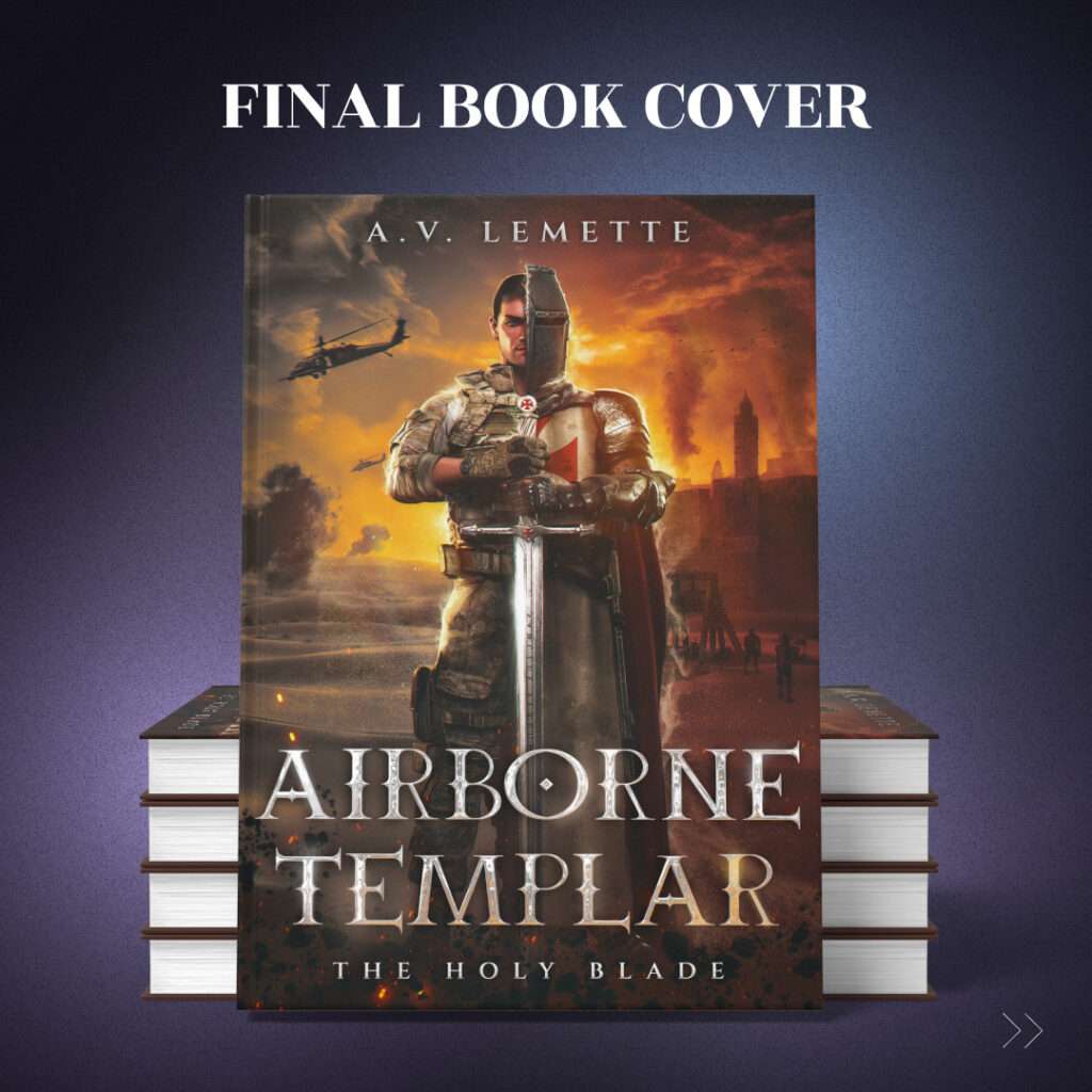
We were almost there but before the final version, the author asked for a few more tweaks:
- Update the author name to A.V. Lemette
- Adjust the sword handle so the top and bottom match (based on the reference image)
- Add a subtle red background tint to the medieval half of the cover
And now, let’s enjoy the final version!
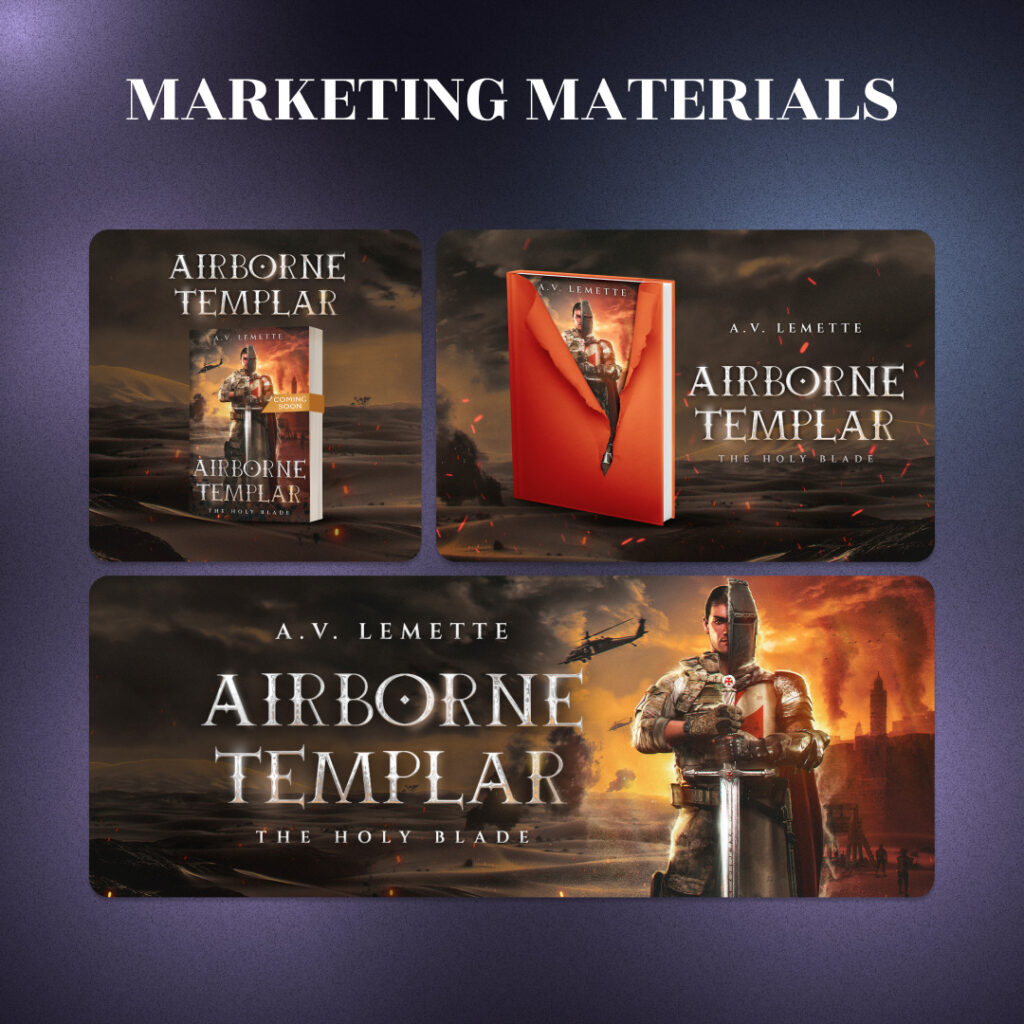
Since the Premium Book Cover Design package also includes marketing materials, take a look at the additional promo designs we prepared below.
Summing up
Our designer developed two distinct concepts, each capturing the fusion of medieval and modern elements at the heart of Airborne Templar. Both options showed unique ideas and compositions, yet stayed true to the book’s epic tone. In the end, the author chose the second concept, which best reflected the story’s spirit and dramatic atmosphere.
Which concept resonates with you more? Share your thoughts in the comments! We’d love to hear your opinion!