To attract more readers, you need an outstanding fiction book cover design. However, to get a great book cover design, you need to master typography. Do you feel stressed already? Don’t be. Sometimes all you need is somebody to walk you through the basics. That’s why we have prepared a guide on fantasy book cover fonts. Follow our tips, check out the examples, and you’ll get one step closer to a mind-blowing fantasy book cover design.
Tips on fantasy book cover design fonts
Before you even start thinking about the fonts for your future fantasy book cover design, you need to ensure that the general appearance emphasizes the mood of your genre.
The font choice is an integral part of the design, but it is like the last missing piece from your jigsaw puzzle. The exception is when typography is the focus of your cover. However, that’s a whole different topic for discussion.


Let us save you the trouble and say it upfront: the font choice is a somewhat subjective concept.
It is difficult to set any specific rules since different people can have different perceptions of typography. For example, let’s take a Brilon font. For some people, it may be suitable for fantasy, while others will associate it with romance.

What’s the solution? You need to keep track of the context in which you use the font. Then, as we mentioned earlier, the typography should give a final touch to the book cover and balance the color palette and images.
Imagine that you already have an illustration or an image, and the last thing missing in your book cover design is the gorgeous typography. So, how do you choose the right one? Here are simple tips you can follow today.
Tip 1: It’s Majesty, The Genre
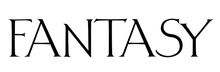
As simple as it is, some fonts are unsuitable for particular genres, and the reader will immediately sense that something went wrong.
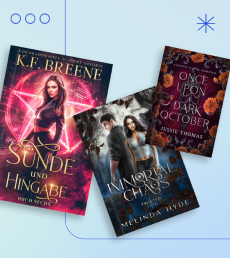
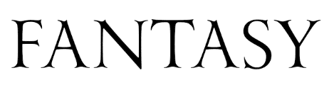
Let’s take a look at the example. The science-fiction font on the right does not represent the epic fiction book genre, don’t you agree?


The idea is not that the book cover design looks odd or wrong, but that you can not define the genre when taking a quick look at the cover.
Result? The reader is confused and not sure what to expect from the book. Well, you don’t want that to happen.
FREE RESOURCE
Everything an Indie Author Should Know About Book Cover Design
Enroll for a free email courseTip 2: Types of book cover fonts
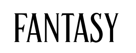
To be or not to be? Serif or Sans Serif? If you have ever tried to research the typography subject at least a bit, you have come across two font types: Serif and Sans Serif.
Here’s the secret. For fantasy, in most cases, it is better to use Serif fonts, and for science fiction, Sans Serif is a go-to. This way, you’ll set a clear difference between the genres and will be able to pique the readers’ interest at the very first glance.


Tip 3: Size matters
Follow the rule: The title on the cover should stand out. Let us explain it more.
For example, choose high fonts if you have long words in your book title. It will allow you to manipulate the size and prevent it from getting lost in the thumbnails.
It’s far more manageable when the words used for the title and author name are short. In this case, any font height is suitable, as there will always be room to increase or decrease the letters’ length and width.
The main thing is not to get carried away because you still need to leave space for a book cover image or illustration. Imagine that a massive title will block the artist’s hard work. Remember that balance about which we talked? Always keep it in mind.
What Would Your
Perfect Cover Look Like?
Get a free book cover idea that fits your story and genre.
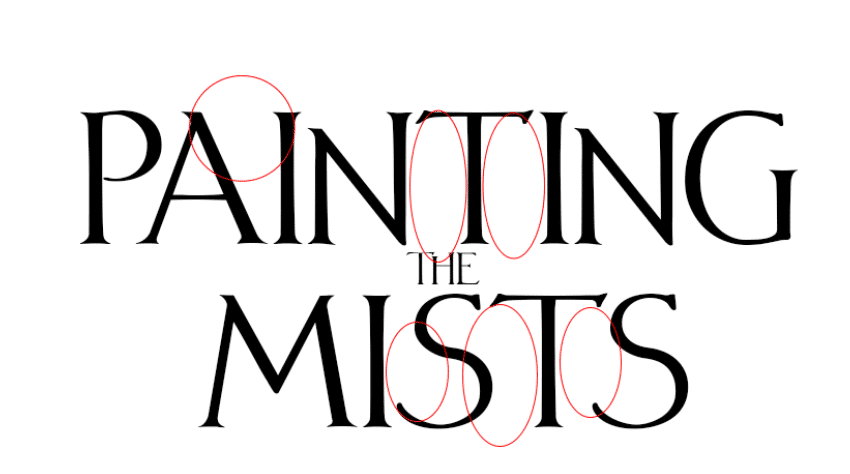
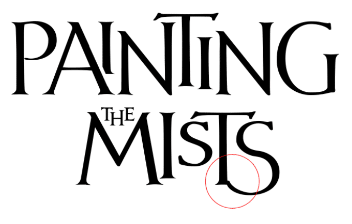
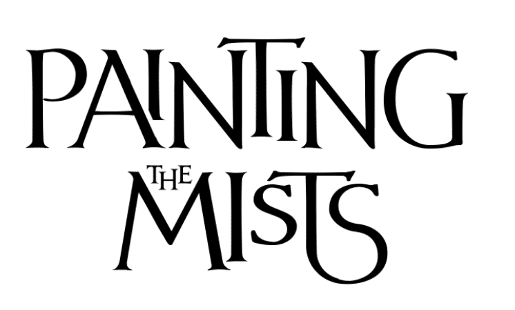
Tip 4: Font design
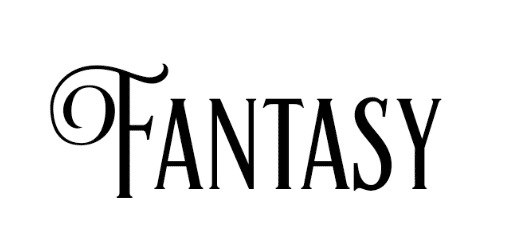
When it comes to a professional cover, you need professional tools and tricks. However, if we are talking about a book cover design that will grasp the reader’s attention, then you should always do a little bit more.
The great idea is to add textures, shadows, gradients, light, and sometimes volume to your font. These are the simple ways to help the font become a part of the book cover design without ruining it or taking a lead role when it’s not necessary. Bring some life into your flat letters.
Take a look at the example below. Can you spot the difference?


If you want inspiration and ideas for effective fantasy book cover design, check out our article Fantasy Book Cover Design: 30 Great Examples .
Now, let us show you 5 great fantasy fonts.
FREE RESOURCE
Everything an Indie Author Should Know About Book Cover Design
Enroll for a free email course5 best fonts for fantasy and dark fantasy book covers
The fantasy genre is magical and mystical creatures, exciting adventures, and supernatural phenomena. You need to pay a lot of attention to the typography here.
It might turn into your guide to introduce a fantasy subgenre and convey the mood of your story correctly. That’s why we strongly recommend that you use fonts that contain glyphs, not super modern font options. This trick allows you to enhance the title without having a professional design background or spending a lot of time figuring it out.
Ready or not, let us introduce you to 5 powerful fantasy fonts.
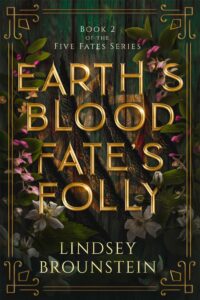
Fantasy font Nº 1: Cinzel Decorative

Meet Cinzel Decorative.
It is a classic font that designers have used for thousands of book covers. Cinzel Decorative does not need to be further adjusted. It is easy to read, and it emphasizes the genre well enough. The font is suitable for the main title and additional text (subtitle, author name, quotes). Capital letters have nice glyphs that will enrich your title.
The main thing is not to get over-excited and experiment with the glyphs too much. Adding a glyph to one or two letters is more than enough for your title’s captivating design.
Take a look at a stunning book cover design using Cinzel Decorative font.
Book cover design by Miblart
Fantasy font Nº 2: Yana
Our next stop is Yana.
The font is similar to the previous one but gives you more space to experiment in your creative projects. Each letter has dozens of modification options. Thanks to the font’s flexibility, it will easily fit into any fantasy subgenre, from paranormal to dark fantasy. But, of course, Yana is also an excellent fit for your urban fantasy novel as well.
See? It’s like killing two birds with one stone.
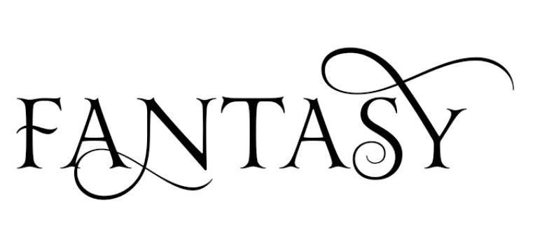
But once again, don’t let things get out of hand. Having many (read: too many) curls in your letters does not give you many advantages. On the contrary, the reader might face difficulties figuring out the title. But, of course, you don’t want that to happen.
Check out this gorgeous book cover design, where we used a modified Yana font. Isn’t it amazing?
Book cover design by Miblart
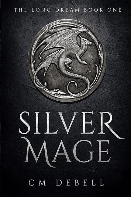
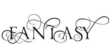
Fantasy font Nº 3: Vectis
Give a round of applause to Vectis.
This font is an excellent choice for your epic fiction or dark fantasy book. Its uneven height of letters and unusual serifs are a perfect genre fit. Bonus point: No additional settings are required at all. You might want to combine the font with metallic textures and add some volume.
Trust us: it’ll shape up to be a fantastic recipe for an epic fantasy book cover design.
We’ve selected two mind-blowing examples for you to prove our point.


Book cover design by Miblart
Fantasy font Nº 4: Artisan
Welcome Artisan.
The font is helpful when you need to make the title big and expressive without sending the wrong genre message. Here’s an idea for you: elegant ornaments in capital letters are perfect for urban fantasy.
Can you take your eyes off these gorgeous book covers using the Artisan font?


Book cover design by Miblart
Fantasy font Nº 5: AgencyFB and AgencyFB extended


Agency FB and its younger brother, Agency FB Extended.
The most famous representatives of science fiction. Again, the fonts do not require additional settings and very well convey the genre.
But, wait, it gets better. You can use both fonts at the same time. For example, use AgencyFB for the title, and AgencyFB extended for additional texts.
You can implement this trick when working with other fonts as well. For example, you can make it a rule to combine high fonts with squared ones. In other words, when the title is high, make all additional texts square. It will help structure the text better and divide the information by importance.
Can you see what we did here?


Book cover design by Miblart
Hope you found these fantasy font tips and tricks helpful. You don’t need to blindly follow these ideas since there are hundreds of thousands of fonts out there, as we mentioned before. The sky is your limit. Moreover, many of them are even free fantasy fonts.
Interested in the basics of book cover design? Read our article How to Create a Book Cover: The Only Guide You Need.
Now, we’ve got a little surprise for you. In our step-by-step tutorial, let us show you how to modify a fantasy font.
FREE RESOURCE
Everything an Indie Author Should Know About Book Cover Design
Enroll for a free email courseFantasy font modification tutorial
We’re going to show you how to make a fantasy font YA-friendly. Follow these steps and enjoy the results.
Step 1
We used Vectis font as a base.
Step 2
Then we turned the text layer into a picture to cut the letters and move them with less effort. After that, we filled the voids formed between the stand-alone letters by increasing and decreasing the letters in some places.
Step 3
In the end, when we placed the letters to fill all the spaces, we noticed that the last two letters looked a little strange. They seemed to be cramped and climbed on top of each other.
Step 4
Finally, we decided to link the letters together to achieve the perfect balance.
You can perform such manipulations with any font, even a standard one. It will help to distinguish your book from thousands of others.
FREE RESOURCE
Everything an Indie Author Should Know About Book Cover Design
Enroll for a free email courseWrapping up
How did you like our guide on fantasy book cover fonts? Whenever you have difficulties with fonts for historical fantasy, dark fantasy, or other book covers, return to it and get your answers.
Do you have any other questions regarding the perfect font or fantasy book cover design in general? Talk to us!


Lou
4 years agoI struggle a lot with typography and fonts on bookcover design. This is amazing and super helpful! Thank you for sharing you knowledge!!
Saloni
5 years agoThis was an amazing article ❤
Thank you!
Glad you’ve enjoyed, Saloni!
Christie
6 years agoVery helpful! Thanks!
Glad that you liked it 🙂
Krystina Kellingley
6 years agoThank you for sharing your knowledge. Really helpful for those like myself who know nothing.
Thank you. We’re really glad to hear that!