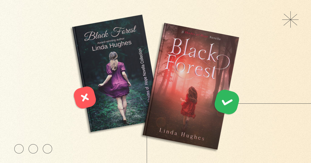
Wow, Miblart is turning 10 this year. Over this time, we’ve created thousands of book covers across various genres, styles, and formats, and we’ve seen many of the challenges indie authors face on their path to publication.
We’ve worked with a wide range of stories, briefs, markets, and authors’ goals, so we definitely have a lot to share. That’s why we’ve compiled the top 10 lessons we’ve learned over 10 years of working with book covers, authors, and the self-publishing industry. Let’s dive in.
1. Good design is not just a matter of talent, but also a system
Over the past 10 years, we’ve come to realize that a strong cover isn’t created by inspiration alone. Yes, a designer’s talent is essential. But the processes, communication, service, and ability to manage the author’s expectations are just as important.
Cover design isn’t just about “making it look pretty.” It’s a journey from the brief to the final file, where every step matters: genre analysis, brainstorming, composition, typography, revisions, and format preparation. And it’s the system itself that helps transform a creative idea into a result that works.
At the same time, creative work always requires a balance between freedom and structure. Too much control stifles creativity. Too little structure compromises service quality. Good design emerges when the team has room for ideas, but the process remains clear and consistent.

2. The first idea is often the strongest
Sometimes an author immediately knows exactly what their book cover should look like. Sometimes a designer finds a solution in the very first concept that most accurately conveys the story. But then the doubts, comparisons, and attempts to “improve it just a little more” set in, and there’s a risk of straying from the strongest idea.
This doesn’t mean that revisions aren’t necessary. They’re important, especially when it comes to the plot, character details, or genre accuracy. But when it comes to the overall concept, mood, and first impression, it’s important to listen to your instincts. Very often, it’s the first idea that hits the mark most accurately.
3. The main purpose of a cover is to evoke emotion
Beautiful effects, an unusual idea, a high-quality typeface, and a detailed composition all matter. But they aren’t the main goal. The main thing is to make the reader feel something.
If, among hundreds of books, a person’s gaze lands on this particular cover, the design has already done an important part of its job. It has made a connection, sparked interest, and conveyed a mood. It has given the reader a reason to take a closer look and think, “What is this book about?”
4. Being eye-catching doesn’t mean being over-the-top
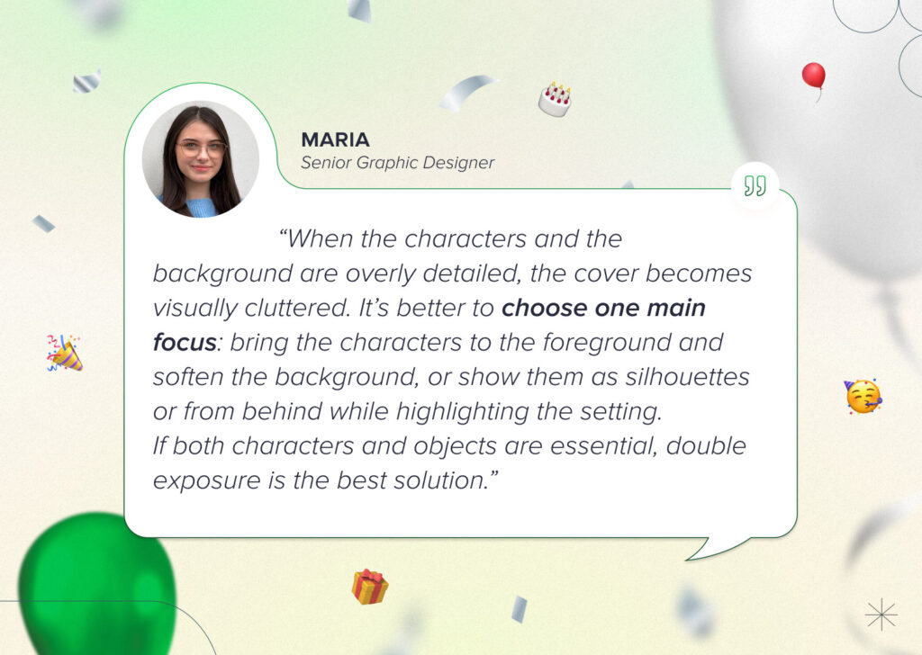
To make a cover look impactful, you don’t necessarily have to show the entire scene, all the characters, and every important plot element on it. On the contrary, excessive detail often creates visual clutter and distracts from the main focus.
You can achieve a striking effect through color, light, a magical element, a silhouette, or a single intriguing or symbolic image. A good cover doesn’t give away the entire plot. It sets the mood, raises questions, and leaves room for the reader’s curiosity.
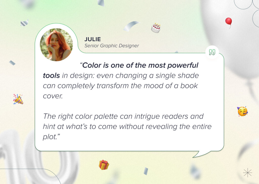
5. Color can say more than unnecessary details
One common mistake is trying to reveal everything right on the cover. The author knows their story very well, so they naturally want to show as much as possible. But the reader doesn’t always need to see everything at once.
Sometimes it’s not the number of elements that makes the biggest impact, but the right color palette. Warm tones can make a story feel softer or more romantic; dark tones can add tension; cool tones can create a sense of mystery; and a bright accent can immediately draw attention to the main detail.
Even a single color change can completely alter a book’s mood and the reader’s perception of it. Therefore, the color palette isn’t just aesthetic but a way to convey the genre, atmosphere, and emotion even before the reader reads the description.
6. Readers should be given room for their imagination
Detailed characters on a cover can be very striking, but they aren’t always the best choice. This is especially true if they’re difficult to recreate accurately using stock photos, or if the character’s appearance might not match the reader’s mental image while reading.
That’s why object-based covers, silhouettes, characters seen from behind, or less detailed images often work better. They convey the essence of the story without robbing the reader of the chance to use their imagination. And that’s important for a book, because part of the magic always happens in the reader’s imagination.
If, however, the cover needs to feature a character, an important object, and the setting all at once, you must set your priorities clearly. This hierarchy helps the reader immediately understand where to look and what’s most important in the story.
7. The reader first gets a feel for the cover and only then examines the details
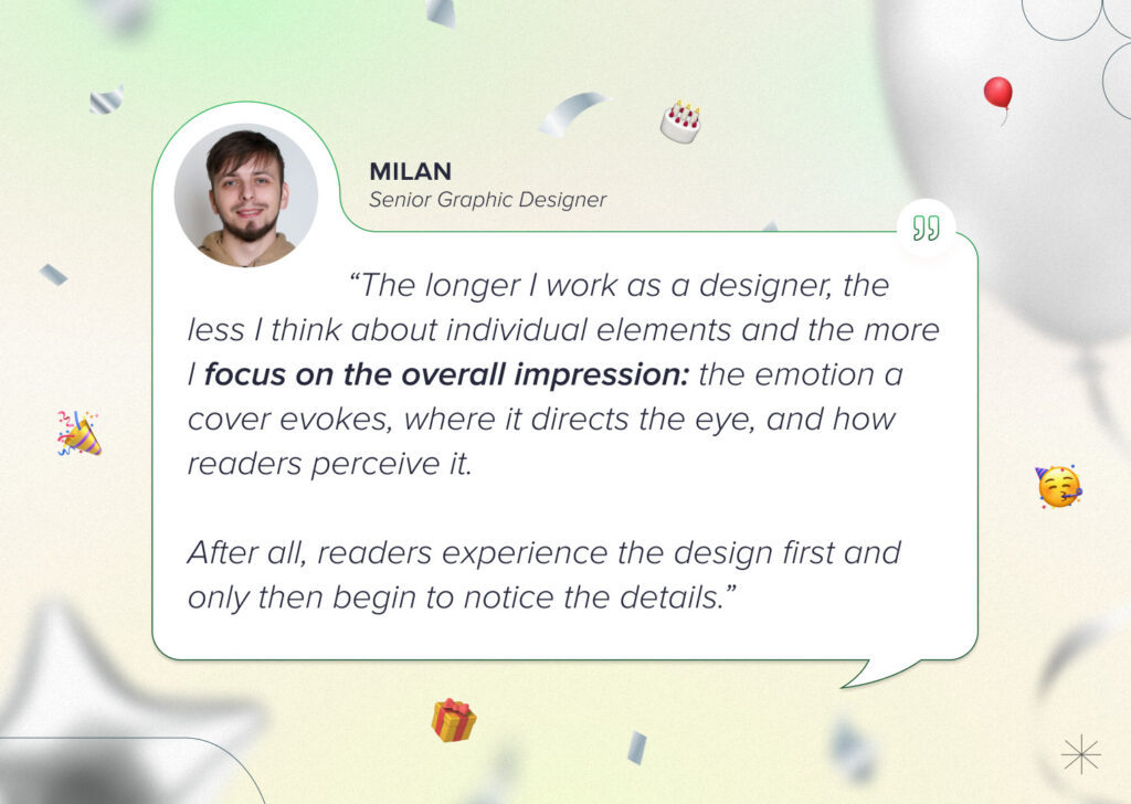
With experience, it becomes clear that a cover is not just a collection of separate elements. It’s not just the font, not just the character, not just the background or the color. What matters is how everything works together.
Before a reader begins to examine the details, they take in the overall impression: the atmosphere, emotion, genre, tension, tenderness, magic, or danger. It is this first impression that often determines whether they’ll want to learn more.
That’s why a good cover is a cohesive image that makes an impact in a split second.
8. There is no such thing as the perfect time to start
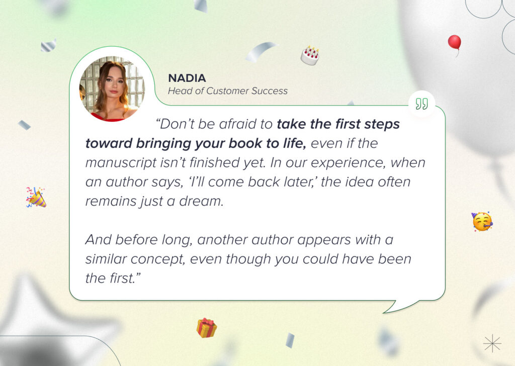
Many authors put off working on the cover because the manuscript isn’t ready yet, the interior pages haven’t been laid out, and the release date seems far off. But experience shows that the phrase “I’ll come back to this later” very often means the book will remain just an idea for a long time.
You can start before everything is perfectly ready. For an author, the book cover often becomes more than just a visual element, serving as additional motivation to keep moving forward. When a book takes on a face, it becomes more real. And that can provide exactly the push needed to finish the work.
9. You should start marketing the book before its release
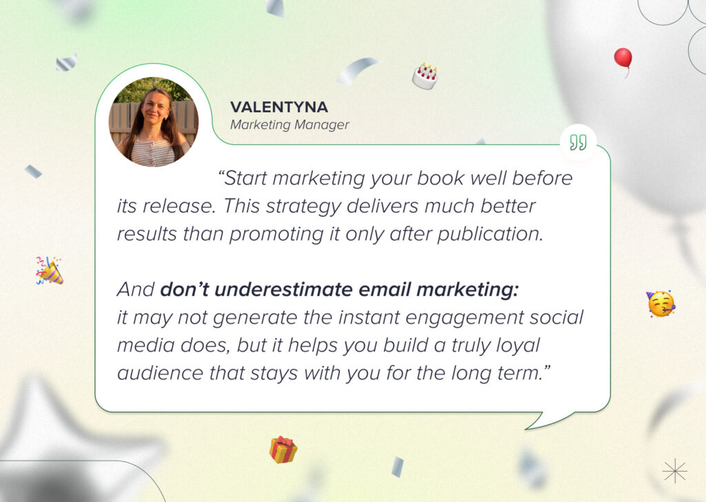
Book promotion doesn’t start on the day of publication. In fact, it’s better to prepare your audience in advance: show them the process, share details, test different content formats, and gradually build interest in the book.
An author doesn’t have to wait until everything is 100% ready. You can talk about inspiration, characters, quotes, playlists, aesthetics, the writing process, or preparations for the release. This helps readers feel a connection to the story even before it becomes available.
And here’s another important lesson: don’t ignore email marketing. Social media provides quick feedback, but email often reaches a more loyal audience. If a reader has given you their email address, that’s already a sign of trust. And it’s worth working carefully with an audience like that.
10. The cover is the main visual element of a promotional campaign
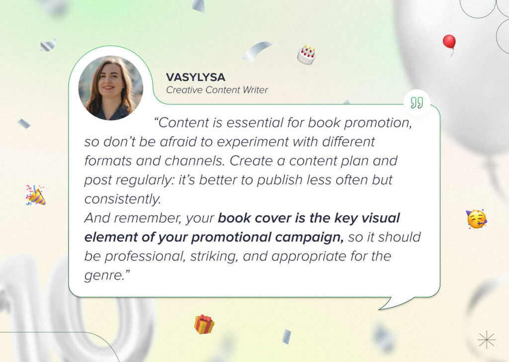
Content is crucial for promoting a book. Authors should experiment with different formats and channels: posts, reels, stories, newsletters, banners, quotes, curated collections, and promotional images. You don’t have to post every day, but it’s important to do so regularly. It’s better to post less frequently but consistently.
And this is where the cover plays a key role. It becomes the main visual element of the promotional campaign: it appears in announcements, ads, social media, on the website, in email newsletters, on banners, and in launch content.
That’s exactly why the cover needs to be beyond beautiful. It needs to be professional, eye-catching, and appropriate for the genre. Because often, the cover is the first thing that introduces the reader to the book, even before the description, reviews, and the first page.
To wrap up
Over the past 10 years, we’ve learned that a good book cover is more than just a beautiful design but a combination of strategy, emotion, an understanding of the genre, clear communication, and experience.
Every story is unique, but the main goal of a cover is always the same: to attract the attention of the right reader and help the book take that first strong step toward its audience.
Which insight did you like the most? Share your thoughts in the comments.