You’ve worked on your book around the clock, and now it’s finally ready. The next step is to wrap it up in a beautiful package and show it to the world.
If you think that book cover design is less important than content, you’re not right. Your great story deserves a professional cover that will attract the right target audience and boost your sales.
In this blog post, we have gathered the 7 most common book cover design mistakes authors make. Try to avoid them at all costs, and you’ll be ahead of your competitors.
Let’s start.
Mistake #1. Weak composition
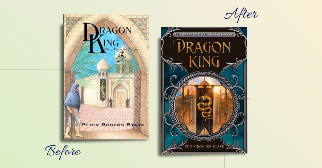
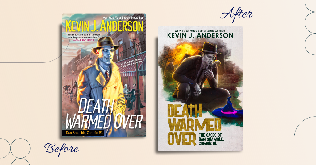
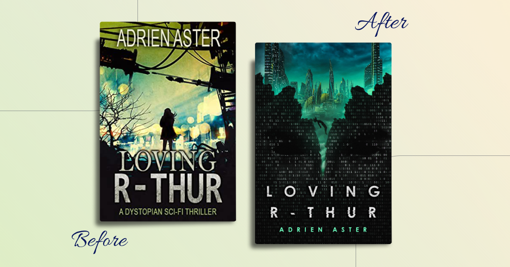
A book cover may perfectly communicate the genre and include many images essential to the plot, yet the reader may feel something is wrong. It’s about a weak composition in which elements are placed somewhat chaotically and do not harmonize with one another. The correct arrangement of characters and other elements, as well as the appropriate color scheme, can entirely change the impression of a book cover.

Mistake #2. Bad font choice
Typography is an essential element of the book cover design. It shows the character of your writing and can become your brandmark.
So, what are the common book cover design typography mistakes?
Typography doesn’t convey the right genre or express the mood. Try to convey it with special colors, imagery, and even customized fonts.

The title is not readable in a thumbnail on Amazon. The size of the title, as well as the author’s name, matters. It targets the reader. Typography helps communicate the book’s genre and mood to your readers.

If it’s a book series with a subtitle, make sure the subtitle is readable. Choose a contrasting font that grabs readers’ attention.

You should use the same alignment for the title, subtitle, author’s name, and the other text you want to include in the exterior design. Also, it makes the book’s visual concept well-organized.
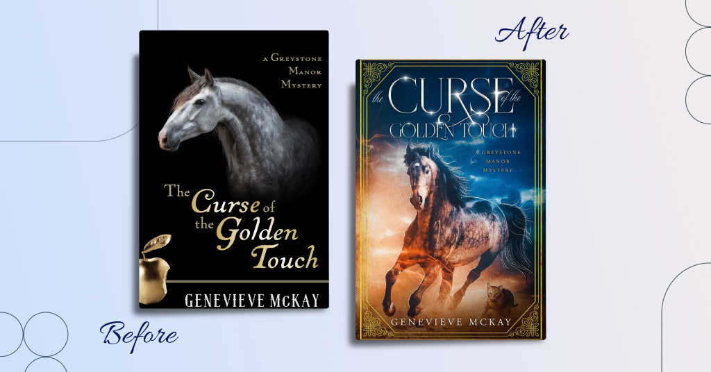
Mistake #3. Bland design and dull colors
Prevent the lack of contrast. Design in genres such as fantasy, urban fantasy, and science fiction requires a bright palette. Tints of contrasting colors enrich it with vivid hues and catch the eye.
The title color is very similar to the background, making it difficult to read. To avoid it, you can choose hues that contrast with your background or highlight the title with extra effects. Yet, try to select from a pleasant color palette so that people can read it in thumbnails and print.

Mistake #4. Lack of professionalism
Knowing how to create collages in Photoshop and add text is not enough to make a book cover look professional. At a minimum, you still need to choose the right font. At a maximum, you should make color corrections to images, create a harmonious composition, and enhance the final picture with effects and decorative elements. Without all these steps, the book cover will look cheap and amateurish.

Mistake #5. Too much text on the cover
Too much text on the cover repels the potential audience because people don’t like reading long titles and subtitles. Additionally, it may be challenging for readers to figure out what the book is about. We don’t mean you have to shorten the title or subtitle. Instead, you can highlight keywords with different colors or enlarge their size.
Mistake #6. Bad quality of images
Low-resolution images spoil the overall impression of the design. It’s always better to choose high-quality pictures to make a book cover design eye-catching. Also, make sure you possess the copyright for the images used.

Mistake #7. The design doesn’t communicate the genre
It’s significant to stick to your genre. Use certain colors and key elements to convey the desired feelings dwelt in the novel. Don’t mislead your audience. Meet their expectations, and you’ll get more loyal readers.
Wrapping up
Book cover design is a key to successful book promotion.
Keep these common book cover design mistakes in mind when working on your next cover to increase your chances of standing out from other authors.