Do you judge a book by its cover? What about its color?
Have you ever wondered why most business books use dominant blue or orange colors? And why is there often a pink or red element somewhere around when it comes to romance books?
What does color theory have to do with professional book cover design?
Please keep reading to learn more about color theory in book cover design and how to use it to promote your book effectively.
The importance of color in book cover design
Why do you think the book cover for It by Stephen King includes black and red? Because the combination of these two colors hints at danger, fear, and evil. Or why a famous children’s book, Alice’s Adventures in Wonderland by Lewis Carroll, is usually published with blue, yellow, or pink covers? These hues are associated with curiosity, friendship, and happiness.
The color isn’t something you can think about later. It’s an essential element that you should choose consciously. We will study color theory in detail to help your book cover become a powerful marketing tool.
But how do the book cover colors communicate with the audience? Before potential readers even open a book, the colors on a book cover give them their first impression. And we all know that one matters a lot.
Pro tip: When choosing a color palette for your book cover, do proper research. Concentrate on colors that create the emotional response you are looking for in your audience.
Interested in how to create a book cover that sells? Read our book cover design guide to learn more.
Enough theory. Now, let’s take a closer look at its majesty—color psychology.
Сolor psychology in book cover design
The idea is simple: every color represents and evokes a certain feeling. Therefore, color is a powerful communication tool that influences psychological reactions.
So, how exactly does this work in book cover design? Let’s take a look.
Red
Red is about an active lifestyle, energy, confidence, and enthusiasm. It immediately attracts attention, sometimes signifying danger (think about all the warning signs). As a result, the color red increases heart rate and boosts energy levels. However, dark red is associated with anger, rage, and prestige, as well as passion and dominance.

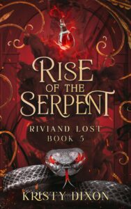

Book cover design by Miblart
Orange
Orange characterizes the maturity of personality. It is the color of joy, pleasure, the pursuit of achievement (Does it ring a bell? Think about all the self-made success books!), and self-affirmation, the color of energy and strength. It has a beneficial effect on human psychology, relieving tension in conflicts.
On the other hand, it displaces different colors associated with the shock effect. In this case, the orange symbolizes the passion of the struggle and the demonic beginning of the war.


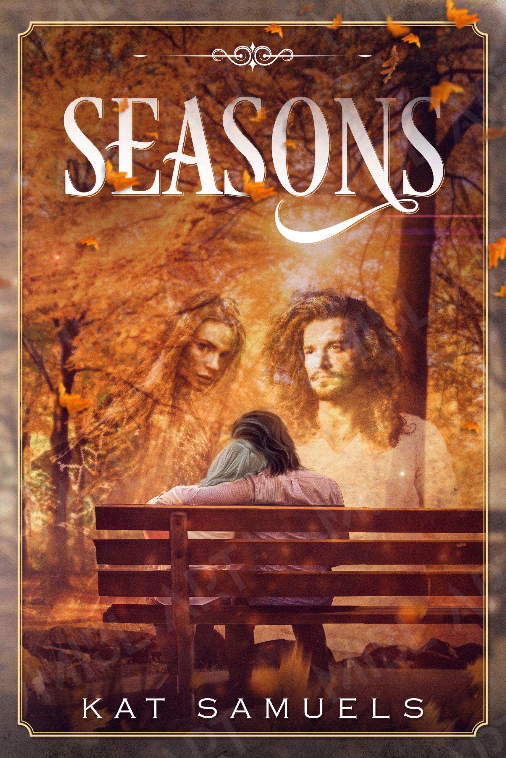

Book cover design by Miblart
Yellow
Yellow stimulates brain activity and imagination. Pale yellow is the color of a good mood; it eliminates apathy and anxiety. Bold yellow provokes ambition, motivation, and creativity. In addition, it influences the left side of the human brain, which is responsible for logic.


Book cover design by Miblart
Green
Light green is associated with nature, vitality, the environment, and health. However, bright green is associated with magic, mysterious light, and paranormal phenomena (as seen on Harry Potter and The Hobbit book covers).


Book cover design by Miblart
Blue
Blue stimulates longing for travel, miracles, and magic. It is a color of peace, relaxation, and meditation. Blue calms, balances, reduces pain, and provides a sense of relief. When the reader detects blue on the cover, they may expect mental tension and involvement. The book might give them a lot to think about.


Book cover design by Miblart
Purple
Light purple is about sensuality and spirituality. It enhances self-esteem and gives a pleasant feeling. At the same time, one of the most mysterious colors, no doubt, is dark purple. It is associated with abnormal activities, fantasy, and magic.


Book cover design by Miblart
Gray
Gray conveys sophistication, knowledge, prestige, and wisdom. Think about images of architecture, strong urban and industrial vibes.


Book cover design by Miblart
Pink
Pink brings youth, playfulness, emotion, innocence, dreams, and desires. It is considered to be a classic feminine color. However, different shades of pink can seem weak, vulnerable, and a bit silly. It can be associated with the refusal to face real-life challenges (remember the “rose-colored glasses” proverb?).


Book cover design by Miblart
White
White is clean, straightforward, self-sufficient, and simple. It correlates with spirituality, energizes, and purifies. However, the white color can get the opposite value. By its nature, it seems to absorb and neutralize all other colors and correlate with emptiness, icy silence, and, ultimately, death.


Book cover design by Miblart
Black
Black evokes a sense of authority, power, and sophistication. Dark cocktail dress, black suit, and tinted car windows. And of course, black is also associated with the dark side and depression.


Book cover design by Miblart
We hope you found the idea of color psychology interesting. Of course, it doesn’t mean you can’t get creative and combine different colors. But knowledge about color theory and psychology can become your game-changer.
Interested in how to create a cover that communicates your genre? Read our book cover design ideas cheat sheet.
How to choose a color for your book genre
Now let’s learn what colors people typically associate with specific genres. Here, we will combine the knowledge of color psychology and cover design in different genres.
When choosing a color palette, take into account the following details:
- Color psychology
- The individual’s assessment of the harmony in colors based on a specific object (e.g., green makes sense as the color of grass, but not human skin)
- Do not use more than three dominant colors on the book cover.
Non-fiction: blue, yellow (or golden), orange, and sometimes red
For non-fiction book covers, designers prefer to use yellow, orange, blue, and red because of the meanings they convey and the feelings they evoke. If you are a proud author of self-help motivational books, success stories, or thought-provoking non-fiction, this is the palette you might be looking for.
By the way
Don’t be afraid to use white space on non-fiction book covers. It has proven to make a book cover more scannable and prioritize the focus element for the audience.


Book cover design by Miblart
Now, let’s look at the most common colors for fiction book cover design.
Science fiction: Blue, Black, Green, Red, and Gray
Many sci-fi books are set in dystopian societies, during hard times, or amid rebellions. Cool blues, purples, and metallic grays will leave the audience feeling tense and unsettled.
There’s an exciting theory of impossible fictional colors, which are the ones that do not occur in nature under normal circumstances. Some sci-fi books use these colors on their covers.


Book cover design by Miblart
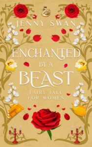
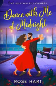
Romance: Pink, Purple, Red, White, Blue
Let’s go by the common stereotype and assume women are the target audience for romance books. As a result, it is good to use a feminine color palette for book covers in this genre.
If your book falls into the category of historical, contemporary, erotic, or paranormal romance, you might want to go with pink, purple, red, white, and blue combinations.


Book cover design by Miblart
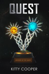
Fantasy: Bright Green, Purple, and Yellow
What about fantasy book cover design? Since this genre quite often involves paranormal activity, the combination of green, purple, and yellow will highlight the book’s mood. It is also a great trick to draw attention. An excellent way to represent different aspects of the unreal worlds, mystic creatures, and scenes.


Book cover design by Miblart
Thriller: Red, Black, and Blue
If you are working on a psychological, action, crime, or mystery thriller, you might consider using red, blue, and black in your cover design.
Think about blood, aggression, fear, and power. The combination of red and black communicates that the book is about violence and mystery.


Book cover design by Miblart
As a cherry on top, we would like to keep you updated on color trends in book cover design in 2026.
So enjoy our little book runway show.
Color trends in book cover design
Monochrome backgrounds
One color and its shades prevail on the book cover. Such hues serve as an excellent background for typography.


Sources: John of John, Anatomy of an Alibi, The Paris Secret (by Miblart)
Vivid contrasting blends
Unexpected mixes of bright colors grab readers’ attention at first glance. This trend works great for various genres.
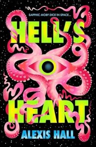


Sources: Hell’s Heart, Where the Wildflowers Grow, Please, Don’t Call Me Crazy (by Miblart)
Cloud Dancer
Cloud Dancer is Pantone’s color of 2026. Consider this elegant, airy shade that works beautifully for both focal elements and full background compositions.
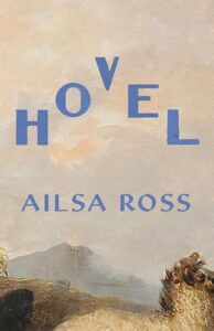


Sources: Hovel, Frog: And Other Essays, Rachel Weeps (by Miblart)
Discover more book cover design trends of 2026 for inspiration in our blog post.
Conclusion
Now you know how to use color theory in book cover design.
Finally, we’ve prepared a little surprise for you.
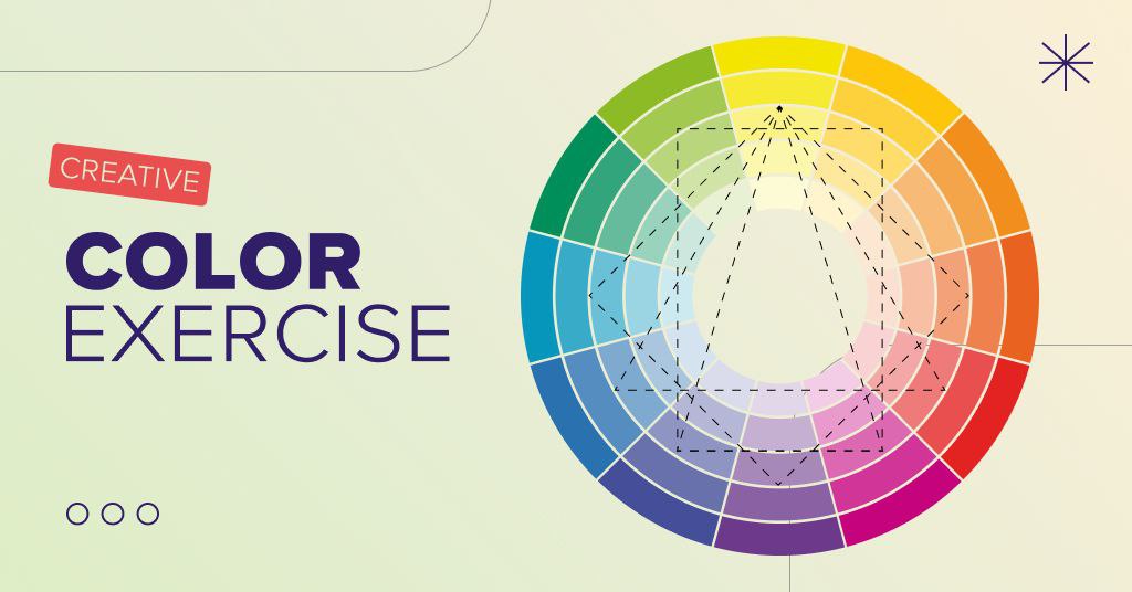
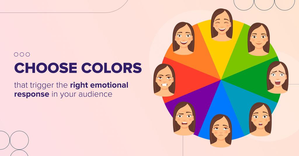
Take a look at the color wheel above, choose one color, and start freewriting a bit. It means what the name suggests: writing without constraint (almost, the color you’ve selected is your constraint).
Start a 10-minute timer and write non-stop, using that color word as a central element of the plot, creating your character around it, describing the scene, etc. This exercise is excellent for boosting your creative thinking; there are no limits or restrictions, just your imagination.
Post your results in the comment section below. Again, let’s try to keep it below 500 words.


maryem
3 years agothis article so helpful
i created a book cover hoping you’ll help me to make it more pretty
Kev
3 years agoA fantastic article. Very enlightening. Thank you 👌👍
Vasylysa
3 years agoWe are happy you find it helpful!
DWoods.Advisor
5 years agoThank you so much for this! Great article! I appreciate you and your staff. I submitted to receive your suggestions, I can’t wait!
Thank you!
Leon King
5 years agoThanks, this was a great article.
Thank you! We’re glad you enjoyed it 🙂
ghalia
6 years agoHi there,
I am just wondering who the author is for this article as I would like to properly cite this article for an essay I am working on
Hi! This article was written by Anastasiya Lototska 😉
Gale
6 years agoThis was so helpful. I have so many directions for my cover design idea this really helped organize things. Thank you
Glad to hear you found it helpful!