Romance is the top-selling genre for indie authors now, drawing readers in with stories of love, passion, and deep emotions. Thus, a striking cover is essential for standing out in this competitive market. To help authors create eye-catching covers, we asked our experienced designers to share their best tips. In this blog post, we’ll break down the key elements of romance book cover design, from colors and fonts to imagery, and share stunning examples. Let’s dive in!
Romance book cover design imagery
The choice of imagery depends on the cover’s style. Two popular options are character-based and object-based designs.
Character-based romantic cover design
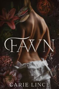
These covers often feature a romantic couple, a single main character, or a protagonist surrounded by admirers, common in love triangles or harem romances. The background is also essential, as it helps set the scene and mood of the story.

Characters can also be presented in different ways. Sometimes they are shown in full detail, with expressive faces and emotions front and center. In other cases, only parts of the body, silhouettes, or faceless figures are used, allowing readers to project their own imagination onto the characters and picture them as they see fit.


Romance book cover design by Miblart
Object-based romantic cover design
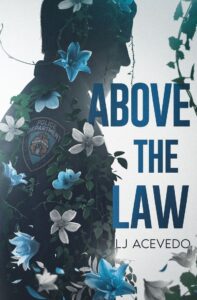
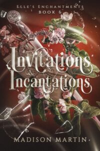
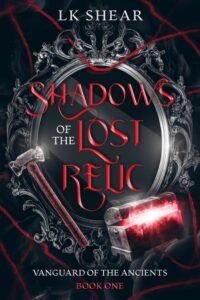
Object-based covers focus on a single symbolic item that represents the story. This could be something related to the main character’s job or a key part of the plot, such as a tie, ballet pointe shoes, a masquerade mask, or a thorned rose.

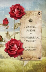
No matter the style, covers can include small romantic details like flowers, birds, candles, doves, jewelry, sweets, ribbons, bows, or hearts to enhance the overall look.


Romance book cover design by Miblart
Color palette in romance covers
The color palette is essential to romance book cover design because it creates emotions and sets the story’s mood. Warm colors feel cozy and passionate, while cooler shades add mystery or elegance. The right colors help show readers what kind of romance they can expect.

You can learn about color psychology in book cover design in our blog post.
Now, let’s explore some of the most popular colors for romance covers:
- Red – Passion, love, and excitement; great for intense, dramatic romances.
- Pink – Sweetness, kindness, and fun; often used for lighthearted love stories.
- White – Fresh starts, purity, and timeless love; perfect for classic or historical romances.
- Purple – Mystery, longing, and deep emotions; works well for dramatic or forbidden love stories.
- Blue – Calm, trust, and devotion; good for emotional, heartfelt romances.
- Gold – Elegance, warmth, and fairy-tale magic; often seen in royal or historical romances.
- Pastels – Soft, dreamy, and innocent love; typical in wholesome or young adult romances.

Choosing the right colors not only makes the cover look beautiful but also helps set the right expectations for readers.


Romance book cover design by Miblart
Romance cover design typography
Typography in romance novel covers enhances the story’s mood, whether it’s light and playful, elegant and timeless, or dark and mysterious. That’s why designers often use fonts that feel soft, flowing, or decorative to create an emotional connection with readers.
Some key features of romance typography include:
- Script and handwritten fonts – Elegant, flowing, and romantic; perfect for sweet, contemporary, or historical love stories.
- Serif fonts – Classic, timeless, and sophisticated; great for historical, literary, or dramatic romances.
- Sans-serif fonts – Clean, modern, and fresh; often used in contemporary or romantic comedy covers.
- Bold and decorative fonts – Eye-catching and expressive; ideal for fantasy, paranormal, or dark romance.
- Soft, rounded fonts – Warm, inviting, and playful; works well for lighthearted or wholesome romances.
Our designers have shared a few specific fonts they love to use for romance covers:

Font pairing is also essential. Titles often use stylish, expressive fonts, while author names and taglines are kept simpler for balance. Choosing the right typography makes the cover visually appealing and sets the appropriate expectations for the story inside.


Romance book cover design by Miblart
Romance cover design examples
Let’s move on to romance cover design examples across different romance subgenres, highlighting the key elements that make them recognizable.
Contemporary romance
Such covers are easily recognizable by their modern setting and stylishly dressed characters. They often feature couples in casual or elegant outfits, reflecting the present-day world. Romantic details like flowers, hearts, or glowing lights add warmth and charm, enhancing the love story at the book’s heart.

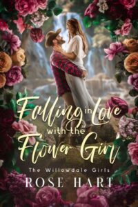


Contemporary romance book cover design by Miblart
Love triangles and harem romance
These designs usually feature a main character surrounded by multiple love interests, highlighting tension, desire, and competition. This instantly sets the tone for romance, drama, and intrigue.
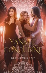


Harem romance book cover design by Miblart
Paranormal romance
Paranormal romance covers often include characters with supernatural powers, shifters, or eerie nighttime scenes with a full moon. Dark tones add to the magic and intrigue. Moreover, object-based covers are popular, using symbolic items such as glowing amulets, blood-stained roses, or enchanted weapons to hint at the story’s paranormal elements.


Paranormal romance book cover design by Miblart
Dark romance covers
The covers of this genre usually use shadowy tones to create an intense and mysterious atmosphere. They often feature haunting imagery, such as black masks, shattered glass, bloodstains, or ominous, masked characters. These elements hint at danger, obsession, and the darker side of love, drawing readers into a world of passion and suspense.


Dark romance book cover design by Miblart
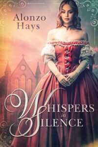
Historical romance cover designs
These covers place strong emphasis on the period setting, transporting readers into past eras through rich visual details. Lavish gowns, tailored suits, ballrooms, castles, carriages, and historical landscapes often set the scene, while elegant typography reinforces the timeless atmosphere.

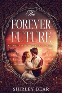
Historical romance book cover design by Miblart
Conclusion
So, now, you are ready to impress your readers with a striking romance cover. Let’s recap a bit of the essential tips. A well-designed piece sets the mood and captures readers’ attention.
Imagery should match the story, whether it’s a couple, a meaningful object, or romantic touches like flowers. Colors help create emotion, for example, red and pink for passion, blue and purple for depth, and gold or pastels for a dreamy feel. Typography should fit the style, with modern fonts for contemporary love stories or bold ones for darker themes.
What’s your romance style? Which of these tips speaks to you the most? Share your thoughts in the comments.


Thank you for your sharing. I am worried that I lack creative ideas. It is your article that makes me full of hope. Thank you.
<a href=”https://www.univ-msila.dz/site/segc/”>Faculty of Economics and Management</a>.
Cathy
4 years agoLove these – definitely inspiring. Quick question: what font is that on Saving Valentine?
Vasylysa
4 years agoThanks for the comment! For Saving Valentine, our designer used a combination of two fonts: Time New Roman and Desire.
How to Craft a Stunning Book Cover – Mark Dawson's Self Publishing Formula
4 years ago[…] can’t imagine a romance book cover without a couple hugging and touching. As for the color gamut, designers usually use pink or red […]