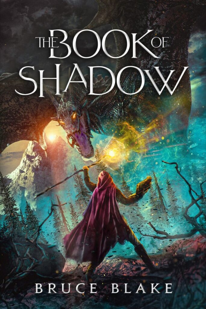
You are here because you believe in your book and want more readers to enjoy your creation. You can do a few things to boost your book sales besides tight storytelling and world-building. There are a few things that can boost your sales besides tight storytelling and world-building. And book cover redesign is one of them.
So:
Read along to learn how changing visuals helped one writer to grow the fanbase, how to determine whether it’s time to invest in a new cover, and what makes book cover redesign effective. Also, stick around for some real-life redesign examples.
How to know it’s time to redesign your book cover?
Book cover redesign can completely transform your writing career. In particular, if your books were gathering dust on the bookshelves before because no one noticed them, they can become bestsellers.
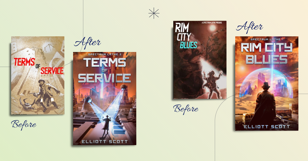
Elliott Scott, a cyberpunk and science fiction writer, is one of those authors who has seen firsthand the power of redesign. He said that the book cover redesign saved his series, Spectrum Lathe. Although people who have read his books like the story, the author could not attract new readers. The reason was mediocre book covers that did not speak to the target audience.
After book cover redesign, Elliott Scott began to feel more confident about promoting his books. They looked professional and attracted the readers attention. His stories also soared up the charts on Amazon.
Here’s what also happened:
- Elliott Scott hit #1 in three free categories of Kindle Store: Cyberpunk Science Fiction, Humorous Science Fiction, and Crime&Mystery Science Fiction
- 4,600 copies of his first book are in readers’ hands
- The author hit the front page of Reddit’s r/scifi with a post that got 80,000 views
- He added 12 readers to his mailing list and got 14 new 4-5 star reviews on his book
- People are reading his fiction every day on Kindle Unlimited!
Now:
If you are wondering whether your books can do much better with a new cover, here are the questions you should answer.
1. Does my book cover meet the genre expectations?
Genres and their respective book covers have conventions to follow. For instance, thriller fans’ eyes are hungry for that particular book cover design: intriguing, grim, soaking with character, and masterful.
The book cover’s imagery, colors, typography, and text layout should belong to the genre. You can’t slap a traditional fantasy font on a mystery book cover and expect people to get it. As well as, you’d instead not use a tender color palette on a horror book cover.
An excellent example of a genre-intuitive cover is “Hidden Enemy” by Nathan B. Dodge. We believe you won’t struggle to guess its genre.

Book cover design by MiblArt
If your book cover design is unclear about its genre, it needs a redesign.
2. Does it evoke the right emotions?
If your book already has a genre-friendly cover, the next question is whether the cover communicates desired emotions. A potential reader craves not only a good story but also certain feelings:
- I want to be thrilled.
- I want to be scared.
- I want to feel infatuated with the main characters.
- I want to explore imaginary worlds.
Of course, a reader’s desires can be complex and combine a lot of different “wants.” However, you must choose a focal feeling your book cover design should evoke.
Your two primary tools for communicating the right emotions are book cover design colors and imagery. For example, dark purple works great for implying danger and mystery.
Book cover design by MiblArt
3. Is the text on a book cover visible?
The book’s title or your name on the cover should be glaringly visible, like Frodo with the Ring on his finger to Sauron. Well, maybe not to that extent, but the idea stands:
- The text should not merge with the background,
- The typography should be big enough and easily readable,
- The layout should be intuitive.
Readable text that attracts attention will help you build your author brand and ensure that the title of your book leaves its mark in the mind of the audience.
It’s an excellent example of typography that attracts attention and does not negatively affect the atmosphere.

Book cover design by MiblArt
4. Does your book cover have a strong composition?
Your book cover can include stunning images, unique font, colors that evoke the right emotions, and other beautiful elements. However, the overall picture may look incomplete and disharmonious. The reason may be a weak composition.
Combining all the elements correctly and creating a solid composition is essential. Characters, objects, symbols, and text should look harmonious and complement each other.
Book cover design by MiblArt
5. Is your book cover a catchy thumbnail?
For better or worse, most books are like videos on YouTube: they need a catchy thumbnail to get millions of views.
It’s a tricky task. On the one hand, you need to ensure that your book cover follows the conventions of the genre. On the other hand, it should be distinct enough to stand out from the crowd. Finding the proper balance between the two requirements is what we strive to accomplish with our covers.
An excellent example is “Pack of Secrets” by Amara Mae. The cover screams fantasy and catches readers’ eye.

Book cover design by MiblArt
6. Do your sales and number of reviews grow?
Do you believe you can sell more books? We believe the answer is yes.
Of course, your sales may stagnate. However, it doesn’t mean that the Universe decided to punish you or your book is terrible. It means that your creation needs a little boost.
You can write a hefty thousand-page book on book marketing. However, such a simple step as redesigning your book cover has an impressive ROI of time and money.
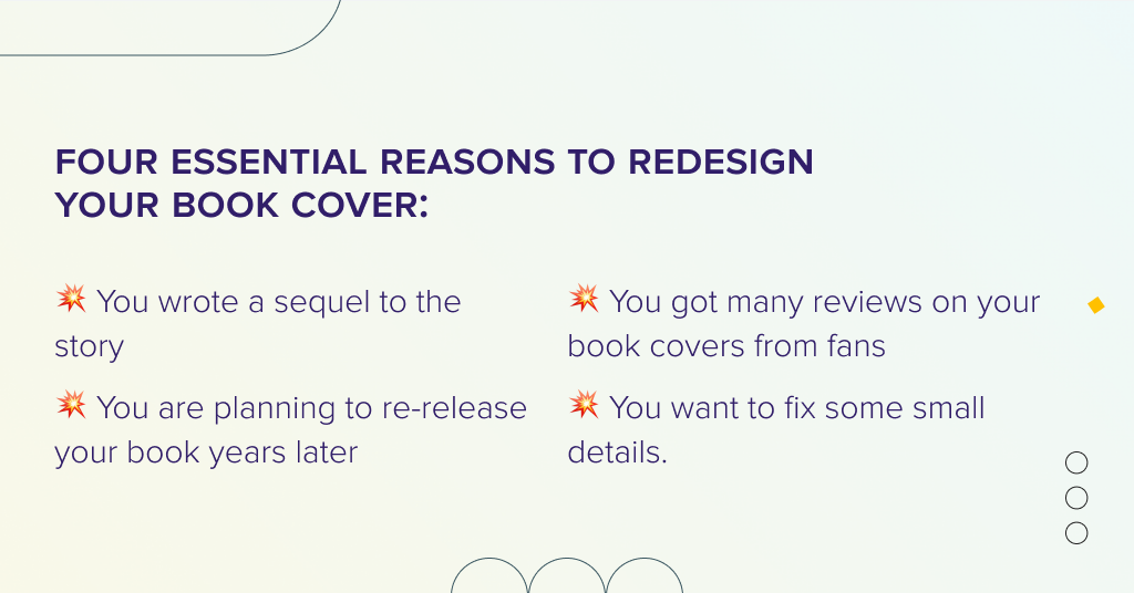
Four more essential reasons to redesign your book cover
Even if your book cover largely meets all of the above requirements, there are still some situations to consider.
1. You wrote a sequel to the story
All parts of one series should look harmonious and complement each other. This positively affects your author’s brand and makes you recognizable to the audience. That is why, if you have written a sequel to your book, you should think about redesigning the cover, which will set the tone for the entire series.
In particular, Glen Dahlgren did so with his The Chronicles of Chaos series. When creating the cover for the first part, he didn’t consider the standards of the genre and the target audience. Thus, it didn’t accomplish what the book needed. Glen realized that the cover was a powerful marketing tool when publishing the second part and turned to MiblArt. First, our designers created a new look for the first book, The Child of Chaos. They changed the typography, focused on the three dice, and chose a suitable color scheme. We also made a logo for the series branding. The new design set the tone for the entire series.
MiblArt went on to create the covers for the prequel, The Game of War, and the sequel, The House of Prophecy. By the way, The Game of War book won first place in the Dante Rosetti award for YA Fantasy.
2. You are planning to re-release your book years later
If your book was published a long time ago, but you plan to boost it in a new way, you cannot do without a redesign. After all, the time has passed, book cover trends have changed, and graphic design has gained new opportunities.
In this case, redesign is an excellent and easy way to refresh your book, catch the readers’ eyes and increase sales. Also, don’t forget to create marketing materials with a new cover to use on your social media and website.
3. You got a lot of advice on your book cover improvement from fans
As an author, you get a variety of feedback on your novel that helps you become better. Comments can be not only about the story itself but also about your book cover. You may have already gathered enough ideas to improve your novel’s look. If there are practical and valuable things, listen to them and redesign the cover. After all, these are the wishes of your target audience, which will help attract the attention of a more significant number of potential readers.
4. You want to fix some small details
Your book cover really meets all genre standards and target audience requirements. However, you want to polish it up a bit: change the font, choose brighter colors, or make the background look more alive. You should not postpone such a minimal redesign either because a high-quality cover in detail will help to look professional.
Miblart Book Cover Redesign Cases
Now, to the juiciest part of the article — actual redesign cases by Miblart. Over the years of providing book cover design services, we’ve had our fair share of changing how texts look.
1. “Winterstruck” by Sara C. Walker
It’s an urban fantasy novel about a Canadian black ops agent, Julia Ivory determined to battle dangerous magical creatures solo. She digs into a new case of burned bodies all over Toronto. And when security footage reveals the culprit is a rogue fae, it’s a race against time to prevent any more fiery deaths.
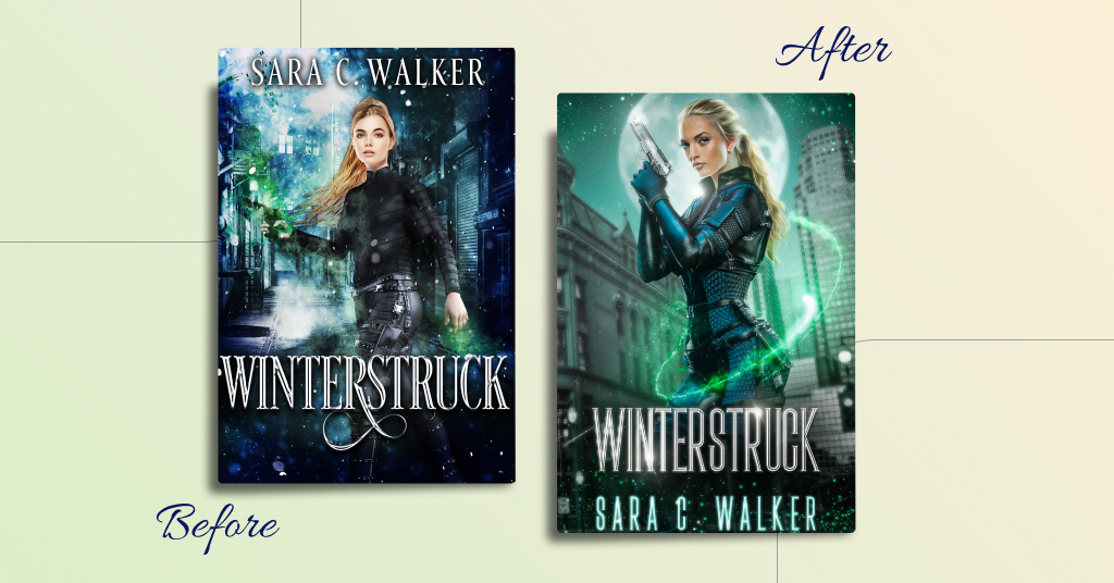
To enhance the visuals of the book, our designers:
- Created a realistic and harmonious protagonist with many details in her appearance
- Chose professional typography, adding a shiny silver look to the title
- Changed the color scheme to a more harmonious one
- Drew a glowing vine surrounding the main character, adding magic to the cover
- Blended everything well so it looks balanced.
2. “A Call to the Sky” by Marc B. Degeorge
“A Call to the Sky” is a science fiction novel telling about a world without ground. Toume d’Nezuhmy wants to become a pilot, just like his mother. The priestess of the Drahken clan offers him a curious mission. Take a mysterious package to the Manuke—the clan of scientists and engineers who will study it to find its secrets. There is no pay, but if Toume is successful, the high priestess will grant him her daughter’s hand in marriage.
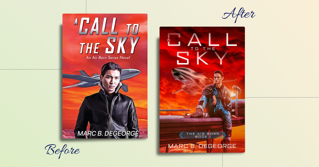
To redesign the cover, our designers:
- Created a high-quality image of the main character in full growth
- Drew a realistic look of the plane in the front and background
- Changed the fonts and the layout to make it more readable and genre-friendly
- Added more suitable series branding title
- Preserved the atmosphere of action and adventure.
3. “Zer0-Day” by Al Davidson
“Zer0-Day” is a science fiction and cyberpunk novel about Joshua with unexplained amplified senses and boosted reflexes that help him survive in a brutal megacity. But these mysterious abilities have drawn the attention of a covert government entity.
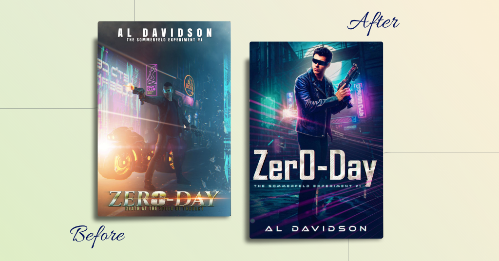
Our designers did the following:
- Changed the fonts and layout of the text to suit the genre
- Created an eye-catching image of the protagonist
- Drew a high-quality background with the atmosphere of the megacity and cyberpunk
- Added brightness to the book cover and changed faded colors.
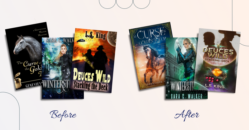
4. “The Curse of the Golden Touch” by Genevieve McKay
This paranormal mystery tells about Jillian Harrington, who wants just a predictable, ordinary life riding her horses and reading books. But, when life throws her a curveball in the form of her reckless cousin Xander, Jilly is dragged into a deadly adventure.
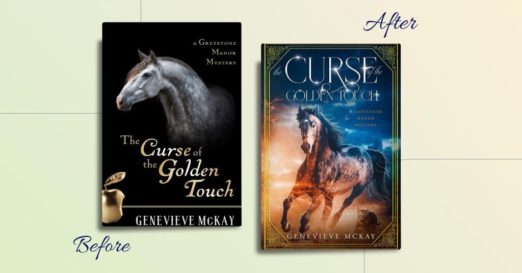
It was a comparably subtle redesign of the book cover, during which our designers
- Radically changed the colors of the book cover, making it bright and eye-catching
- Created a complete and realistic image of a horse
- Added an elegant frame
- Changed the font to an elegant and shiny one
- Included a sky image in the background to create an atmosphere of mystery.
5. “Deuces Wild: Stacking the Deck” by L. S. King
“Deuces Wild: Stacking the Deck” is a space opera, and one of the series part about Tristan and Slap. They take a contract to deliver supplies to settlers on a pioneer world, not realizing it would involve running a planetary blockade.
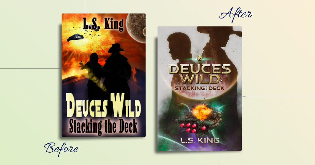
We decided to maintain the main idea of the cover but add some details. So our designers:
- Fixed the fonts and gave the typography a contemporary look
- Added more accurate silhouettes of the protagonists
- Created a realistic image of the spaceship to highlight the genre
- Included pictures of planets in the background
- Added numerations of the book series.
Conclusion
Book cover redesign can seriously increase your book sales and attract new readers to your writing with a minimum of investments. You just need to know when and how to approach this nuanced task.
Have you ever redesigned your book covers? What result did you get? Share your experience in the comments.