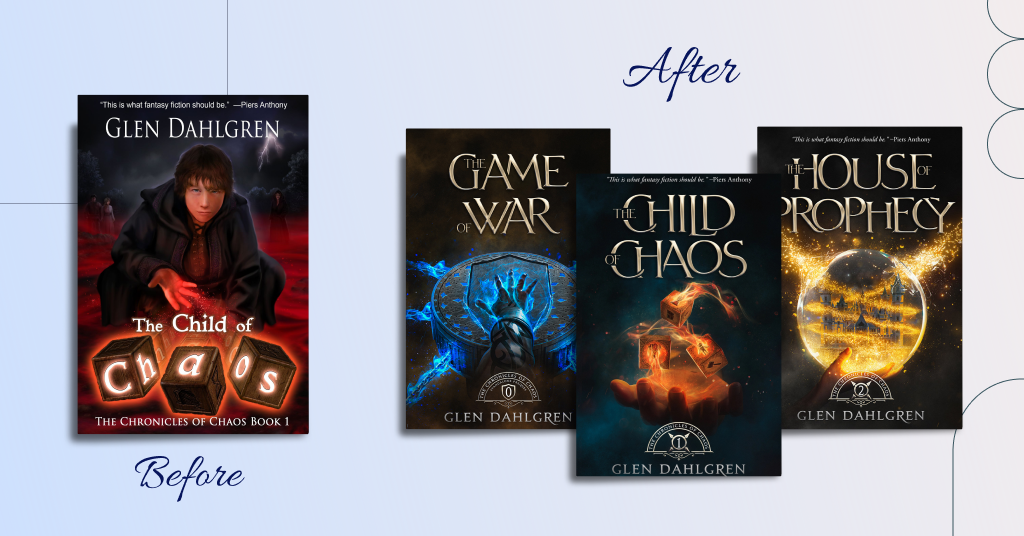
Today we want to share the story of how one book cover redesign turned into creating book designs for a whole series. We’ll tell you how a new book look increased sales and how a novel we designed a cover for won a prestigious award. Let’s dive in!
Behind the scenes of this book cover
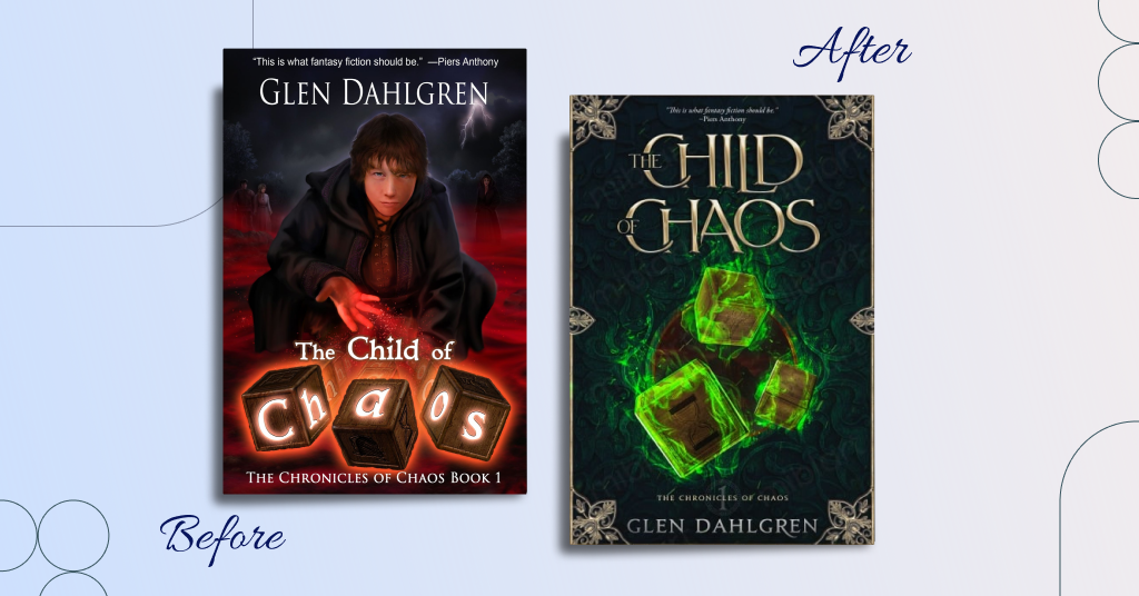
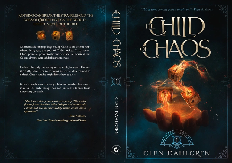
Glen Dahlgren came to us on the advice of his author friend. He wanted to redesign the cover of the first part of his series, The Chronicles of Chaos. The book is called The Child of Chaos. It’s a young adult fantasy with an exciting plot about a world controlled by the gods of Order.
Here’s a more detailed blurb of the story:
An irresistible longing drags young Galen to an ancient vault where, long ago, the gods of Order locked Chaos away. Chaos promises power to the one destined to liberate it, but Galen’s dreams warn of dark consequences. He isn’t the only one racing to the vault, however. Horace, the bully who lives to torment Galen, is determined to unleash Chaos–and he might know how to do it. Galen’s imagination always got him into trouble, but now it may be the only thing that can prevent Horace from unraveling the world.
Glen Dahlgren shared his previous book cover and requirements for the new one:
- He wanted to focus on an object: the three dice. They should be magic, wooden, and have infinite symbols on the sides (a volcano, pile of gems, cave opening, hammer, pit, and door).
- Typography should be artistic and bold. Glen also needed treatment for the series name that he could use across all books.
- A book cover should hint at its fantasy and magic genre and appeal to both males and females).
What about the first version of the book cover?
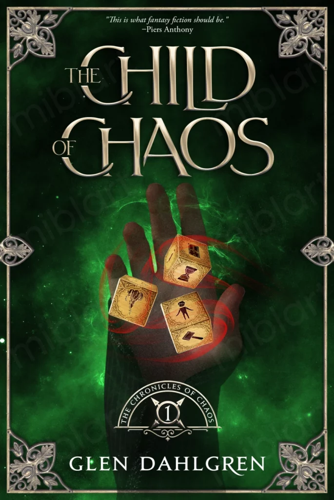
Glen Dahlgren worked with a talented artist, Cindy Wentzell, to create the book cover for his book. However, neither of them had any book cover design experience. They tried an unusual trick: put a part of the title on the dice.
The result wasn’t bad, but the design didn’t accomplish what the book needed.
- Some people said that the title wasn’t prominent enough despite the playful and a bit innovative title treatment.
- The font selection didn’t look professional enough.
- The color scheme felt more middle-grade than young adult.
- There was virtually no series branding.
Book cover redesign for The Child of Chaos
When creating the first book cover, Glen Dahlgren wanted to put too many meanings and a complex story. He refused the advice that the cover is an essential marketing tool. And here, you should think more about what works in the market in this genre and leave passion and complex concepts for the novel’s plot.
When Glen Dahlgren finished the second part of the series, Game of War, and it was time to create the cover, he decided to return to the first. After all, the whole series should look harmonious. So, Glen decided to change the look of the first book too. The writer heeded the advice this time and made a simpler but marketable book cover. He did a little market research and came to MiblArt with his ideas.
We are happy to take on this project. Considering the author’s wishes, the market and the target audience, we created a cover concept for The Child of Chaos:
Glen Dahlgren liked many elements, for example, the title font: striking, genre-appropriate, and imaginative. However, the dice looked like flaming crates. The author suggested that maybe the problem was scale. There was nothing to measure the boxes against. So, we decided to add a hand in the background. Also, Glen wanted something more robust for the series branding.
We changed the first concept according to the author’s desires and came back with these versions:
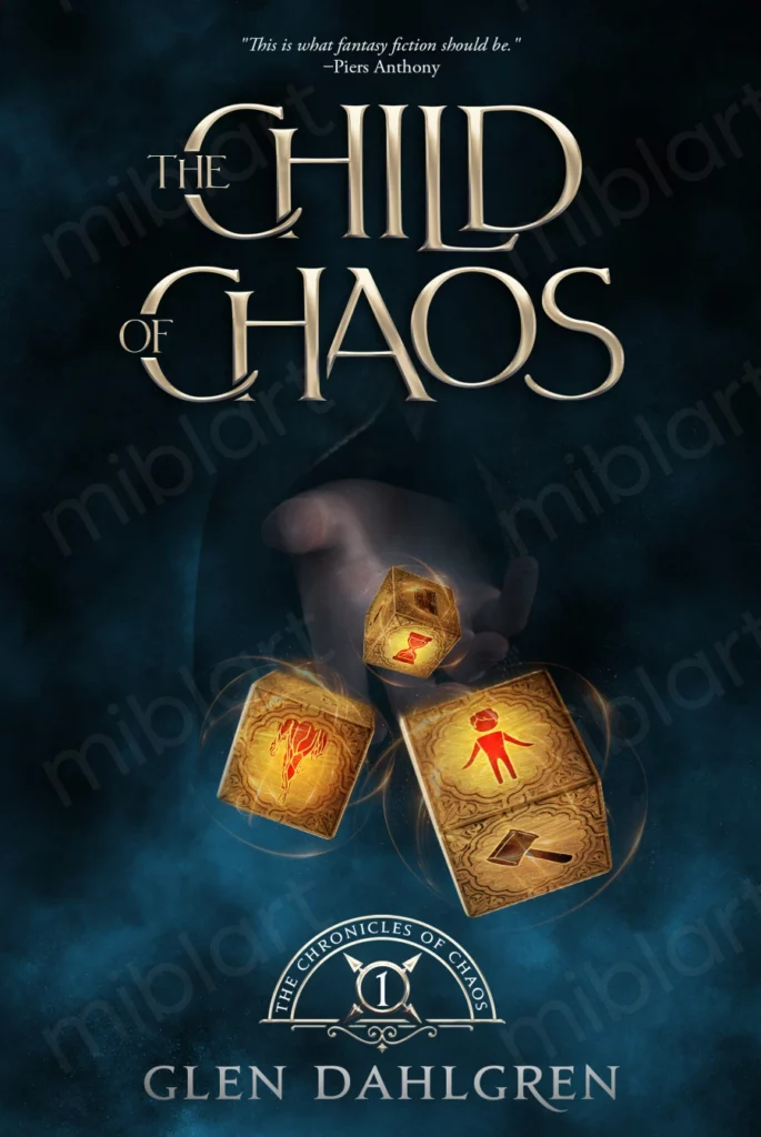
That was the right direction. Glen Dahlgren loved the series branding. Also, the hand really solved the problem of the dice and scale, so we kept working on it. The author sent us some references for the hand position and images of magic fire. Here’s the result we got:
This version was almost perfect, but Glen hesitated about the border. He worried that the printer would slip, and any mistake would add space to the edges so they would be unequal. We removed that decorative frame and got the final book cover:
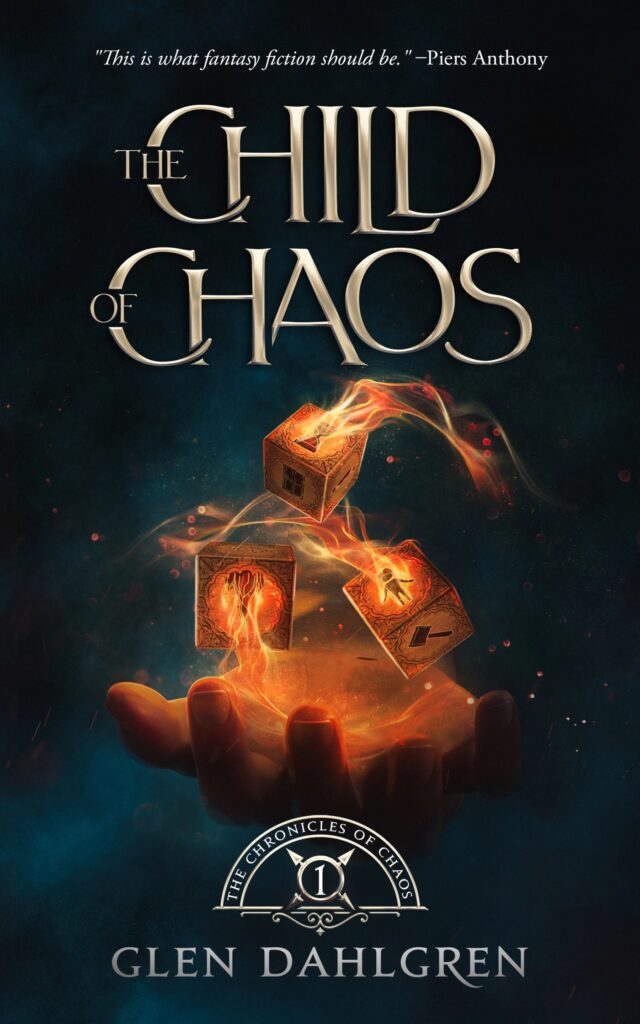
Now, it was not just a character or an object. This book cover was unique, standing out on shelves and appealing to the target audience. Also, this design became a foundation for other covers in the series.
What were the redesign results?
- Sales increased as soon as the new book cover appeared online.
- Ads that didn’t work before started generating sales.
Glen Dahlgren also said that the outstanding covers made the books’ first impressions. And while the books themselves are responsible for the various awards they’re winning, those first impressions don’t hurt in those highly competitive arenas.
MiblArt designed book covers for other parts in the series
The Game of War
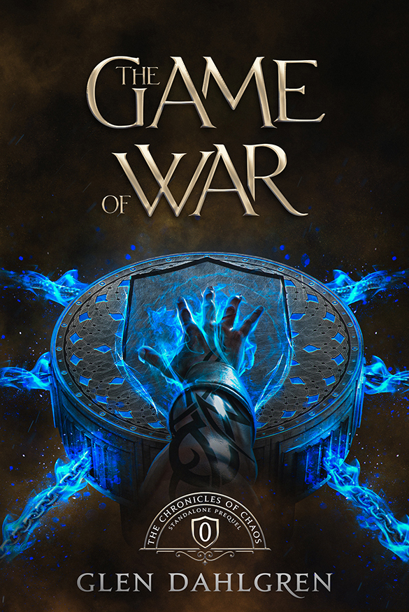
Soon, Glen Dahlgren came to us again to bring to life the cover of the prequel to the Chronicles of Chaos: The Game of War. The book tells the story of a young Dantess becoming the priest of War that we know in the Child of Chaos. You can see the then-high priest, Morghaust, activating War’s test on the book cover. By the way, the test and the actual Game of War are Glen’s two favorite parts of the book.
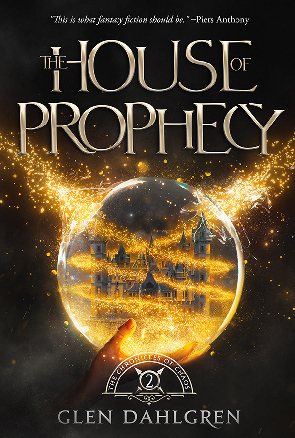
The House of Prophecy
We were happy when Glen Dahlgren wrote us again to order the book cover for the second part of the Chronicles of Chaos: the House of Prophecy.
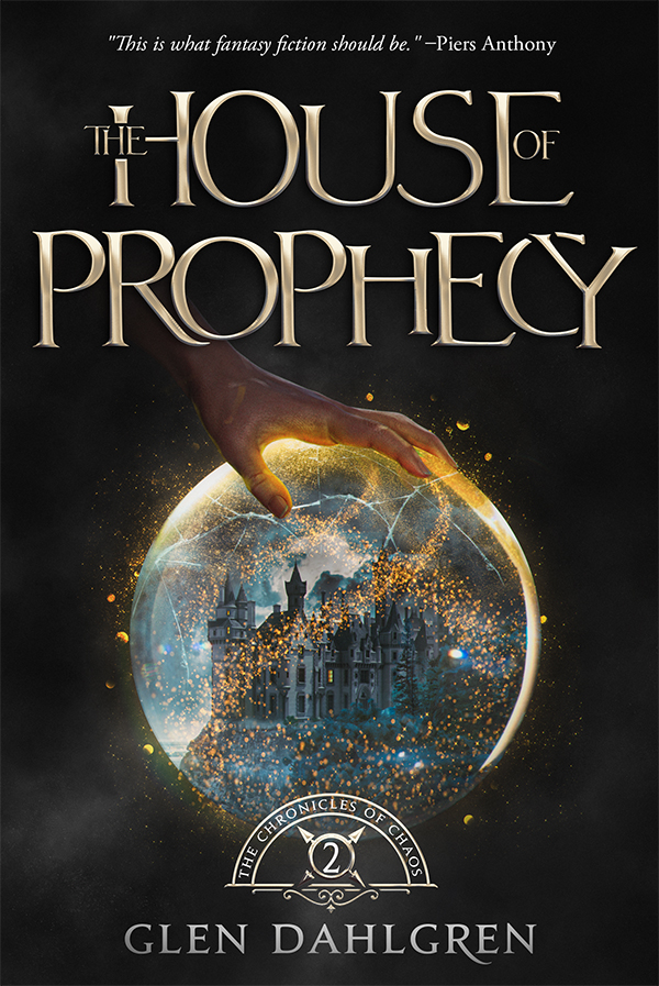
This time, we started with a completely different concept: Lorre tearing through a curtain of reality to reveal another world behind it. Here, you can see our first version:
Unfortunately, these sketches missed the mark visually and conceptually despite following the idea of a hand and something magic. Moreover, Glen’s friend, Jordan Barnes, noticed that the last cover looked exactly like a werewolf book.
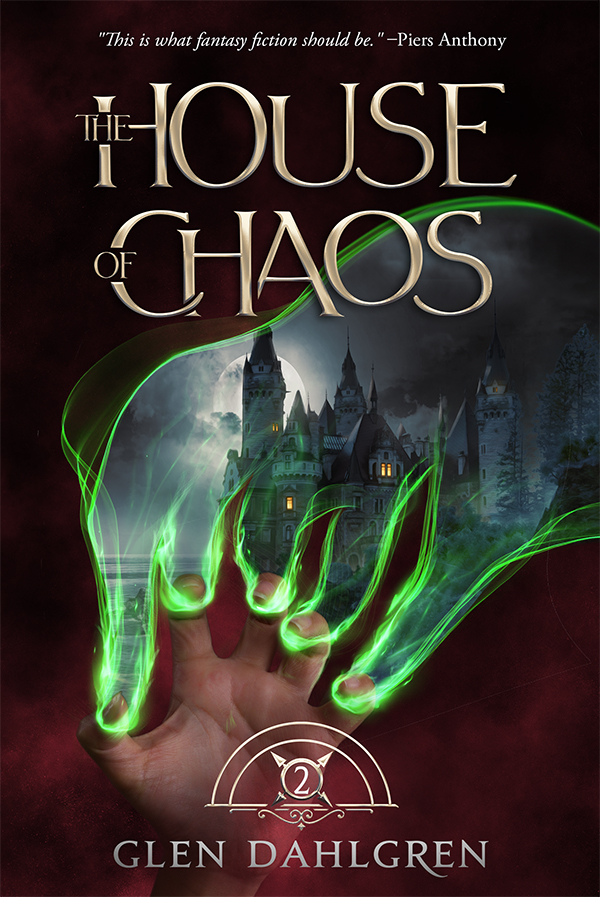
That’s why the author proposed another approach. We decided to experiment with a crystal sphere: a snow globe filled with magic.
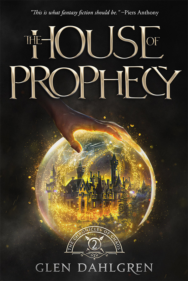
That was better: the hand interacted with the globe in a position of mastery. There also was the house inside. Glen Dahlgren liked the bursting glass on the third version, but the magic looked like a portal somewhere. The streams of charms weren’t understandable, and the connection between the hand and the magic wasn’t apparent. So we kept working.
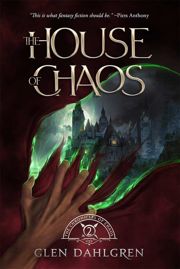
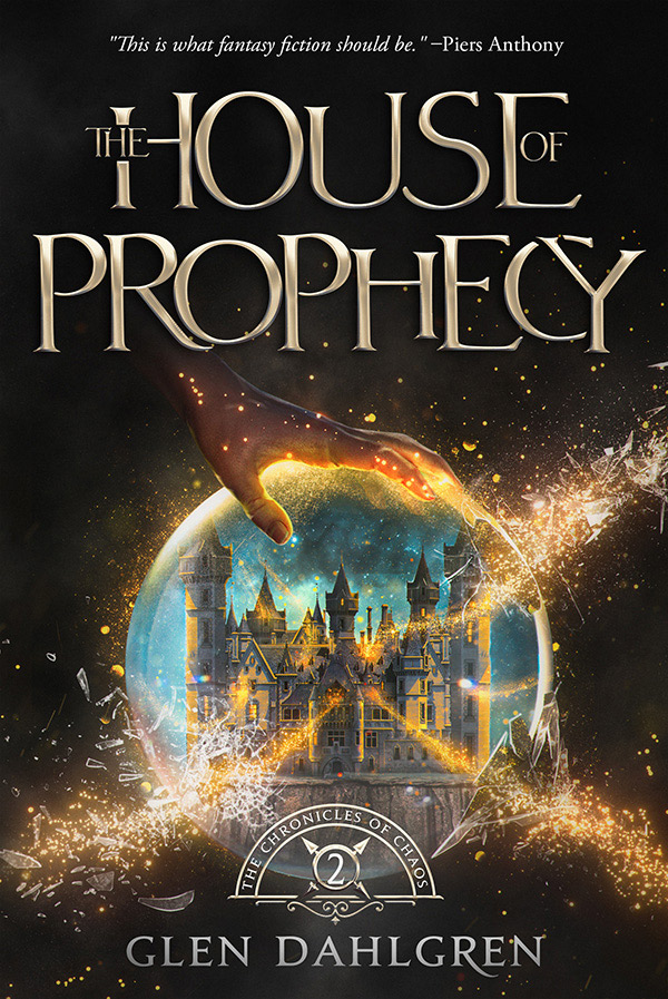
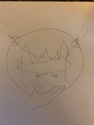
Glen Dahlgren sent us his sketch with an image that could harmonize all the elements. He moved the hand to the bottom, so the connection between the hand and magic was obvious. The streams were traveling up and eventually escaped with the cool breaking glass. The author’s sketch helped a lot. Here is what it looked like:
Then, our designer created this book cover based on the sketch:
This concept impressed the author as it was interesting, magical, mysterious, and eye-catching. Glen Dahlgren suggested some recent changes:
- The exits of the streams should be more extensive, leaving the globe.
- The author wanted some depth to the trails inside.
- The green color reminded readers of a Christmas tree, so we changed the background.
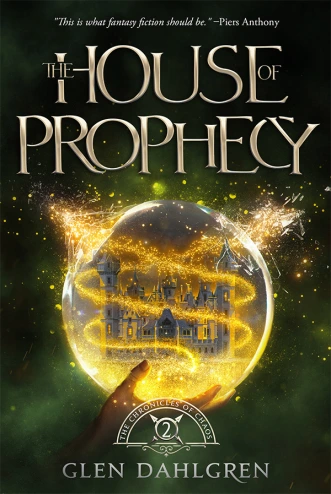
And voila! We got the final book cover, and it looked absolutely stunning:
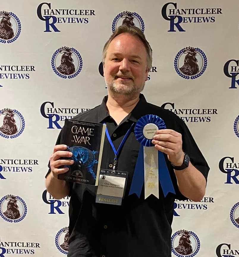
It’s not the end: The Game of War wins the Dante Rossetti Award
We were surprised and happy to know that the book The Game of War won an award. Seeing our book cover in the photo with the prize was a pleasure.
First, Game of War was a finalist for Chanticleer’s Ozma Fantasy Awards 2021. However, when Glen Dahlgren arrived at the conference where the winners and awards were announced, it turned out that the novel had been moved to the Dante Rossetti YA award.
Thus, Game of War won first place in the Dante Rosetti award for YA Fantasy.
Summing up
It was a fantastic experience working with Glen Dahlgren. It proved that a book cover should not only contain hidden meanings but also meet the market requirements, target audience tastes, and genre standards. Speaking about The Child of Chaos, you can spot the remarkable difference between the first and redesigned covers. The new version helped the author to increase sales and make ads work.
The Child of Chaos also became a foundation for the design of the entire series. MiblArt has already created covers for three novels. And we look forward to having Glen Dahlgren return to us for the following covers in the series.
Do you like the redesigned book cover and the looks of the other parts? Share your opinions in the comments.


Courtney Cannon
4 years agoI’m the author friend who sent Glen to you! I am so happy he followed my advice! It has been a great tool to sell his books, and I’ve seen the amazing sales results and an increase in the popularity of the series since the redesign!
I’ll keep sending authors to you guys! You’re a joy to work with and produce amazing results!
Vasylysa
4 years agoThank you! We’re happy to hear such kind words. Your comment inspires us 🙂