We’ve rounded up the best ideas for your horror and thriller book cover design. From screaming faces to bloody axes and knives, here are the best tips and tricks that will make your design stand out.
Keep reading, and find out how to:
-
choose the images that will give your readers goosebumps;
-
make anybody break out in cold sweat from just taking a quick look at your horror fonts;
-
turn your color palette into a creepily creative design tool;
Warning: Leave the lights on!
Horror & thriller book cover design ideas
Scroll down to learn how to choose perfect images, fonts, and colors that will send some chills down your reader’s spine. We’ve put together a list of hair-raising ideas for your next horror or thriller book cover design.
Tips on spine-tingling imagery
There are a few popular design techniques that’ll help evoke the desired emotions when it comes to imagery for your horror, thriller, and suspense book covers. Let us show you how to grab your readers’ attention at the very first glance.
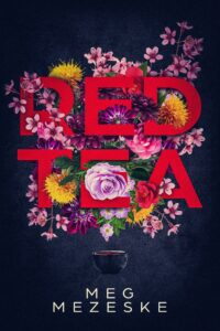
Concentrate on typography
Many thriller book covers turn typography into the main element of the design. This strategy works best if you need to keep the mystery, build tension, and avoid revealing too many plot details. When the title and author name are the centerpiece of the project, you have plenty of space for creativity and can add special effects to your fonts. You might want to try illustrated typography, experiment with different font colors, or add special effects to your letters, like blurs, glows, sparkles, or even blood drops.
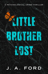
Book cover design by Miblart
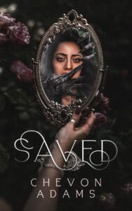
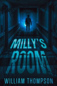
Blurred and faded images
If you aim to highlight the unknown and play with your readers’ minds, you might want to use blurred and faded images in your book cover design background. This technique helps you to hint at a twisted reality or distorted perception. It fits well with psychological thrillers, where the main topic revolves around madness and instability.
Create a creepy setting by blurring the protagonist, a monstrous zombie, or a scary object that plays a significant role in your plot. This way, you’ll leave the readers guessing about what’s going on in the story, and at the same time, provide them with small details that can help solve the riddle.


Book cover design by Miblart
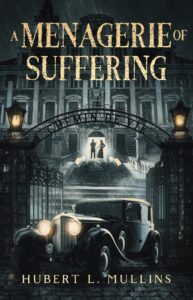
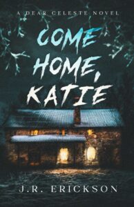
Follow the protagonist
One of our favorite thriller and suspense techniques is to use images with a unique perspective. The idea is simple: make the readers follow the main protagonist down the path. All you have to do is make the character’s silhouette facing backward the central element of your book cover design. It’ll help you pique the reader’s interest, create the urge to accompany the hero, and discover what adventures are waiting ahead.

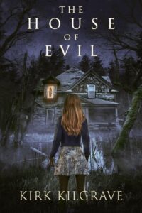
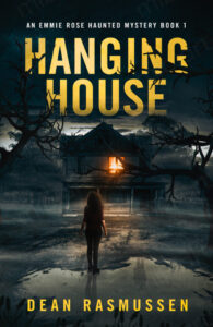
Book cover design by Miblart
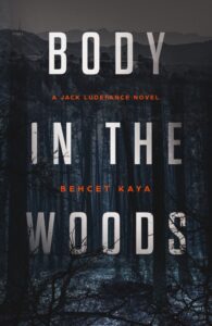
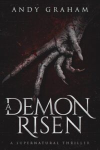
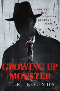
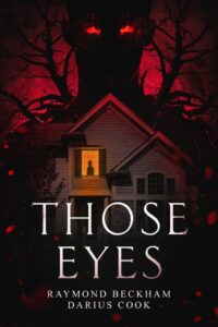
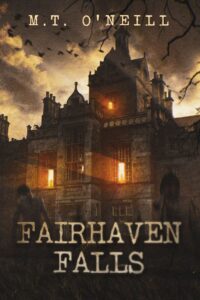
Rich imagery
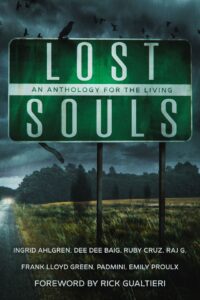
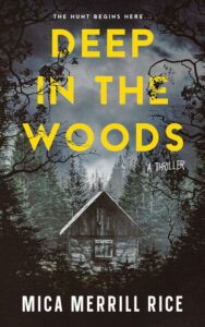
If you’d like to show the readers that what they’re looking at is a true horror story, feel free to use some shocking and outrageous images. First, this technique sends a clear, direct message of what is happening in the story. No tricks or secret agendas. Let your readers feel uneasy from looking at the monster figure, blood, creepy limbs, forest in shadows, etc. Ready or not, take a look at these horrifying book covers.

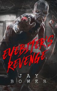
Book cover design by Miblart
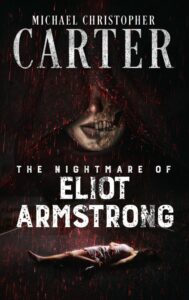
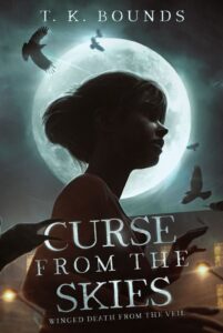
Focus on the face
Another excellent idea for your horror and thriller book cover design is to concentrate on the face. Remember how we talked about evoking the right emotions? Could you think of a better and easier way to achieve this task than literally showing the desired mood and sensation through a person’s face? Spoiler alert: you might want to use a female face for your book cover design. It’s been a very popular and effective trend for ages. No need to reinvent the wheel. Keep in mind that a direct frightened look captivates the readers, and a half-face design is all about highlighting the mysterious vibe.
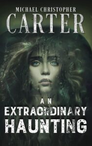
Book cover design by Miblart
Now, it’s time to take a closer look at the best typography ideas for your next horror & thriller book cover design.
Creepy fonts for your horror book cover design
The typography in your horror and thriller book cover design should match and represent the novel’s general mood. Let’s take a closer look at the spooktacular font ideas.
To put it simply, there are two main typography options when it comes to horror.
You can go with uneven, chaotic letters and add special effects that won’t leave the potential readers doubting what genre they are looking at. Best font inspirations, in this case, would be:
-
Violence
-
Chiller
-
Feral
-
Boycott
Book cover design by Miblart
Another idea is to use simple, bold typography that will leave some space for imagination. In this case, you get to experiment with the font colors, shapes, density, and angles to end up with unique cover text. Here are some font ideas for your inspiration:
-
Ravenscroft
-
Scream real
-
Akoom
-
Showcard Gothic
-
Dharma Gothic


Book cover design by Miblart
Last but not least, we’re going to show you how to master the color theory in horror & thriller book cover design.
Best color combinations for spooky book covers
Let’s try to dig into color theory and psychology to figure out which colors suit the horror and thriller genres the best.
Black
The color black symbolizes secret desires, denial, rebellion, and mystery. It’s the color of the night, terrifying nightmares, and mourning. In the horror and suspense genre, designers will use black to symbolize the unknown, pain, death, and bad luck.
Book cover design by Miblart
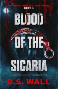
Red
Red is one of the most attractive and mysterious colors of all. It accelerates the rhythm of respiration and heartbeat, increases blood pressure and muscle tone, and boosts energy levels. Red is associated with blood, fear, and power, thus increasing popularity in horror and thriller book cover design.


Book cover design by Miblart
Blue
Some shades of blue can cause apathy, alienation, and depression. Dark blue has an even more negative connotation. In our subconscious, it is associated with the restless sea waves that can cause danger and a threat to life. Also, there are many tales of so-called “blue demons”, insidious creatures from the other world, that bring suffering and bad luck in folklore.

Book cover design by Miblart
Brown
Brown evokes decay, dirt, and the passage of time. In horror and thriller design, it suggests rot, neglect, and buried secrets. This earthy tone grounds the supernatural in something grimy and real, making it perfect for psychological horror, rural terror, and stories where the past refuses to stay buried.
Book cover design by Miblart
Yellow
Yellow can be a surprisingly unsettling color in horror and thriller covers. While often associated with warmth, in these genres it frequently evokes unease, sickness, or unnaturalness. It can symbolize madness, illness, or a disturbing, subtly hinting at psychological terror or impending dread.


Book cover design by Miblart
Wrapping up
You are now one step closer to the mysteriously spooky horror and thriller book cover design that will make anybody’s blood run cold.
Which book cover design impressed (read: scared) you the most? What other tips and tricks on horror & thriller book cover design would you like to learn?
Drop your questions in the comments section below, and we’ll be right back with you.