Are you looking for a dose of inspiration? Then, we have good news – a fresh premium book cover design case study.
This service offers many benefits for indie authors:
- A consultation with our creative director
- 2 book cover design concepts to choose from
- Free book promo images
- Heavy photo manipulation, 3D modeling, and digitally painted elements will bring your book’s fictional world to life.
Let’s discover how we created a fantastic book cover for Bill McCurry’s fantasy Death’s Baby Sister.
The story of the book
- Title: Death’s Baby Sister
- Author: Bill McCurry
- Genre: Fantasy
- Plot: Bib’s semi-retirement from killing for the gods isn’t going so well. So when he’s asked to help an angry twelve-year-old girl with out-of-control powers, he embarks on a quest, hoping for redemption. But as Bib takes his sassy young charge under his wing, a voyage to the temple almost ends in disaster after a deadly ambush. With reports of other sorcerers going mad and the kid wreaking magical mayhem whenever she opens her mouth, Bib struggles to resist strangling the brat. And after the girl triggers a series of lethal attacks, Bib fears the only way out of this mess will be a return to his murderous ways…
- Settings: Late medieval European fantasy setting
How did we see this book cover?
Miblart created the first book cover for this series, so we were super excited to design the sequel cover.
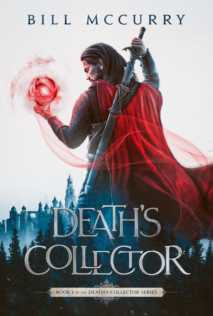
Book cover design by Miblart
Bill McCurry provided us with all the story details and shared some ideas about what scene to depict on the cover:
- The main character and the girl are standing near one another atop a vast, two-story stone building, using magic to fight a large group of armed people.
- The main character faces a large ogre-type creature, and the girl might be in the background.
- The main character and the girl are fighting armed men in the courtyard of a monastery-like building.
After considering everything, our designer prepared 2 concepts.
Book cover concept #1
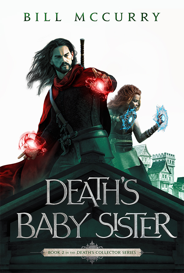
Main characters
The dynamic pose of the man suggests action and adventure, while the flowing hair and cape add a sense of movement and drama. The magic in the characters’ hands hints at a shared purpose or mission.
Color palette
Red magic fire creates a bold focal point, capturing the reader’s eye. The contrasting green elements suggest a lush and vibrant environment.
Background
The building behind the characters creates a sense of depth and perspective, drawing the viewer’s eye into the book’s settings.
Typography
The typography and layout of the cover are consistent with the series style. The bold and clear font ensures that the title and author’s name are readable and recognizable.
Book cover concept #2
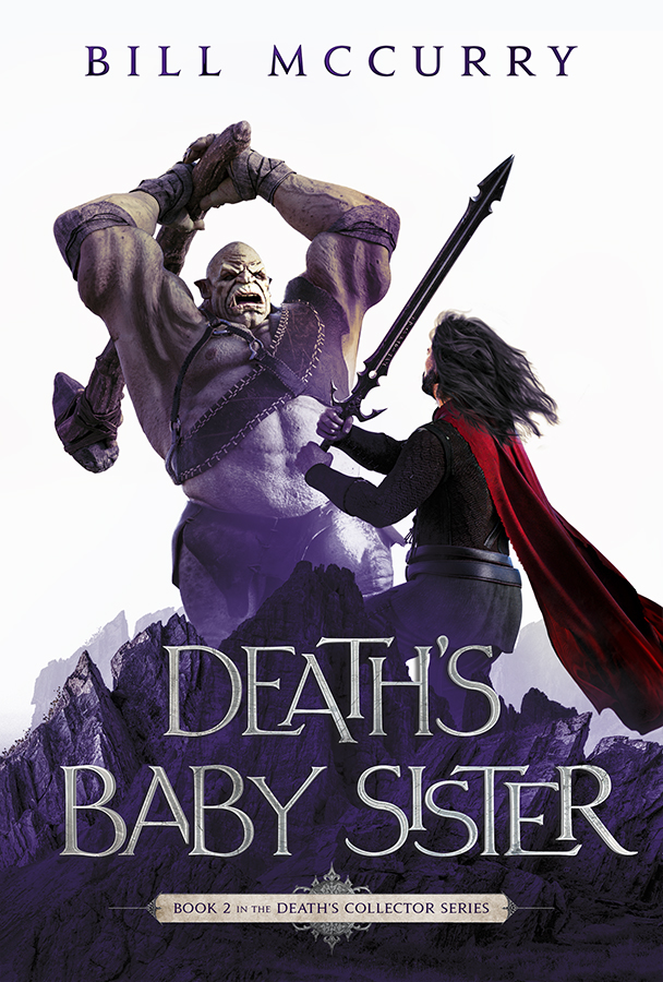
Main character
In the second version, we portrayed the man in a tense and dramatic confrontation with a terrifying foe. Again, the image is striking and powerful, with the main character boldly facing a hulking and intimidating monster.
Color palette
Our designer combined red and purple tones to achieve a harmonious color scheme. These colors create a pleasing visual cover and are associated with fantasy.
Background
A mountainous landscape creates an additional layer of depth and intrigue, reinforcing the sense of adventure and expiration suggested by the narrative.
Typography
The typography in the second concept also has a style that seamlessly continues the visual language of the series.
What book cover concept did the author choose?
Bill McCurry enjoyed the first concept. It matches one of the author’s scene ideas. Next, our designer added detail, color, and sharpness to the book cover.
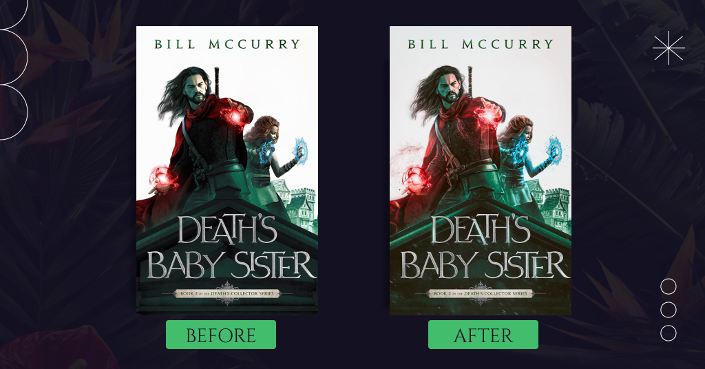
The only note the author had is that the man’s right arm and hand blended with the cloak and torso. That’s why the arm was hard to distinguish at first glance.
Finally, after this little change, you can enjoy the final result!
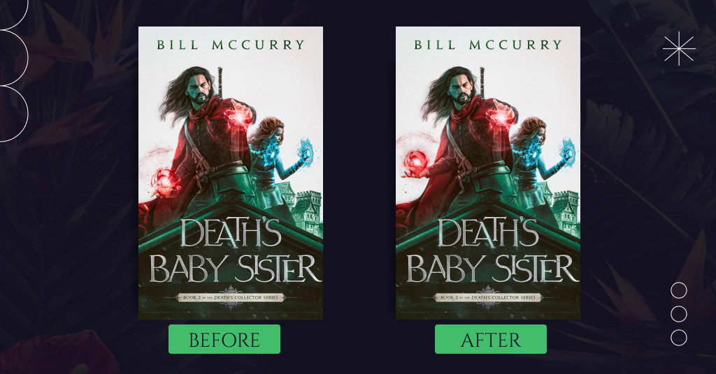
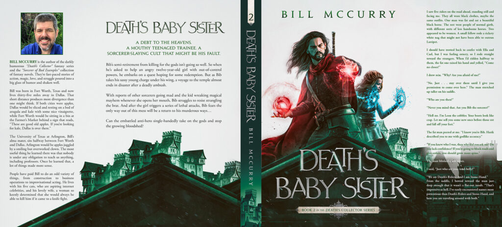
By the way, except for marketing materials, an ebook, and paperback covers within the premium package, Bill McCurry ordered a hardcover and a jacket as additional items for extra pay.
The hardcover jacket protects the book and adds space for even more information about the story and the author. So let’s check it out:
Summing up
The final book cover is stunning. The powerful main characters with magical fire in their hands capture readers’ attention. In addition, the red and green color palette and fantastic typography make the cover stand out.
Share your thoughts in the comments below, and let us know if you’re as impressed as we are.


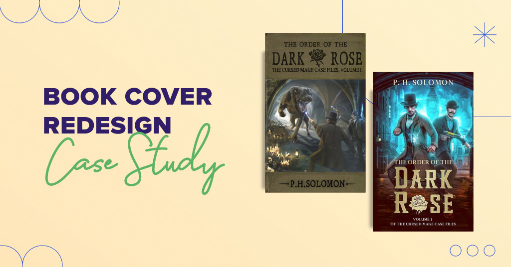
Let me be the first to chime in. I couldn’t be happier with Miblart’s results, process, and people. Thank you for creating a great cover for me!
Thank you! We can’t wait to design book covers for your new books!