Kindle Vella has launched in the US, and people are holding their breaths to see what comes of it.
What about you? Are you ready to flex your serial fiction writing skills on KIndle Vella? If so, you need a cover to accompany your stories. The problem is Kindle Vella covers aren’t your standard cozy book rectangles. They’re squares, which then get turned into circles on the smartphones of Vella users.
It’s a new and slightly confusing change to the norms of book cover design. But, we’ve already dipped our toes into Kindle Vella cover design and researched the new format. We know what it takes to make a catchy Vella cover. And we want to share this knowledge with you.
Read along, to learn Kindle Vella cover design tips.
Kindle Vella Story Covers Requirements
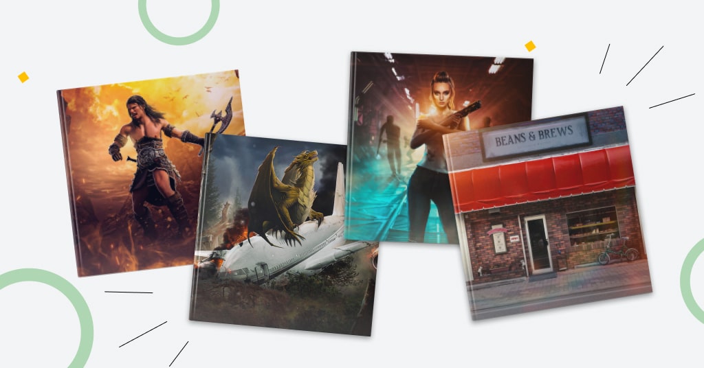
Kindle Vella story covers are squares with the following requirements
- The size should be 1600 x 1600 px;
- They shouldn’t exceed 2 MB;
- The formats are jpg and tiff.
But, on user’s phones, story images will be displayed as circles. So, the corners of the Vella covers won’t be visible to the readers.
Also, Vella story covers don’t contain a title or author’s name. It means two things:
- No need to worry about picking proper fonts, size, the distance between the letters, text colors, and textures;
- Imagery should be extra catchy.
Is it a good thing? Hard to say for certain, but we lean towards “not really.” Typography is an important storytelling element of the design. It often ties the cover together and strengthens its impact. Now the imagery is at the top of the table, and it should be completely self-sufficient.
Keeping these things in mind, let’s dive into Kindle Vella cover design tips.
Kindle Vella Story Cover Design Tips
A Kindle Vella cover is a strange beast. On one hand, it shares some similarities with the traditional book cover design. On the other hand, it completely breaks the industry’s conventions. That’s where the fun’s at though.
Let’s take a closer look at what makes a Vella story cover tick.
Kindle Vella cover composition
Your standard rectangular covers have three primary focal points:
- Top third;
- Bottom third;
- Middle third.
Here, you have ample space to work with. And using tricks, contrast, and guidelines, you can guide the reader’s eye through each focal point, telling them an interesting visual story. You can make something like this.
With Vella, you don’t have such a privilege.
The Kindle Vella circle has a single focal point — the center of the image. That’s where the viewer’s eye will be drawn to, and where the heart and soul of the covers should be.
So
Make sure the important elements of the Kindle Vella cover are strictly centered.
If you mess up the focal points and try to move the elements to the sides of the circle, it’ll look unbalanced. For a reader, it will seem as if the Vella cover is going to roll away. (Maybe, if you’re writing about racing, it makes sense.)
Kindle Vella colors
Colors have always been a big deal in book cover design. They create contrasts, emphasize the emotional charge of the cover, and tell a story.
We’d argue that colors are even a bigger deal in Kindle Vella story covers. Now, you have less space to work with, so each color your pick has more weight to it. And besides, the circular Vella images will look extra tiny on a smartphone’s screen. So, you need crispy contrasts for a catchy and discernable image.
Still, the color advice for Kindle Vella covers is similar to the usual one:
- Pick a few main colors that communicate the required emotional message;
- Ensure the main and complementary colors don’t blend and create a contrast;
- Ensure the complementary colors don’t overpower the main ones: keep their saturation and presence lower.
If you need more help with Vella cover colors, consult our cover design color guide.
Kindle Vella cover as thumbnails
Kindle Vella covers are tiny, round, and exist for smartphones. A solid Vella story cover should also be a great thumbnail.
So
No matter whether you choose a photo-based or illustrated Vella cover, stick to simple, intuitive concepts.
Avoid tiny details. Instead, focus on bigger shapes and recognizable forms. You want a reader to understand your image without paying much attention to it. Besides, confusion is rarely helpful in marketing.
Also, now that you don’t have the space of a rectangular for visual storytelling, you should be strict to the point with your imagery. Make sure, the cover’s visuals intrigue a target reader at first glance.
Kindle Vella cover style
When it comes to Kindle Vella cover images, you have three main approaches
- A stock photo;
- A photo-manipulated cover;
- An illustrated cover.
We suggest against the first one. Stock photos will go unnoticed in the stream of Vella covers. Yes, it’s simple, but also underwhelming and too ubiquitous. It’s easy to get dismissed without investing effort in your cover.
A photo-manipulated piece of art is the meat and potatoes of the cover design. You can quickly create catchy and interesting images given enough skills and experience. If you lack either, you can get such a cover without breaking the bank.
We can’t know for sure how the market of Vella stories will look like. But, our experience and intuition tell us that illustrated covers will be a minority as they’re expensive or time-consuming. It means that if you have an illustrated Vella cover design, you’ll stand out in the crowd.
Conclusion on Kindle Vella Cover Design
Kindle Vella is a very fresh niche. Genre conventions of casual book covers won’t easily translate to the new format. It means you and other authors will be the ones dictating the rules of the new game.
It’s a challenge but also a privilege. You are free to experiment and have fun. But remember to follow our recommendations if you want a solid Vella cover that will help attract readers’ attention.
Also, if you need a professional Kindle Vella cover design, we have your back.
