While there are many key design elements that you need to pay a lot of attention to, one performs an extremely important task.
Yes, book cover design typography, we are looking at you.
When it comes to book covers, fonts, their size and color, placement, shape, and textures can become deal breakers or deal makers.
Feeling swamped already? No worries. We have put together 7 mind-blowing book cover typography tips so that you can master fonts in book cover design.
Keep reading this article and learn more about:
- Why typography matters in book cover design;
- Typography tips and ideas to win over your readership;
- Font ideas for a variety of genres, both fiction and nonfiction books;
- Custom illustrated fonts;
- And so much more.
Roll up your sleeves, and let’s get down to business.
Why book cover typography matters
Good captivating typography is one of the essential elements of the book cover design. In fact, fonts are the visual keys that hint to the reader what your book is about. Typography represents the message and idea you want your reader to gasp by only taking a quick look at the letters on a book cover. The font helps to stress and highlight the meaning and value of words, phrases, and sentences in front book cover design.
Keep that in mind, and you’ll see how typography will help you to communicate with your target audience, build a brand, and set the tone for the entire book cover design.
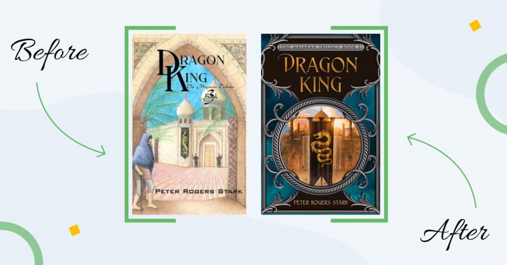
Take a look at Miblart book cover redesign. Different typography makes the cover look much more professional. Don’t you agree?
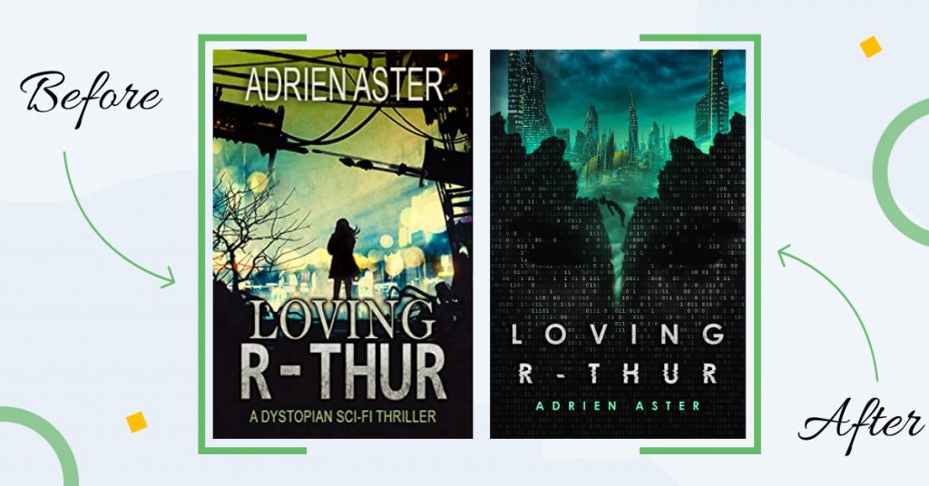
Here’s another typography redesign example to inspire you:
Now, let us walk you through typography tips and ideas that will help your book stand out and leave the readers speechless.
Book cover typography tips
Wonder how to design a book cover with captivating fonts? Now, it’s time to dive into the main tips in book cover design typography. Follow these ideas and turn your fonts into a powerful design tool.
Tip 1: Get in the right mood
It may sound hard to believe, but trust us when we say it: each font has its own mood.
Choosing the right typography starts with understanding what message you want your book cover design to carry and knowledge of the different styles of fonts.
There is no definite science for matching fonts by mood. It is mostly intuitive. You just have to do some basic research, put the font and the word together, and test the results. This way, you can check if your vision matches your target audience’s expectations.
Here are some examples to get you started with different typography styles:
- Serif fonts represent eternity and formality.
- Modern serifs are associated with gloss and haute couture.
- Slab serifs are used to grab attention and highlight the content’s importance.
- Sans serif fonts are neutral and simple.
- The concise font is more authoritative and intense.
- Bold fonts relate to importance and strong key messages.
- Handwritten fonts are mostly elegant and distinctive.
- Geometric fonts go well with kids’ topics and have a retro vibe to them.
- Mono-spaced fonts send a clear and sharp message.
- Rounded fonts are friendly and lively.
- Vintage typography is trendy and cool.
- Grunge font refers to something mystical and magical.


Book cover design by Miblart
Tip 2: Avoid clichés in the book cover fonts
Don’t fall into the trap of using cliché fonts because of their common association or because you’re not sure what to do.
Maybe you want to mix a serif font with lighter content or make a handwritten font more masculine. As with any font combination, choose one for the headline and big words, and something more straightforward for the rest of the text. This combination can be more traditional with serif fonts, or more modern with vintage or news-style serifs.
Make sure you conduct proper research before settling for a font in your book cover design.
However, keep in mind that whatever you decide to do, it’s best not to use the pre-installed Word fonts. They look too amateur and might compromise the credibility of your book cover design. If you did find a font that matches your ideas, use programs like InDesign or Figma to edit it and add some creative touch to the whole deal. You can experiment with the length and width of the letters, remove or add the edges or toss in some cursive details.


Book cover design by Miblart
Book cover design typography resources
Except for Google Fonts, here are some resources where you can access a variety of font options and ideas. Check out top fonts that are popular with designers, and find inspiration:
You can find over 37 thousand free fonts here. There are even special icons available (for example, the Trees Go font with trees). The fonts are distributed under different licenses, and you need to purchase some of them to be able to use them commercially.
Another site with free fonts. The fonts are divided into categories. For example, under the “Famous” tag, you can find fonts from Jurassic Park or Teenage Mutant Ninja Turtles. Sounds pretty cool, doesn’t it?
This is another website with many different fonts to choose from. In addition to the free section, there are almost free fonts available as well. Which basically means that they offer too good to be true discounts. Check it out!
Here you can find free fonts for personal and commercial use. They offer a huge variety of creative fonts. We’re pretty sure you will find your typographical inspiration.
Browse these free fonts platforms in your spare time and get ideas for your book cover design typography. Now, let’s talk about the almighty target audience.
Tip 3: Know your audience
There is one more important factor to consider when it comes to typography. And it’s how your audience perceives your content and font variations.
Users will approach the design from different perspectives. Take your audience into account in advance and try to predict how they will perceive the design.
You may ask yourself the following questions with your target audience persona in mind:
- What will the target audience think of your choice of typography?
- Does the font choice align with what the audience wants and expects from the book?
- What first impression do you want to create? Which element should be in charge of that impression: typography, color palette, or imagery?
- What feelings and emotions should the words on the book cover express?
Based on these, you can get a rough idea of how your target audience should respond to your book cover design typography.
This brings us to another important thing to keep in mind: typography layout.
Tip 4: Figure out the layout
No cover is complete without the title of the book and the surname of its author. And every author is interested in his name and book being remembered. We all know that the cover might also include other content information. For example, volume number, city, and year of the book. The back cover can contain an abstract to the work, author bio ISBN, barcode, testimonials, etc.
When working on the text for the cover, it is important to pay attention to the fonts of all the elements we mentioned above. It’s not enough just to use the same font, size, and color on all the book cover text elements, and hope for the best. Every word on the book cover should fulfill its main task. What’s that? Right, the reader should want to get acquainted with your book right here and right now.
Thus, the whole composition (sizes of various elements of the inscription, spacing between them, breakdown into lines, etc.) must be readable, logical, and justified. The rhythmic construction of the letters and their connection with other signs that form the word are complex artistic tasks that require professional experience and a developed aesthetic sense.
To sum up, pay attention to the visual hierarchy of the fonts you use in the book cover design to create the perfect balance and make the layout appear very professional.


Book cover design by Miblart
Let’s dig even deeper and discuss the idea of the book cover design that focuses just on the typography.
Tip 5: There’s nothing wrong with minimalism
We’re pretty sure you’ve already seen many typography-oriented book cover designs out there. That’s another approach you might consider. Make the typography a central focus element of your design. In this case, you don’t need to add many images so as not to steal the attention. Instead, play a bit with the style of your fonts, and see how you can make it pop. Keep in mind that there’s no need to use the same fonts for your title, subtitle, author’s name, and whatever else is placed on your book cover. At the same time, a good idea is to use just two or three different fonts at once, not to confuse and overwhelm the reader.
Make sure the font style interacts well with your background color or image. See if you’d like to make all the letters capital, and how to go around the conjunctions.
Take a look at a few Miblart’s typography-oriented book cover designs:


Now, we’ll try to take your breath away. Meet custom-illustrated fonts.
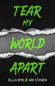
Tip 6: Impress your readers with custom typefaces
Illustrated typography is also an excellent choice of weapon for your book cover design.
Custom illustrated fonts combine all the elements of common typography by experimenting with color, size, shape, and textures to capture the essence of your message. It certainly gives a unique touch to your book cover. You get a chance to apply your creativity and impress your readers with a mind-blowing book cover.
Besides, illustrated typography is a growing trend in design. Many illustrators find it an interesting niche where they can polish their illustrative skills to design custom fonts.
Let us show you what we mean with an excellent example.
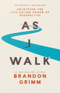
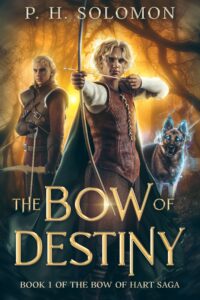
Tip 7: Represent your book genre
We left the best for dessert. As you might have guessed, all the elements of your book cover design should above all represent the genre. And typography is not an exception. Readers tend to consciously or unconsciously look for certain things in the book cover design fonts.
So without further ado, let’s take a closer look at the fiction book cover design typography tips for different genres.
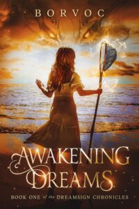
Science-fiction book cover design typography
The sci-fi genre quite often involves space, faraway galaxies, parallel universes, advanced technology, aliens, machines, and the list goes on and on. In this case, a good idea is to use fonts that have a scientific, industrial, or technological vibe to them. This way, you’ll give the readers a sneak peek into your story and pique their interest.
You might want to look into these font options suitable for the sci-fi genre.
Free science-fiction fonts:
- Encode Sans
- Josefin Sans
- Grove
- Orbitron
- Roboto
- Geom Graphic
Paid science-fiction fonts:
- Cosmic War
- Space Marine
- Dynatron
- Telegramo
- Agency


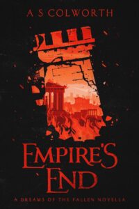
Book cover design by Miblart
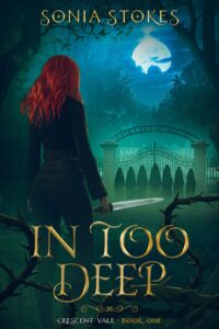
Thriller book cover design typography
When it comes to the thriller genre, typography should match the book’s mood and send some chills down your spine. Depending on the plot details and the amount of tension you’d like to introduce, you might go with creepy and freaky fonts that will alarm your readers.
Consider one of the following fonts for a blood-curdling experience.
Free thriller fonts:
- Ravenscroft
- Scream real
- Dharma Gothic
- Boycott
- Feral
- Showcard Gothic
Paid thriller fonts:
- Akoom
- League Gothic
- LHF Euphoria
- Violence


Book cover design by Miblart
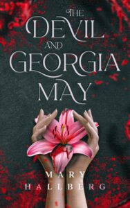
Crime & mystery book cover design typography
Titles have an exceptional task when it comes to crime and mystery book cover design. They either serve as the main or supportive factor in the design that builds tension and creates uncertainty.
For all your detectives, riddles, and puzzles, you might consider the following fonts.
Free crime & mystery fonts:
- Hennigar Regular
- Roar Bold
- Cook County Jailhouse
- Trade Gothic
- Romic
- Interstate
Paid crime & mystery fonts:
- Sleuthserif bb regular
- Cyrulik
- Alexon
- Versus Regular
- Inika Regular


Book cover design by Miblart
Romance book cover design typography
If your book falls into the category of historical, contemporary, erotic, or paranormal romance, keep reading. Depending on your plot twists and details, you can either go with traditional romantic vanilla italics that will tell your reader that love is in the air. Your second option is seductive and passionate typography to spice things up.
Check out these font ideas, and may the inspiration be with you.
Free romance fonts:
- Bentham
- Desire
- Merienda
- Julietta Messie
- Alex Brush
- Bromello
Paid romance fonts:
- Lavenda
- Water Brush
- Butter Scotch
- Vix Antique Script
- Amaze


Book cover design by Miblart
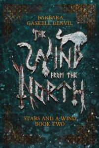
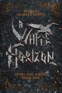
Fantasy book cover design typography
Fantasy fonts might be a weird cookie, since there are a lot of subgenres in the category, so it might be hard to make a solid choice. The typography in the fantasy genre leaves a lot of space for imagination. It’s not only about choosing the right font but also experimenting with size, color, mixing the upper and lower case letters, or using capitalization.
Here are the best fantasy book cover fonts to consider:
Free fantasy fonts:
- Oranienbaum
- Apple Garamond
- Gothic A1
- Cinzel
- Augustus
Paid fantasy fonts:
- Jupiter Pro
- Vectis Miniscule
- Trajan Pro
- Morpheus
- Loki
Let’s take a look at some examples.
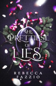
Book cover design by Miblart
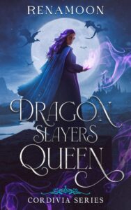
YA & Paranormal Fantasy book cover design typography
Since we’re here, let’s also go through typography ideas for some of the most widely popular fantasy subgenres: YA and paranormal fantasy. Designers use eye-catching typography, sometimes borrowed from fiction and chick-lit genres. You might consider trendy Aleo, Organic elements, Storybook, Fondamento, and more classy Tusar, Fortunata, or Essendine. A good idea is also to add some sparkles, glow, and shine to the letters.
Wrapping up
As you can see, book cover design typography isn’t something that you should take lightly. It’s an extremely important design element, so give it enough care and attention.
Follow our 7 typography tips, and get one step closer to the book cover design of your dreams.
Which of our font ideas and examples impressed you the most? Let us know in the comments section below.
Cheers!


Joshn Heller
3 years agoWhat classic and simple tips about the use of typefaces in book covers. I know that choosing the right font is necessary for the best and most decorative covers.
Thanks for sharing.
Vasylysa
3 years agoThank you for appreciation! We’re happy that this blog post was helpful 😊