
The tables have turned. In the all-digital book world, it’s not enough to just create a splendid piece of writing without considering the interior of the book.
Believe it or not, Microsoft Word will not take care of your book formatting for you.
And what is most important: do not punish your book by choosing a wrong layout design.
There’s a bit of art and a bit of science in formatting. Take some time to better understand all the secrets of book formatting and layout by reading our blog post.
Book formatting vs. Book layout design: What’s the difference?
Let’s start with some basics. Both book formatting and book layout design apply to the interior of a book. Interior book design might appear simple on the surface, but it comprises many processes.
For example, how do you choose the right size and font? Why do you need to make sure that text alignment is the same on every single page? And how do you know if there’s enough white space in your book interior? The list goes on and on.
Sometimes the terms in book formatting and layout overlap and can confuse you. The most important thing to remember is that you’ll be dealing with the interior book design from two unique perspectives: technical and artistic.
- Book formatting is literally what the name suggests. Make sure the main content of your book is well balanced. In addition, pay attention to the instructions and requirements of the publishing platform. Most of the time, you will format your manuscript (plain text) first and then move on to all the other adjustments. It’s more on the technical side. This is where we would refer to numbers and data when trying to explain how it works. Do words like font, type size, white space make sense to you? They are among the fundamental basics of the formatting.
- Book layout, on the other hand, is gathering the formatting knowledge and putting it to action. The aim is to make sure the overall text design looks great and doesn’t compromise readability. For example, are the margins set correctly to present the layout of the page? Do images and text blocks coexist well enough?
Now it’s time to move on from theory to practice. Let’s look at the major elements of book formatting and layout.
Interior book design elements
Let’s dig into the central interior book design elements you should keep in mind.
We’ll walk you through the terms you should be familiar with. And we’ll do our best to provide some guidance on common mistakes and best practices.
Trim size
That’s your books’ height and width we are talking about.
Easy? Hold on. Yes, most of the time you will end up using 6″×9″, the standard U.S. trim size for mass market fiction and non-fiction. However, there are a few more options you might want to consider. We are referring to the good old genre specifics.
Do you write general fiction or nonfiction? Workbook or art book? Maybe it’s short story collections? What about poetry?
Don’t get too overwhelmed. Just make sure you know and understand the trim size guidelines, and you’ll be good to go.
Think about it. If you are writing poetry or something that goes with long lines, do you really want to break them all the time because of the width limitation? By choosing a small trim size for a book with over 250 pages, you can dramatically affect the number of pages.
You might think it’s irrelevant, but have you considered the behavior patterns of your target audience? Let’s say you write in the YA genre, and the teenager, aka your potential reader, might be driven away from picking up a very thick book. Customer purchase habits change, so pay attention to the latest updates.
Oh, we almost forgot. E-books don’t have a trim size. They are most often displayed on different devices (laptop, smartphone, iPad, e-book reader, etc.). So at least you don’t need to worry about this one.
It might be too soon to celebrate. Let’s move on to one of the key elements in book cover layout. Meet the margins.
What Would Your
Perfect Cover Look Like?
Get a free book cover idea that fits your story and genre.
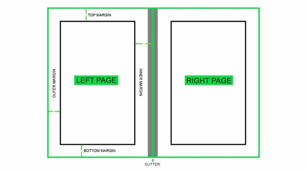
Margins
To put it simple, margins are that space you see on the sides of the page. We often refer to them as “negative space”. Their prime function is to improve the readability of the text itself.
There are three main margins placed on the outside, the top and the bottom of the book page. And an inside margin, or gutter, which belongs to the section where the two sheets are glued together.
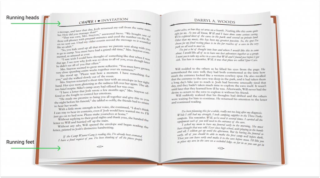
- The top margin is responsible for such information as the author’s name and the name of the book or chapter, in other words running heads and feet. More on those later.
- The bottom margin is home for the page number. In some cases, it just provides supporting white space.
- The outside margin gives a possibility for the reader to hold the book without covering parts of the text.
- The gutter makes sure the text on two mirroring pages does not overlap.
Normally, outside, top and bottom margins have similar size dimensions (0.5″). And the gutter is slightly bigger (0.75″).
To sum up, make sure that:
- the text block area looks delightful, and nothing compromises readability;
- running head and feet are present and blend into the interior design well;
- the book feels comfortable to hold;
Keep in mind that your book is not flat. But the correct choice of margins makes the pages look symmetrical and neat.
Anyhow, it’s an excellent practice to have 30 to 35 lines per book page. And the choice of margins is exactly what helps you to get there.
Running heads and feet
We promised we’ll be back.
Let’s start with the running heads. Running head is a line of text in the top margin that provides navigation support to the reader. It includes the book name, author name, chapter name, and page number. Sometimes the page number goes in the bottom margin, and as a result, creates the running feet.
The main unchangeable element is the page number, it’s always there. You can decide on its alignment. The rest of the information you want to include in your running heads and feet is flexible and depends on how you would like to structure your book. Non-fiction books often provide the chapter name in their running heads to give the best support to the readers.
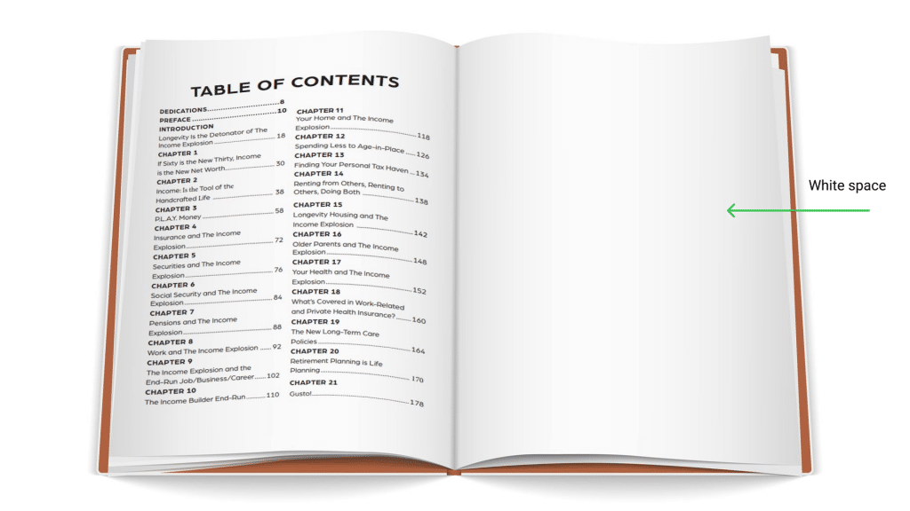
White space
Most of the people who have to deal with text and content creation are familiar with the concept of white space.
Remember how when reading a book, you keep going till the end of the chapter and only then take a break? Well, it has a lot to do with that enormous chunk of white space.
There are also some blank pages that disconnect the novel itself (the major block of text) from the book cover, synopsis, authors’ word, etc. This method shows the professional design of the book and creates some aesthetic balance in the text.
Another component of white space is line spacing.
Line spacing
Line spacing (or leading) improves the readability of the novel a lot. The choice of line spacing will closely depend on the font choice. Some of them are too tight, and the letters are so close to each other that a reader might even get a headache. We definitely don’t want that to happen, right?
The common practice is to use 1.5 lines, which is also good for screen-reading. But normally line spacing should be between 1.25 and 2.00.
You can sometimes adjust the spacing in particular parts of the text to avoid two typography mistakes: orphans and widows.
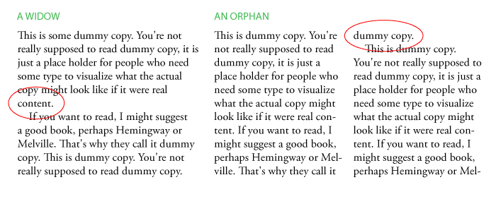
Orphans and widows
Interesting choice of words, isn’t it? Well, get over it. Widows and orphans are words and parts of the sentence that end up where they don’t belong. They compromise readability and create unnecessary negative space.
A widow is a word (or just a few words) that stands isolated at the bottom of a paragraph, column or page. It makes the text structure look very unbalanced.
Orphans are words that stand on their own as a part of the paragraph on a previous page. Think about the subconscious reaction: you turn the page over only to find one missing word.
Both single words or phrases also influence the eye movement from one line of the text to another.
The white space can be under-used and overused quite often. If possible, try to avoid orphans or widows.
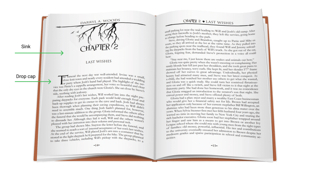
Consider a sink, though.
Sink
The sink is a design style of starting your next chapter in the middle of the next page.
- First, you involve and correctly structure the white space.
- Second, you send your reader a mental signal regarding a change in your plot. In addition, you give those bookworms a possibility to take a break before they embrace themselves with another text block.
- Last but not least, if you like graphic details, here’s your chance to use a drop cap. A drop what? Have you ever admired this large capital letter in an artistic font at the beginning of the chapter? That’s the drop cap.
Line Width
A key to great text readability is having a correct amount of characters in a text line. There are two ways things could go wrong: too wide or too narrow.
- If a text line is very wide, the reader will have problems focusing on the text. It might be hard to get where it starts and finishes, especially if you are dealing with a big text block.
- If the line is too narrow, the reader gets tired more easily, since he needs to move his eyes faster.
A wonderful practice is to keep your text within the range of 50-75 characters per line.
Typography
Do not underestimate the importance of choosing the right font, since it represents your whole writing. There is a wide variety of fonts available, so it sometimes might be too hard to resist the temptation of choosing something different. Well, don’t do that. Standard fonts in publishing are Serif, they are classy and somehow traditional. Semi-serifs are more contemporary. Both of them make words more convenient to read.
Most fiction and non-fiction books use:
- Garamond
- Calso (Calso Pro)
- Baskerville
- Calso
- Goudy
- Brandon
But a lot of non-fiction, especially guidebooks, go with Sans-serif to add a modern vibe to it. You want to be sure that the font you choose has italics. Semi-bold, bold and small caps should also be available. An appropriate choice of font size for most books is 11pt.
Classified information: you can choose fonts depending on the gender of your target audience. Normally, bold fonts reflect masculinity, and rounded curvy ones carry some softness and a feminine vibe.
And then there is an issue of the genre. Make a proper research, especially if you are leaning towards using some fancy font.
Just to give you a glimpse, fantasy books are best served with fonts as:
- Serif
- Gothic
- Baskerville
- Apple Garamond
- Trajan Pro
- Cinzel
- Optimus Princeps
- Oranienbaum
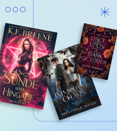
Images
If you are using additional illustrations and images in your book, make sure they integrate well with typography and text blocks.
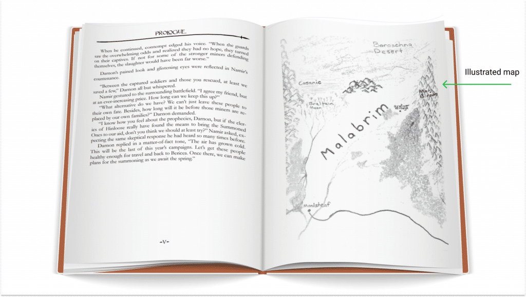
If you are writing a fantasy book with an entire medieval world involved, include the map inside of the book as a visual aid. The map helps the reader get a sense and general idea of a place and also adds aesthetic charm to the book.
Don’t overdo it. It’s better to use one good picture rather than a lot of small ones all over the book. The image just helps you to tell a story better.
Why you need a professional book layout and formatting
If you still think Microsoft Word can take care of those details for you, you might be wrong. Formatting is more than throwing your book in the word file and calling it a day.
We believe you worked hard on your written word. Do you really want to jeopardize the future best-selling success of your book by choosing the wrong layout?
Here is why you need a professional format designer:
- If your book doesn’t meet formatting requirements, it may not get accepted by the publishing platform. If you go with the hired help option, you will not waste your time and energy on figuring out what exactly went wrong in the book layout.
- The professional understands the connection between genre, market, target audience and typography. They might have some useful insights for you.
- Your workload will be less overwhelming. There are so many things you need to take care of from the marketing and business perspective. Or would you rather spend hours aligning the text?
If you are on the verge of hiring someone to format your manuscript, first ask yourself a few questions:
- Have I done everything I could to format my work?
- Am I getting exhausted from staring at my book, trying to understand how to format it?
- Do I understand the timing and budgetary restraints properly?
If you answered “yes” to any of these, keep reading on how to find the right book interior designer.
Let’s quickly look at how to find professional format designers in the book layout field.
How to find the right book interior designer
Here is where you can look for an interior designer:
- There are some book formatting options on Fiverr, Bookalope and Upwork.
The problem is that the quality of work might be low. Only use this option if:
a) you are feeling lucky;
b) you accept the fact that your layout might not look professional;
- There are also graphic designers who are trying to figure out how the layout works. This is a solid option, since you will deal with professionals who might work on crafting their portfolio. Besides, many companies offer a so-called package deal. You might end up with extra services and get an impressive book layout.
- Last but not least, you can hire a good professional who will take care of your formatting completely. You need to keep budgetary restraints in mind if it comes to this one.
Before making a final choice, check out the designers’ sample portfolio. Ask them to email you something they have done before in the same genre. Look at what you see from the readers’ point of view. Is it convenient for you to read the book? Do you feel like something is wrong with the text?
Consider your options carefully and prepare for the publishing moment of glory while the professional formats your book.
Wrapping Up
We hope we explained the basics of book formatting and layout design. Make sure you understand the subject well before starting to format your precious book. Break a leg!


Carolyn
4 years agoThanks for including specifics about lines per page, characters per line, line spacing, and other technical details.
Yolandah
5 years agoThis is very helpful.
Glad you find our work useful, Yolandah!