Coming up with book cover design ideas can be frustrating.
Guess what?
You no longer have to bang your head against the wall. Hire a professional designer and get the book cover of your dreams.
We’ve researched, analysed, and listed the top 10 reasons why you should get a professional book cover design.
Keep reading and find out:
- why you should not even consider a DIY book cover;
- what are the benefits of getting a professional book cover design;
- examples that illustrate the clear difference between amateur and professional book covers;
Let’s get down to business.
Top 10 reasons why you should get a professional book cover design
Want to attract more readers and sell more books? We’ve put together some solid reasons why professional book cover design is a life-saver and a game changer.
Let’s take a closer look.
Reason 1: An unforgettable first impression
We’ve all heard the popular expression “don’t judge a book by its cover”. Oddly enough, it might work on anything except books.
The best part is that every single one of your current and potential readers will still keep building prejudices about the book based on its cover art. There’s no way around it.
However, remember one simple thing: first impressions matter. So make sure your book cover creates the right setting to get the readers’ attention. According to Claire Richards, an Art Director at Leighton Interactive, the first impression’s psychology has three stages.
- First, you need to attract your target audience. The cover art they’ll see on a shelf in a bookstore or online shop should instantly charm and win over the person. It’s all about that first initial brain reaction that will signal the readers they want to know more about what is hiding behind the book cover design.
- Then, design-related first impressions need to convert. It means that the design piqued the target audience’s interest so much that they can’t resist taking a closer look at the book. At this stage, the reader will carefully examine the book cover, read the blurb and endorsements, and scan the cover art for some plot hints.
- And finally, we should close the deal. Most probably, the desired result for you as an author would be for a book to end up in somebody’s shopping cart.
It all sounds feasible, doesn’t it? Well, here’s the tricky part: you have 8 seconds to nail your first impressions.
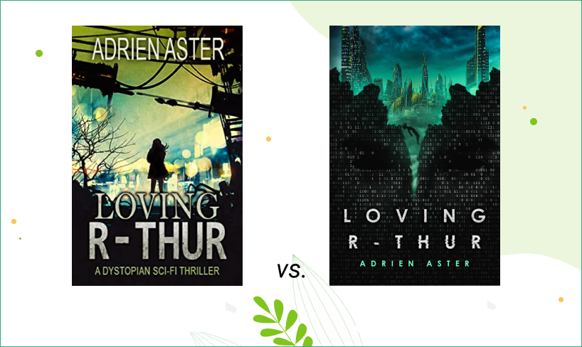
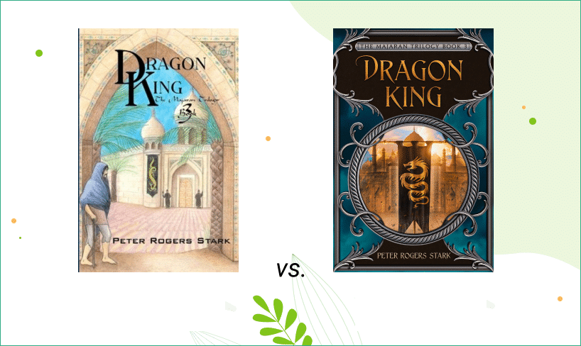
Let’s check which book cover follows the attract-convert rule.

The book cover on the left might not create the best first impression due to questionable image quality and font choice. The book cover design on the right looks much more appealing, and makes you wonder what’s the book going to be about.
Reason 2: Represent your genre
Another important thing to remember about the book cover design is to keep up with the readers’ genre expectations.
It appears simple on the surface: the genre means creating an art form with similar forms or characteristics. We all have a pretty good idea of let’s say mystery, romance, horror, and science fiction genres. Everyone can immediately picture specific elements in the story that will most probably occur, what characters you are expecting to deal with, and where the key events are happening.
The professional book cover design makes sure that the cover represents the genre well enough, avoiding cliches and keeping up with the industry trends.
Take a look at some examples. Can you guess the genre of this book cover art?
Reason 3: Appeal to your target audience
Target audience research is something that is often overlooked in the book cover design. And it becomes a very obvious mistake when it comes to DIY covers.
We’re pretty sure you are already aware that one of the biggest challenges in the book writing business is to determine and meet the expectations of your target audience.
Naturally, the same applies to book covers.
- Good book cover design should reflect the idea of your writing and correlate with the opinions of potential readers. When you choose the appropriate imagery, color palette, and fonts, you send small hints to the target audience.
- Besides, there’s nothing wrong with not knowing how to reach the right audience using the design elements. It all comes with experience. That’s why a professional designer reflects his knowledge of the market when creating your cover art. They gather feedback, see what readers respond to the most, what turns them off, and what catches their attention immediately. It’s hard work, but it is rewarding in the end. Trust us: it does take time to achieve that level of competence to see right through the readers with the book cover design.
- Last but not least, professional book cover design involves a team that examines the book cover before it gets passed on to the author. You get multiple opinions from people who know the market and know what works and, as a result, sells best.
Let’s move on to some practical details that make the professional book cover design your best option.
Reason 4: Catch the hook of your story
You might have heard this one before. A professional book cover design should never reveal too much. Instead, it should be focusing on creating a sensation by providing a short glimpse at some story details, setting, and tone. It’s a commitment of all the design elements: colors, fonts, and images.
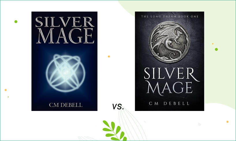
Just take a look at this DIY book cover design on the left, and try to guess what the hook is. Complicated, isn’t it? It feels like something is missing.
Now, how about the other book cover? Much better, right?

Let’s move on to learn how professional design nails imagery, typography, and color.
Reason 5: Image quality matters
First of all, do not forget about the ease of perception.
- Hand-drawn illustrations or unique images look much better than Shutterstock pictures. The book cover stands out in the crowd and impresses with its cover art, rather than having readers think, “Hmm, I’ve seen this somewhere”.
- With a professional design, you can rest well, knowing that all the copyrights belong to you, and you won’t have any issues in the future. Some people who try themselves in the book cover art think it’s ok to take any picture from Google or some social media platform and use it commercially. Spoiler alert: it’s not!
- The pictures used on a book cover should be bright and clear enough, especially for digital publications, so that the cover’s previews and thumbnails do not look like a muddy mess of colorful spots.
Can you spot the difference?
Reason 6: Professional vs. amateur typography
Ever cringed when looking at fonts used on a book cover? Ouch, no-one wants that to happen.
Believe it or not, one of the most common mistakes is the wrong font choice. Typography is an essential element of the book cover design. If you settle for the weird font, you might end up with a book cover that looks cheap and unprofessional. Unless you have a design or calligraphy-related background, fonts might become your worst nightmare.
First of all, there are at least half a million fonts out there. Half a million! So picking one that will fit and suit your book cover design is a difficult task.
Many designers also modify the font a bit, so it looks different and unique. To make things worse, you might want to have a typography-oriented book cover where the focus is on the font. Professional designers create that kind of art with custom-made or illustrated fonts, and they look absolutely stunning.
A solid piece of advice: don’t neglect a professional approach to the book cover design typography.
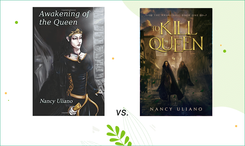
Would you agree that the font completely changed the book cover’s credibility?
Reason 7: Color palettes, shades, tints and contrasts in professional book cover design
The thing about colors is that when readers scan the shelves in an offline or online bookstore, they are subconsciously looking for the specific visual pattern. That’s what color theory and psychology is all about.
The idea is simple: the color evokes a certain feeling. That knowledge is extremely important for book cover design, and professionals know how to implement the right colors on your book cover art. Moreover, there’s the whole set of rules behind shades, tints, glows, and contrasts, that might require you to get a major in design first, and then move on to creating book cover art.
Remember: the color is an essential design element that you should choose carefully.
Take a look how changes in color palette affect the overall design perception.
Reason 8: Author branding and brand identity
Never forget one simple thing: Your book cover design forms your author brand. It is exceptionally relevant for authors of the book series. You want your book cover design elements to have something in common so that the readers will immediately recognize your style at first glance.
Here are a few tips to take into consideration:
- You can stick to the same font style, but change the color palette or experiment with the images. It’s a good idea to highlight the series title, book title, or author’s name depending on what you choose as your branding element. And vice versa.
- You might want to concentrate on your colors as a distinguishing feature of the book series. The same background color can be used to emphasize the connection between the books in the series.
- You can use a completely different dominant color for each cover, but go with the same drawing style and imagery.
If we take all the things mentioned above into account, you might notice there are many nuances that come along the way that you don’t want to deal with.
Just take a look at how the book cover series professional design combines typography, color hues and protagonist image as a branding point.
Reason 9: Book cover art in marketing materials
We hope we don’t need to remind you that you will end up using your book cover for marketing. This means it will be displayed as the central visual aid to promote your book. Just to give you a few examples.
- You might want to use your book cover as a social media banner.

- Maybe you want to impress your readers with the animated book cover design?
- And it’s always a good idea to have some bonus ad materials.

How amateur do you really want your book marketing to appear? Make it painless, and get professional additional design materials. They cost close to nothing, and you can use the marketing materials on multiple platforms and for different promotional campaigns. It’s like killing two birds with one stone.
Reason 10: Save time and effort
Even if you have design knowledge and background, it takes a lot of time and effort to polish your skills to get a great final version of the book cover.
Design aside, you might get sucked down a rabbit hole when it’ll come to formatting, calculating dimensions, or figuring out front and back cover margins. Wait, it gets better. Every publishing platform also has its requirements. If you miss one of them, the book will get rejected, and you’ll need to figure out what went wrong.
With professional design services, all those small details are covered. Designers deal with that every day and can do the job with their eyes closed. You just need to sit back, relax, and enjoy the results.
Wrapping up
Hope we managed to persuade you not to take a risk, save yourself a trouble and choose a professional book cover design. Think of it as a small investment in your book’s success and your career as a self-published author.
What option do you use when it comes to your book cover art?


