Book series cover design is more than just matching colors – it’s about creating a visual identity readers instantly recognize. In this blog post, we’ll dive into why book series cover design is important, how to make it cohesive, and share some standout examples to inspire you.
Why do matching series covers matter?
A cohesive series cover design helps your books look great on the shelf (yes, that’s essential!), but it also works behind the scenes to support your brand, boost recognition, and build reader trust. Let’s dive deeper into it.
1. Instant recognition
When readers spot one of your books, they should immediately know it’s part of a series. Matching covers make your books stand out in a crowded bookstore or online by keeping things visually consistent.
2. Professional look
Cohesive covers give your series a polished and professional look. It shows you’ve put care into your author brand, and readers pick up on that. It tells them you’re serious about your work.
3. Stronger branding
When your books look like part of a set, it helps readers remember you. If you’re building a world or writing within the same genre, a unified book series branding helps reinforce that identity across your titles.
4. Boosted sales
If a reader enjoys book one and sees that the rest of the series looks just as good, they’re likelier to keep reading (and buying!). Mismatched covers can break that connection and make your series feel less cohesive.
5. Reader satisfaction
There’s something really satisfying about owning a full set of books that look like they go together. Readers love that visual harmony – and when they feel good about your books, they will stick with you.
What makes a good series cover design?
So, do you want your series covers to match? Now, it’s time to figure out how to do it. The goal is to hit that perfect balance between consistency and character. Great book series cover design makes your novels feel like a connected set, while still giving each one its personality. Pay attention to the following rules.
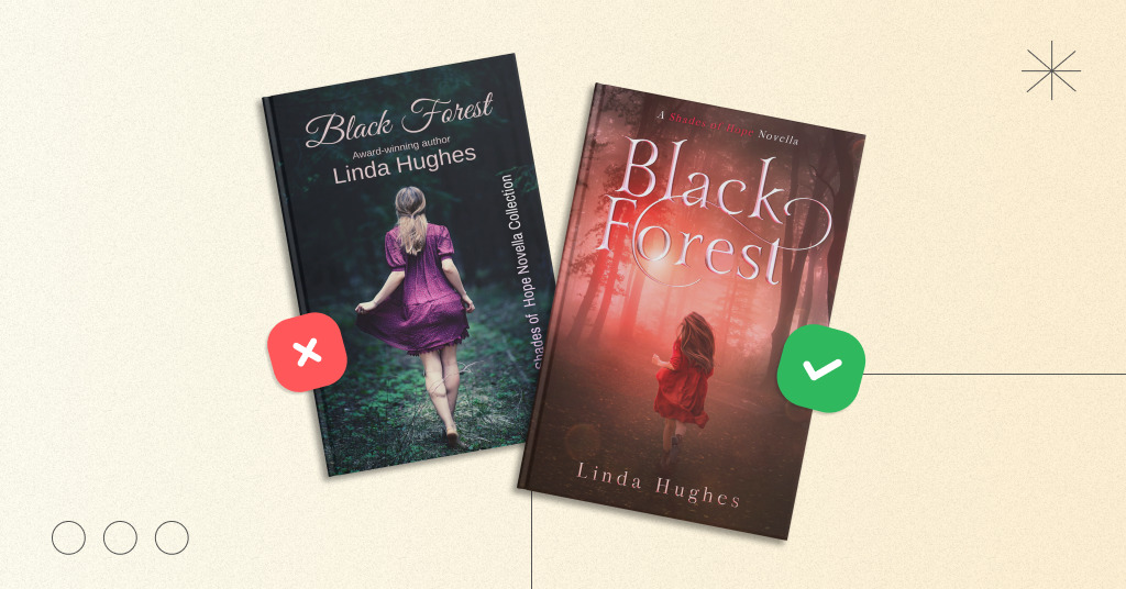
Keep the title style consistent
Using the same font and styling for your book titles across the series instantly signals that these books belong together. Whether it’s bold serif letters or elegant handwritten script, consistency builds trust and makes your series easier to recognize at a glance.


Book cover design by Miblart
Stick to the exact composition
Keep the general placement of key elements, like the title, author name, and any illustrations, in the same spots on each cover. This gives your series a cohesive look, even if the background art or color changes from book to book.


Book cover design by Miblart
Include visual anchors
Using recurring elements like the same character, a signature object, or a theme (for example, fire, stars, or forests) helps tie your covers together. It’s a visual thread that connects the story world and keeps everything feeling cohesive.

Book cover design by Miblart
Play with color, not chaos
Your covers don’t all have to be the same color, but they should feel like they’re from the same palette. Think of a gradient that shifts from cool blues to fiery reds, or each book having its bold color while keeping the same tone or saturation.


Book cover design by Miblart
Let the Covers Evolve With the Story
As your story develops, your covers can reflect that progression. Maybe book one has a simpler design, while book three is darker or more intense. This evolution helps show readers that the stakes are rising, and keeps things visually exciting as the series unfolds. And yes, don’t forget to add a book number.
Best book series cover design examples
Enough theory – let’s dive into practice with real book series cover designs. We’ll take a closer look at what makes each one stand out and feel visually cohesive.
Let’s start with this litRPG series. The consistent title font and layout make it clear these books belong together. And the main character in that red plaid shirt? Total icon. He anchors each cover and ties the series together perfectly.
Each book brings in a new color vibe, but the glowing energy keeps the look cohesive. Best part? The covers grow with the story, from first discovery to full-blown magical clash.


Book cover design by Miblart
Let’s move on to this stunning fantasy series. Each cover sticks to the same title design, font, and layout, which instantly ties the series together. The ornate golden frames, delicate flourishes, and glowing title treatment give the books a magical feel.
What keeps it fresh? The color shifts – rich green, deep blue, and bold purple – bring its mood while staying within the same luxurious vibe. Plus, the tiny corner symbols change from book to book, hinting at new adventures while still fitting perfectly into the overall aesthetic.


Book cover design by Miblart
The next example shows a horror-comedy series that stands out with consistent titles, moody splashes of color, and the unforgettable presence of Dan Shamble, zombie P.I., on every cover.
Each book leans into chaos – ghosts, monsters, magic, and mayhem – but keeps the same gritty, playful vibe. Different scenes, same stylish formula. Funny, creepy, and totally cohesive.


Book cover design by Miblart
This paranormal horror series has a strong and spooky style that really works. The bold title font stays the same across all covers, making it easy to tell they’re connected.
Each book has a different look and main character, but the creepy glow, swirling effects, and dark atmosphere keep everything feeling like one chilling world. Simple, striking, and totally on theme.


Book cover design by Miblart
How about this mystery thriller series? It is instantly eye-catching thanks to its colorful design. The covers keep a consistent layout – same profile view, same swirls of color, and the same strong, stylish vibe.
Each book switches up the background color and title design, but the distinct character silhouette and playful accessories (those earrings!) keep everything tied together.


Book cover design by Miblart
The next cozy fantasy series is pure visual harmony. Each cover features bright florals, glowing magic, and charming still-life elements that reflect the heart of slice-of-life storytelling.
The title font, layout, and sparkly effects stay the same, creating a soft, magical feel across the board. While each book uses different props and colors, they all feel connected, like pages from the same gentle and healing world.


Now, let’s review this cozy mystery series has a fun, instantly recognizable style. The quirky white cat, delicious desserts, and a splash of blood on every cover make it clear you’re in for a murder-filled (but lighthearted) ride.
The playful fonts, bright colors, and chocolate-themed titles tie everything together. Each book adds new clues and props, but the vibe stays the same: sweet, sassy, and just a little deadly.


Book cover design by Miblart
It’s time to talk about this breathtaking fantasy series. It has a dark, luxurious style that’s impossible to miss. With its intricate borders of roses and thorns, glowing titles, and enchanted backdrops, every cover pulls you into a world of magic, power, and secrets.
The rich color themes, dramatic lighting, and romantic gothic flair tie it all together. Each book brings a new twist – dragons, castles, monsters – but the vibe stays the same: fierce, haunting, and spellbinding.


Book cover design by Miblart
These witchy fantasy romance covers cast a charming spell at first glance. Playful fonts, pastel backgrounds, and cheerful motifs like lemons, daisies, potions, and magical hats create a cozy, uplifting mood.
Each book has its seasonal twist – springtime herbs, autumn leaves, or winter blooms – but the overall vibe is bright, sweet, and whimsical. Just one look tells you: this story will be light on drama, heavy on heart, and full of magical mischief.


Book cover design by Miblart
Summing up
Now you know what it takes to create the perfect series design. From consistent fonts and color palettes to recurring visual elements and tone-setting imagery, a cohesive cover style helps readers instantly recognize your books and know exactly what kind of story they’re getting. Whether it’s cozy, romantic, dark, or magical, strong visual branding keeps your series looking sharp and unforgettable.
Which series design caught your eye the most? Tell us your favorite in the comments!