Post-apocalyptic and dystopian books are a big deal nowadays. And it isn’t strange: These books are thrilling, immersive, creepy, cathartic, and often emotionally overwhelming.
As an indie author, you need a post-apocalyptic book cover design that will communicate the emotional punch of the book well. That’s why we’ve prepared a few book cover tips and inspiring ideas that will help you do just that.
Post-apocalyptic and dystopian book cover design tips
Sometimes, art embraces the anxieties that riddle society and reflects them through various mediums. Such art can achieve great success: A nice example is the boom of post-apocalyptic fiction. The looming ecological disaster, financial crisis, deterioration of trust in politics: All of it contributed to the enduring popularity of the genre.
Now, you’ve written a post-apocalyptic novel yourself, and you have a difficult task: You should get a proper book cover. It’s not an easy feat, but it’s not that scary if you understand the three main components of the cover: imagery, typography, and color.
Post-apocalyptic and dystopian imagery tips
While the majority of genre fiction provides you with often pleasant escapism, dystopian and post-apocalyptic books throw you in the middle of the worst-case cataclysmic scenario. You rarely want to put yourself in the protagonist’s shoes and travel to yet another reimagining of dystopian wastelands (and if you do, we don’t shame you).
So
The cover of a post-apocalyptic book cover should evoke the feeling of decadence, danger, and the cataclysm that shook the very foundation of civilization. How exactly? Well, it depends on your preferences and the desire for subtlety.
Here are a few post-apocalyptic book cover imagery tips to achieve the feeling of gloom and dread:
- Use the imagery of destroyed architecture, infrastructure, or machinery. Nothing speaks “catastrophe” louder than the shambles of the human-built creations.
- Use the imagery of dying nature. Nature is often the first victim and the final judge of the post-apocalyptic world.
- Use the imagery of desolate landscapes. It will help you evoke the feeling of loneliness and a struggle for survival.
- Use the imagery of ghostly silhouettes. When combined with other elements of post-apocalyptic covers, they will create the haunting feeling of death and evoke a sense of dread and loss.

- Use the symbols of rapid change or destruction. If you want to be more symbolic, you can hint at cataclysmic change and survival with the imagery of fire, time, different types of danger (biohazard, radioactive, etc), death, and others.
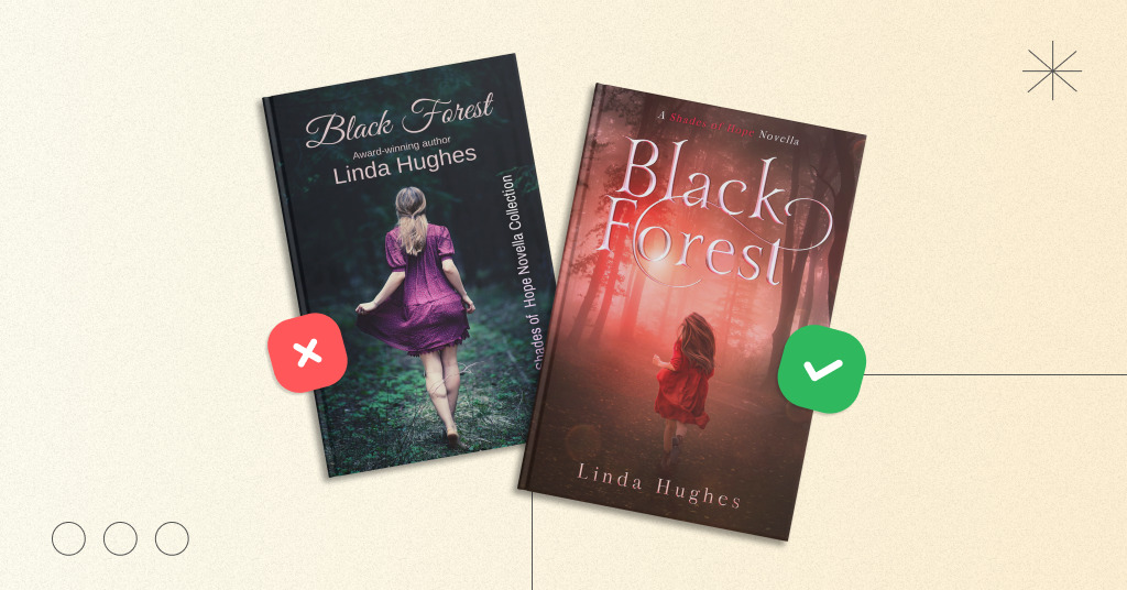
- Don’t focus on faces. A human face is a very familiar and comforting visage. Make it hardy-discernable, covered in the shadows, or simply distanced to amplify the sense of loneliness and fear.
Finally, our universal tip for an effective dystopian book cover design is
If you want to include something comforting or familiar on your post-apocalyptic cover, ensure that the imagery feels ravaged, damaged, twisted, or somehow corrupted, so it sends shivers down a reader’s spine.
Post-apocalyptic and dystopian typography tips
Typography serves three important functions:
- Сommunicates the book’s title and author’s name
- Emphasizes the genre of the cover
- Ties up the cover art
So, it’s important to get the font right and ensure that it complements the art through proper color, ornamentation, and customization.
Here are a few tips to ensure that the post-apocalyptic book typography is easy to read:
- Implement an intuitive reading pattern
The most common choice is a z-pattern layout, which mimics the way our eyes parse information on a page — from the top-left, down, and to the bottom right. Of course, if you write for cultures that read from right to left, the pattern should be mirrored.
- Ensure proper text hierarchy
Usually, the book’s title is the biggest one, the author’s name comes second with thinner and smaller letters, while a subtitle, if any, comes third.
- Use contrasting colors
Text colors should contrast against the art well and suit the cover’s emotional atmosphere.
The next step is to pick the font that suits the dystopian and post-apocalyptic stories. Here are a few typography tips that will help you to pick a proper font for your end-of-the-world novel:
- Use bold, angular fonts without ornamentation. They are the universal choice for post-apocalyptic novels.
From a book cover design by MiblArt
- Use minimalistic thin san-serif fonts (fonts without little hooks at the ends of the letters) for subtitles or an author’s name. They’re the second-best choice because such fonts are neutral and strict.
From a book cover design by MiblArt
- Treat minimalistic thin serif fonts (fonts with little hooks at the ends of the letters) carefully. Serifs are quite common but also more capricious because of their tiny hooks. So, they are often left for books with more “loud” art, which often hints at the supernatural, magical, or fantastic.
From a book cover design by MiblArt
- Avoid cursive fonts and fonts with excessive ornamentation as they’re too flowery and better suited for fantasy or romance.
As for the customization of the fonts, we suggest using textures that convey the damage, raggedness, or corruption. For example, you can make your post-apocalyptic book cover text burnt, scratched, or rusty.
Post-apocalyptic and dystopian color tips
Color in cover design helps you communicate emotions and emphasize the atmosphere of your story. Color can make or break a post-apocalyptic or dystopian book cover. We have a few color tips:
- Pick up to three main colors. Postapocalyptic worlds aren’t very colorful, and your cover should reflect it.
- Choose colors that complement each other in favor of colors that create sharp contrasts. Most often, you’d want a smooth transition between the colors on your post-apocalyptic cover to create the feeling of a bleak, faded environment.
- If you want sharp contrasts, pick bright colors against the dark hues. For example, red and black, green and dark grey, orange and black. The stark difference between the colors will evoke feelings of danger and discomfort.
Some of the most popular color choices for the postapocalyptic book covers include the shades of brown, orange, red, and green. When implemented properly, such colors help to create hostile-looking landscapes that seem unnatural and exaggerated.
Post-apocalyptic and dystopian book cover ideas
Now, that you know how to put a post-apocalyptic book cover together, it’s time to come up with a good book art idea. To make it easier on you, we prepared a few world-ending book cover ideas for your inspiration.
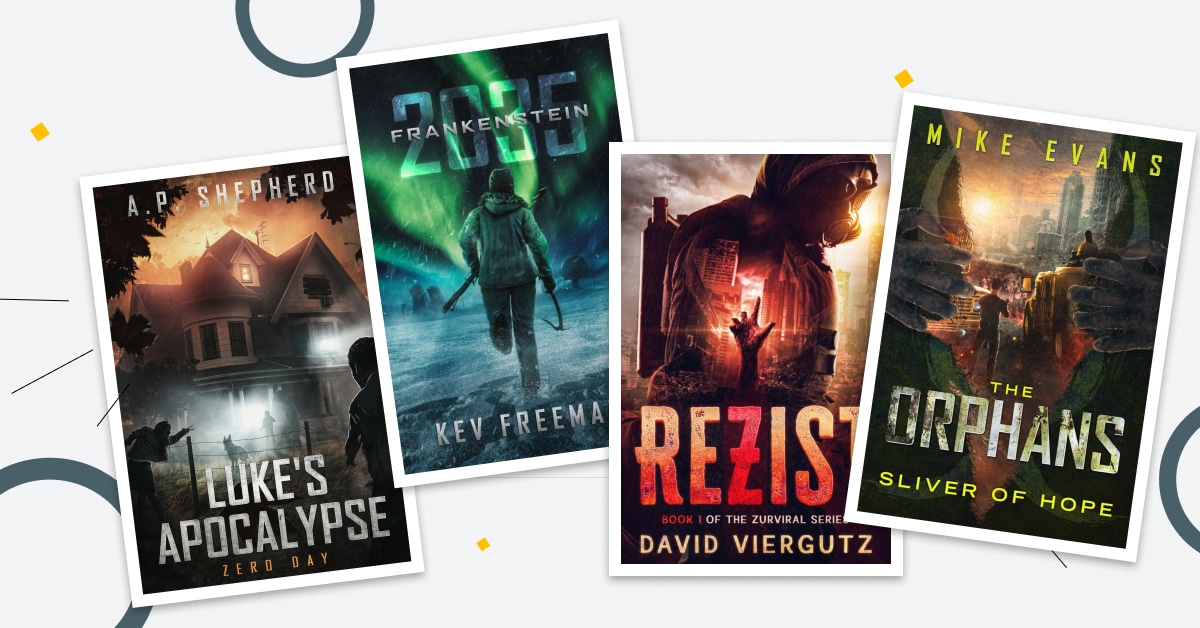
Show people observing the end of something bigger
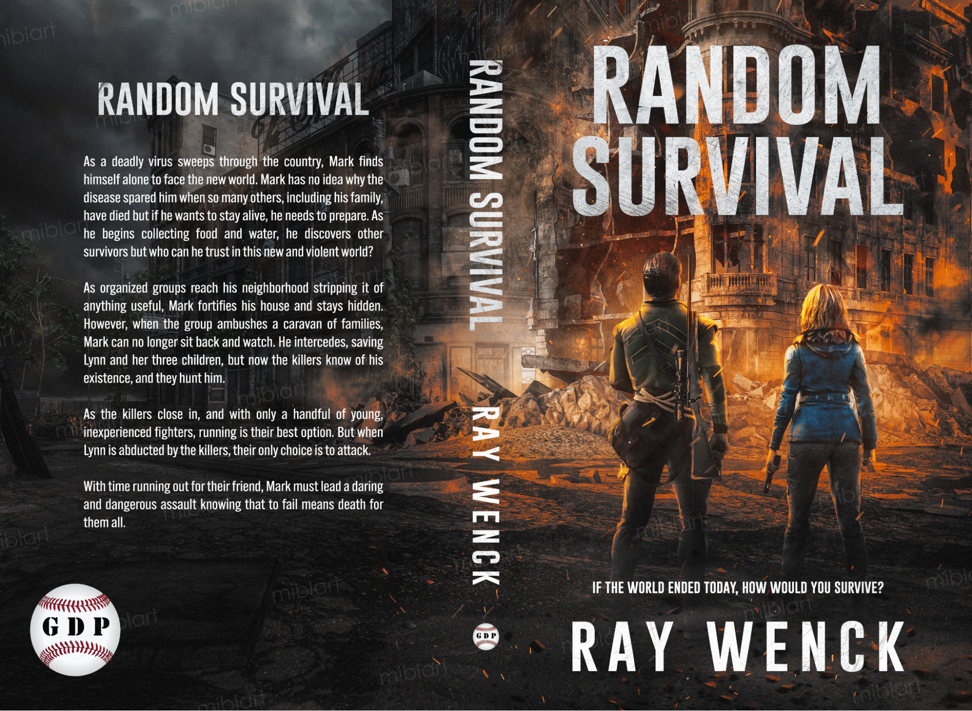
You can’t see the character’s faces, but their posture and the frozen instance of the destruction they observe communicate all you need to know and feel.
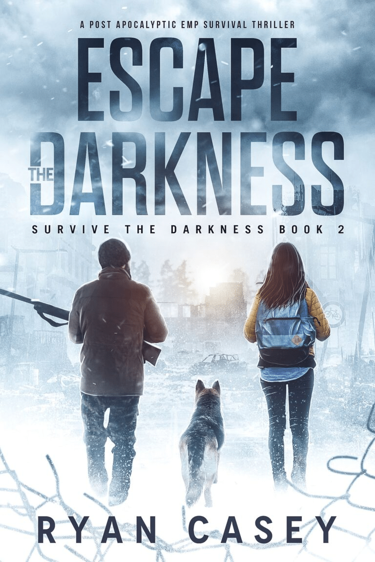
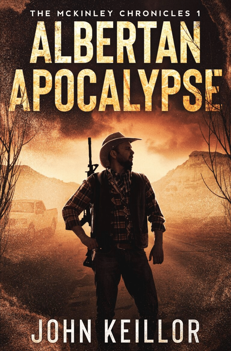
Show the protagonists surrounded by the overwhelming odds in a hostile world
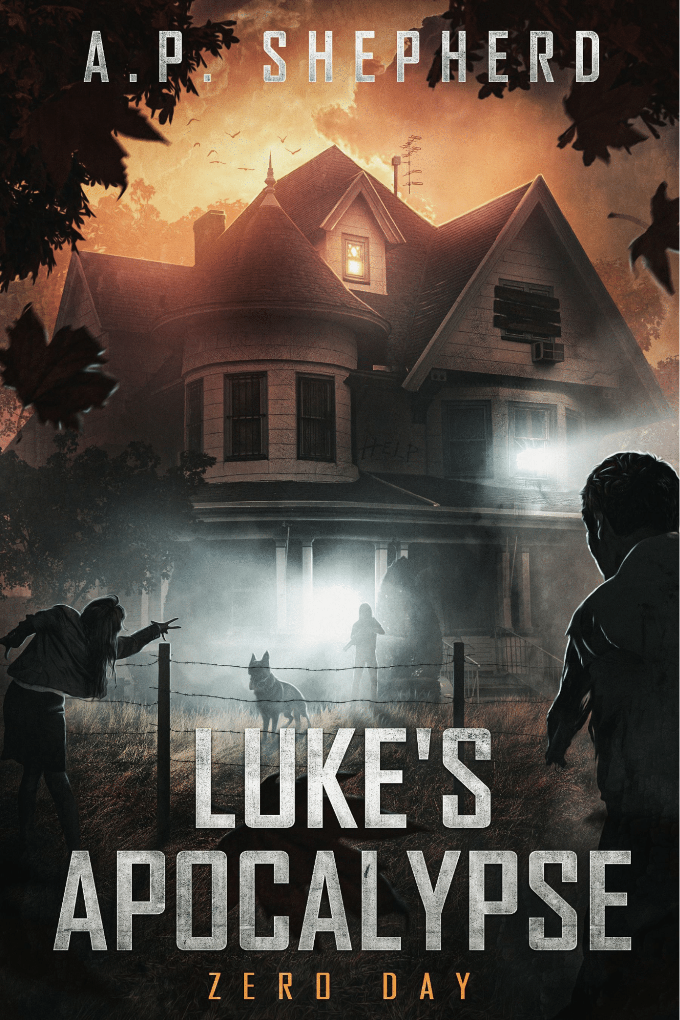
Throw your characters in the very middle of the danger. Make them seem small, defenseless, but determined — just what you need for the post-apocalyptic novel.
Show the beauty of nature but imply that something is very wrong
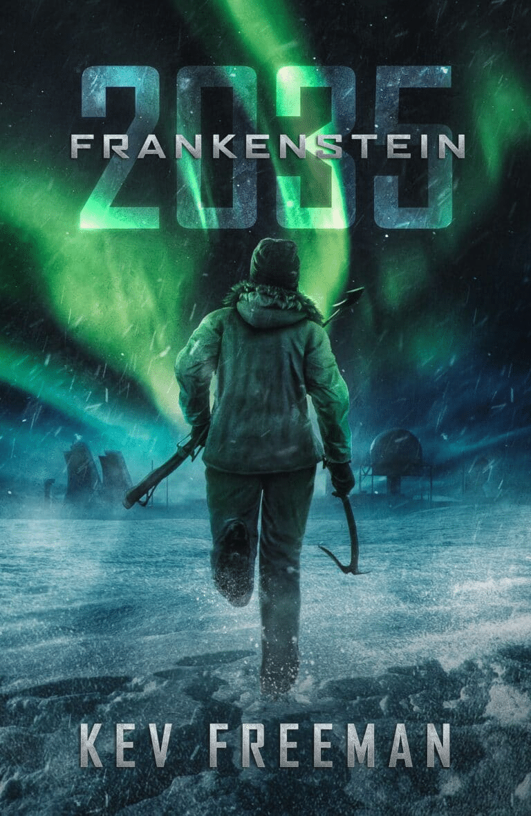
Nature has many mesmerizing gifts to offer, which is a ripe opportunity for a sharp contrast that is suitable for a post-apocalyptic cover. In this case, you can feel the panic of the character running against the time, so the gorgeous arctic landscape feels threatening and unwelcoming despite its beauty.
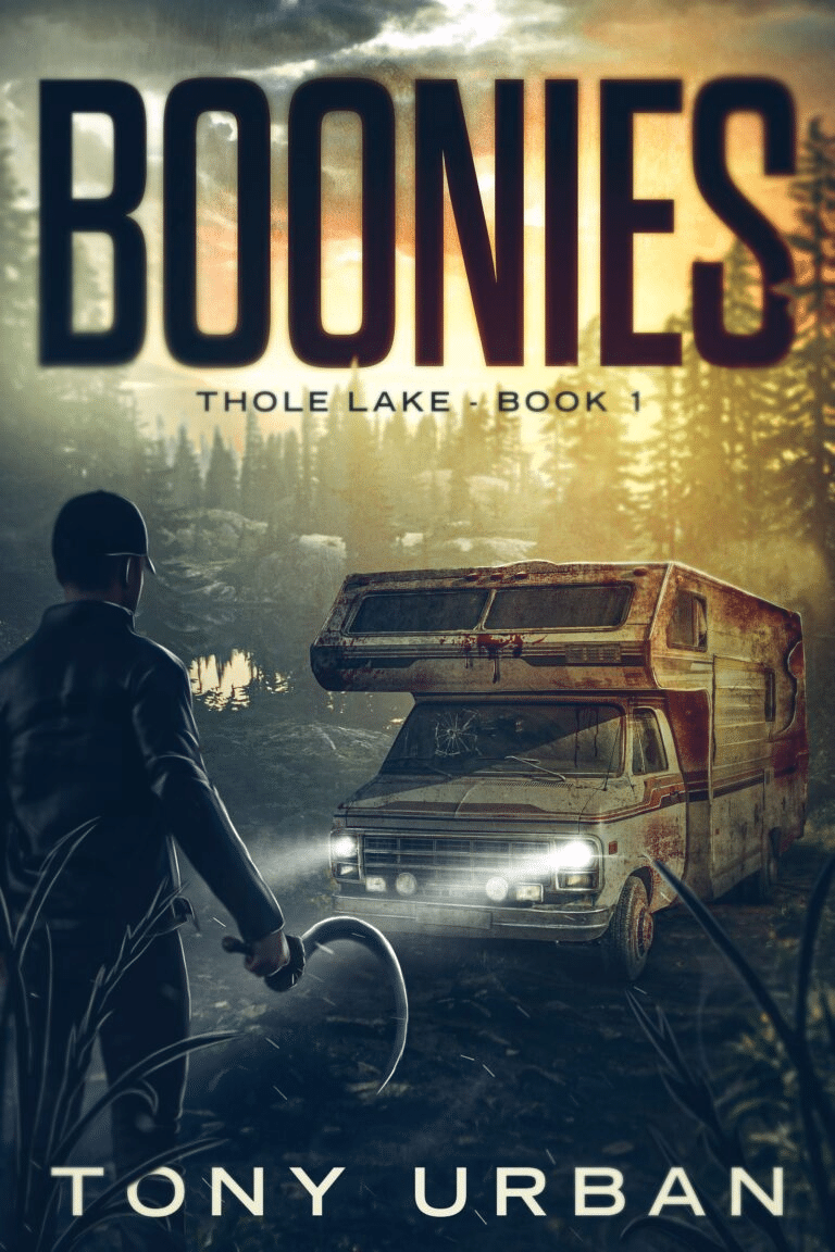
Show the protagonists during their struggle for survival/fight against adversaries in the dying world

Post-apocalypse stories are determined by the constant fight, struggle for survival, and danger coming from other sentient beings. So, why not depict just that and show your characters ready to face the hostile world?
Juxtapose two different images that show different aspects of your world
Why show a single image if you can show two? The juxtaposition of visuals is a neat trick that allows you to just that and also create a catchy and unique picture.
Focus on typography but add powerful and symbolic imagery.

Typography is rarely used as a main focal point of a post-apocalyptic cover, which means you can use it to stand out more. In our example, you can see a bold text adorned by a powerful image that contrasts the comfort of the Christmas ornamentation with disturbing visuals of blood and shattered glass.
Summing Up
We assume that post-apocalyptic and dystopian books are a ton of fun to write despite their grim contents. We do know though that such books are a ton of fun to design covers for because you can go all-in with creepy, tense, and ravaged visuals.
When you work on a post-apocalyptic book cover, remember that your main task is to evoke the feeling of a cataclysm, struggle, and danger. How exactly you decide to do it isn’t as important as using the right imagery, colors, and typography for the job.
Good luck and have fun!