Children’s books are a peculiar market :
- 61% of children’s books are bought by adults, mostly women, aged 18-44;
- Moms, teachers, and dads have the most influence on what kids choose to read;
- 80% of book purchases are not planned, and 40% are pure impulse;
- For kids aged 7-12, the primary criteria for choosing a book are familiar characters and a front cover image.
Two conclusions are important here:
First, covers are essential for boosting the sales of kids’ books.
Second, children’s book covers should attract both kids and adults.
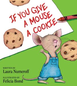
And suppose you examine the shelves of any bookstore, from picture book classics like The Tale of Peter Rabbit to phenomena like the Harry Potter series. In that case, one pattern emerges: the most successful children’s books invariably feature vibrant, expertly created illustrated covers that simultaneously speak to both generations.
So, let’s learn effective kids’ book cover design tips.
What makes a good illustrated children’s book cover design?
You may have already bought more than one book for a kid, and you know how it goes.
You arrive at a bookstore, uncertain of what exactly you want. Then, your eyes stumble upon a book that touches you:
-
The cover is vivid;
-
The imagery is masterful even if simple-looking;
-
The atmosphere seems joyful or adventurous;
-
The art has its distinct style and character;
-
You feel the book can teach a meaningful lesson.
It either gets to your inner child, or you think it will get the child’s attention you’re buying the book for.
How to design an illustrated book cover that’s so effective?
Make the cover age-appropriate
Adults who look for a kid’s book have the general idea of what a book cover for a certain age should look like.
A person who wants a book for a 7-year-old child wouldn’t pay attention to a cover that seems too mature, and vice versa.
To design a proper cover for young readers, research books in the same age group and follow their lead. No need for experiments here.
Here are some illustrated book cover tips for different groups:
For the kids aged 1-5:
- Joyful colors with strong contrasts (children tend to be attracted to the bright block colors of the color wheel rather than pastels or muted blends)
- The minimalist cartoonish/hand-drawn art style
- Familiar characters (pets and animals are a popular choice)
- Big text
- Simple fonts
- Short and legible title or a longer but memorable one
 |
 |
 |
| Source | Source | Source |
If you need references for illustration style, here are some cartoons with the visuals that cater to the age group effectively:
Messy Goes to Okido, Paw Patrol, Peppa the Pig, Nina’s World, Word World.
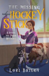
For the kids aged 6-9:
- More elaborate color schemes, but stick to vivid colors
- Illustration with more details
- Imagery can be more abstract but still easily recognizable
- More complex typography
- Longer titles
 |
 |
 |
| Source | Covers by Miblart |
Treat this age group cover as the previous one on steroids.
For art references, here are some cartoons with visuals that cater to the age group effectively:
Beat Bugs, My Little Pony, Adventure Time, Sofia the First.
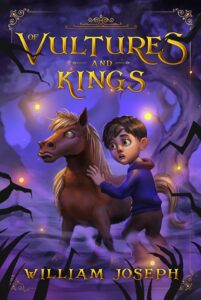
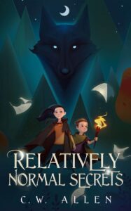
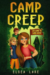
For the kids aged 9-11
At this age, kids are on the path to adolescence. They form independent relations with their peers, adopt new fears and anxieties, and enjoy suspenseful stories.
The book covers should account for their new knowledge and experience, so feel free to
- Use grimmer/softer color schemes if needed
- Build intrigue and tension with imagery
- Don’t avoid unique art styles
- Use unique eye-catching typography
- Busy covers with plenty of details are ok now
 |
 |
 |
| Covers by Miblart |
For art references, here are some cartoons with visuals that cater to the age group effectively:
Kipo and the Age of Wonderbeasts, Cyberchase, Star Wars: the Clone Wars, Gravity Falls
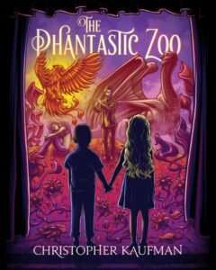
For the kids aged 12 and beyond
These children are officially teenagers. Puberty hits hard; the desire for individualism and self-expression even harder. The kids discover their likes and dislikes and get a more intimate understanding of the world.
Thus, we can’t give you any specific tips for this age group. The covers should be approached case-by-case, considering their content, message, and emotional atmosphere.
If you are struggling to come up with an idea for a kids’ book cover, we can help you for free.
 |
 |
 |
| Covers by Miblart |
Simply remember to follow illustrated children’s book cover guidelines.
Avoid too many colors on the cover art
Even though younger kids prefer bright colors, you shouldn’t make the cover into a rainbow. Such a cover would seem too sugary and harmful, like too much chocolate.
So, stick to classics.
Pick a couple of main colors and complementary hues that create well-defined contrasts and convey desired emotions.
 |
 |
 |
| Covers by Miblart |
On the same note.
Avoid bleak tones in illustrations
The book covers can communicate tension, suspense, or even danger with dark tones and stark contrasts (red and black, for example).
However, avoid bleak tones that can convey existentialism or depression.
Create an illustration that communicates the book’s theme
The most successful covers communicate the content and/or themes of the books. Such covers state:
- I will tell you an interesting story;
- I can teach you a meaningful lesson;
- Or both.
Adults will always prefer a children’s book that is clear about its intent over one that is vague.
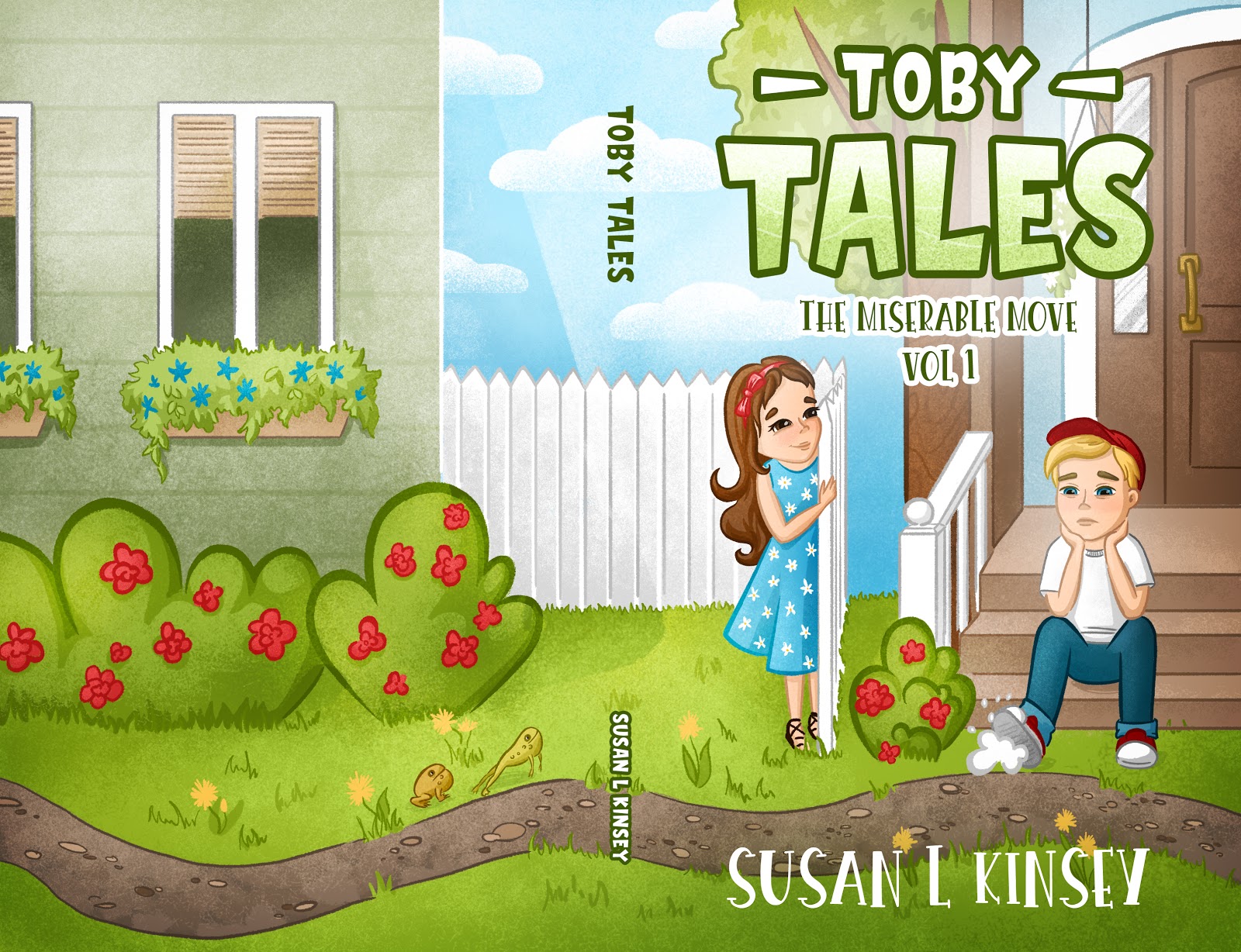
This book of Toby Tales is about moving places and all the stress and anxiety it causes to kids.
Create associations using an illustration style
If you write for younger kids, stick to familiar and popular styles. On average, children are more likely to pick familiar over new.
You can also try a nostalgic approach to kids’ book illustrations if you aim at adults who buy books for kids.
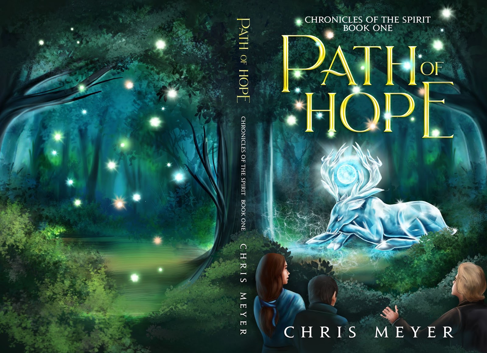
This cover reminds us a bit of studio Ghibli animations and older Disney cartoons. A pleasant, nostalgic blend that attracts.
Make sure the typography fits
The text on the kids’ book cover should fit its emotions and theme as well as be age-friendly.
If you write for the youngest, use fonts that are easy to read and don’t have many embellishments. For example,
- Comfortaa
- Helsinki
- Linotte
- Airfool
- DK crayonista
For the kids over 6, you can use fonts with more ornaments to emphasize the desired atmosphere. For example,
- Henny Penny
- Advert
- Christmas Time
- Pijamas
- Pequena
Also, choose the color of the text that makes the title pop.
 |
 |
 |
| Covers by Miblart |
Summing Up
At first glance, illustrated children’s book covers may seem straightforward — Choose bright colors, create a cartoon-style illustration, and throw some fun-looking font on top.
This simplicity is deceiving, though.
There are a few genres where there’s as much nuance as in kids’ literature. Just a couple of years of difference in age of the reader changes your approach. You should reconsider the color, typography, style, and visual storytelling. Besides, illustrations that appeal to kids and adults are an art people hone for years.
But if you approach the cover design process cautiously and have some illustration chops, an effective cover is guaranteed.
What do you think is the most essential element of a kid’s book cover?