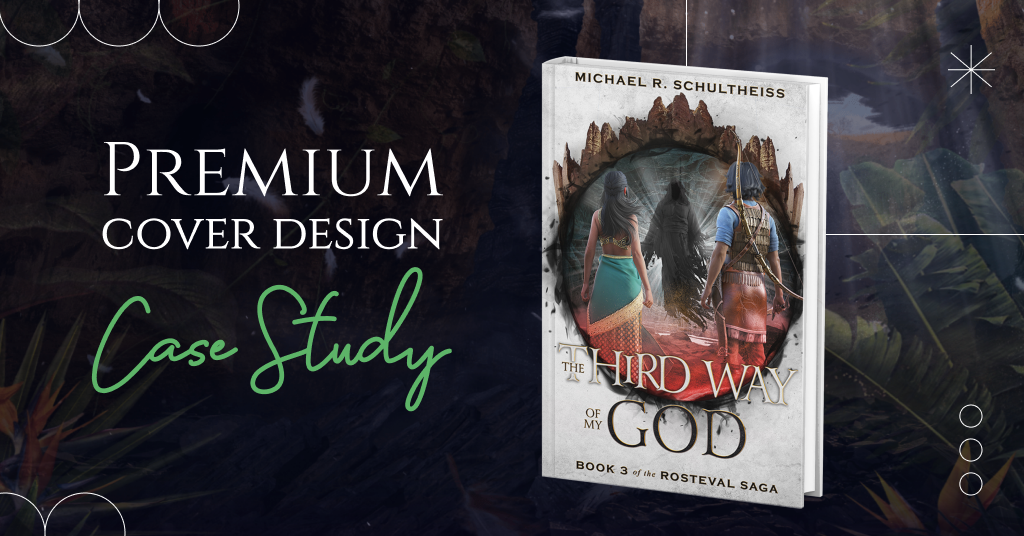
Let’s dive into more stunning examples of our premium book cover design.
This package offers many advantages for authors: a consultation with our creative director, two book cover design concepts to choose from, marketing materials, and discounts from our partners. Moreover, the premium design provides heavy photo manipulation, 3D modeling, and digitally painted elements that will bring your book’s fictional world to life.
Today’s case concerns “The Third Way of My God” by Michael R. Schultheiss, and we can’t wait to share impressive results.
The story of the book
- Title: The Third Way of My God
- Author: Michael R. Schultheiss
- Genre: Epic Fantasy, Sword & Sorcery
- Plot: Rosteval faces twin disasters when an enemy army comes for his kingdom, even as a terrible new menace arises from the darkness to threaten his entire world. Forced to flee, Rosteval and Ghaitta lead their people into exile, but they run out of time. Outmatched in a war between gods and armies of light and shadow, can Rosteval and Ghaitta find a third way to save their people, kingdom, and themselves?
How did we see this book cover?
We are honored to say that Michael R. Schultheiss is our repeat customer. He already ordered covers for the previous parts of The Rosteval Saga and finally returned for the cover for the third book, The Third Way of My God.
As for the author’s desires, Michael wanted to see his protagonists, both Rosteval and Ghaitta, on the cover again, dressed as they are on the cover of The Spiral of My Destiny. He also offered to add some elements of light and darkness to speak to the key theme. Other than that, the author was open to our ideas.
Fascinated by the plot, we made two different versions that still flawlessly continue the previous books and harmonize with them. Let’s see the designs in detail.
Book cover concept #1
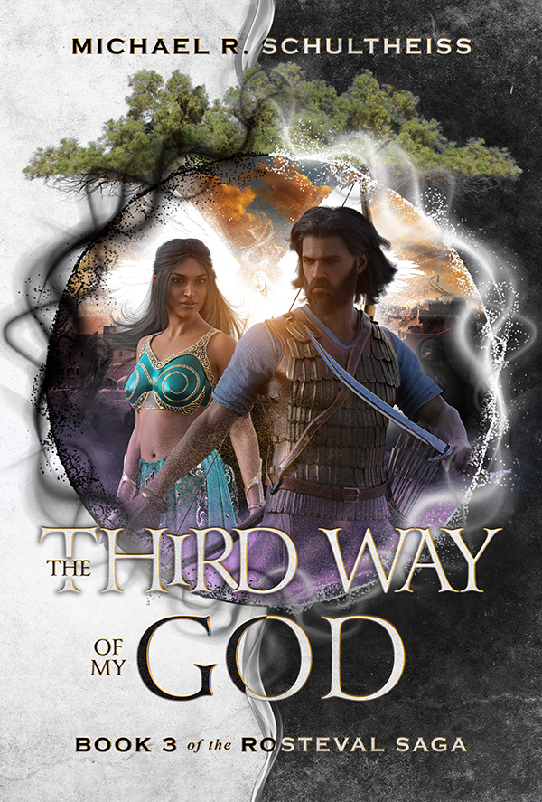
General composition
Here, we continued the series look by adding the new book’s main elements. This version’s theme is the contrast between the forces of light and darkness, which attributes surround the protagonists in the center.
Behind the characters, you can see Goddess with clashing armies and legendary hinting at events in the new book.
Main characters
As the author requested, we used the main characters’ clothes from the previous part. But the designer changed their positions to make them look different and suit the composition.
Colors and typography
The typography continues the style of the series. But here, we also played with black and white colors to symbolize the forces of light and darkness.
Book cover concept #2
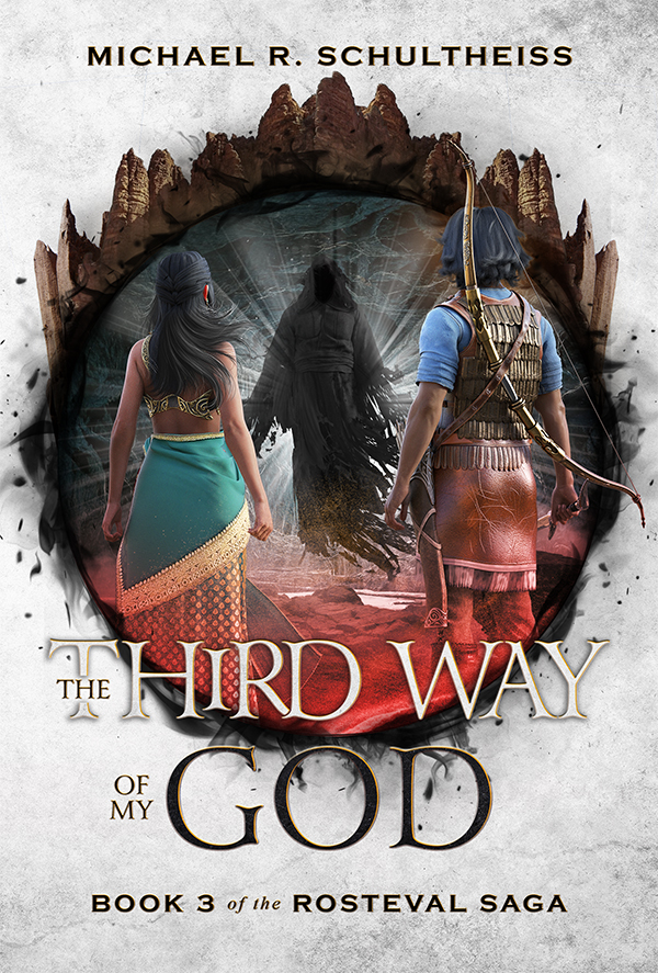
General composition
In this version, we made a different contrast: A light background and a dark circle with the main characters in the center. The designer decorated the upper part of the circle with rock elements since the description has a plot related to the cave. The lower part of the circle is wrapped in black magic.
Main characters
Protagonists dressed in the same outfit stand with their backs to the viewer. They look toward the dark figure. This approach creates a tense cover story and conveys a sense of danger and challenges to the characters.
Colors and typography
We played the title in black and white colors but split it horizontally. The typography continues the style of the series. The book cover design looks very clean and without extraneous elements.
What concept did the author choose?
We were pleased to hear that Michael R. Schultheiss adored both concepts a lot. However, he decided to go with the second version. Michael liked the intense atmosphere and the dark figure that perfectly connects to the core of the book’s plot. More than that, the author even didn’t want to change anything.
Conclusion
Both book cover versions look like portals through which the reader can enter the fictional world created by Michael R. Schultheiss. At the same time, the concepts are pretty different.
The first option showed the characters in the foreground as if a man was protecting his woman. Here, we also showed a strong contrast between the forces of light and darkness with black and white colors.
In the second concept, we wanted to create a more intense atmosphere. The protagonists’ gaze at the dark figure adds to the effect of struggle. A circle stylized with rocks and dark magic tells about the settings and events described in the book.
Have these book covers impressed you? Share your opinion in the comments.


Michael Porter
4 years agoI really love this design! You did a wonderful job!
Vasylysa
4 years agoThank you! It’s a pleasure for us to hear such kind words.