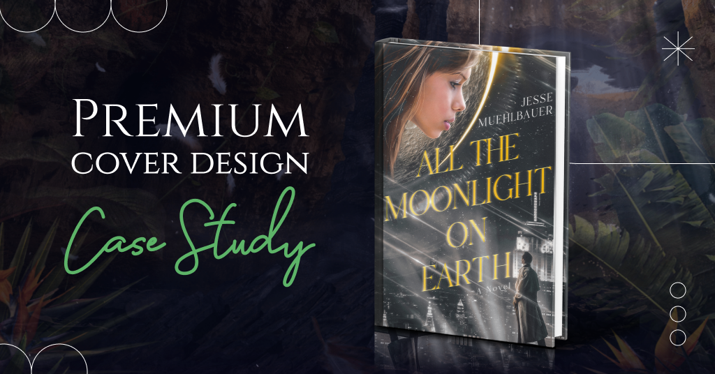
The moment has come — we’re revealing the new premium book cover design and the process of its creation.
We also want to remind you that by ordering our unique package, you get a consultation with our creative director, two book cover design concepts to choose from, marketing materials, and discounts from our partners. The premium design includes heavy photo manipulation, 3D modeling, and digitally painted elements to bring your book’s fictional world to life.
Now, let’s jump right into our new case study.
The story of the book
- Title: All the Moonlight on Earth
- Author: Jesse Muehlbauer
- Genre: Science Fiction / Romance / Suspense
- Plot: A year after his wife’s tragic loss, Gillen Rainer struggles to find closure. Unanswered questions linger even for his thirteen-year-old daughter, who seeks solace in memory far beyond her recollection… It’s October 7th, 1957…As Sputnik orbits the globe every ninety-six minutes, Gillen and his team are set to announce their own surprise. The Alignment — a portal connecting the earth and the moon — is ready for visitors, effectively ending the space race before it has even begun. But at the moment of their most significant achievement, disaster strikes, forcing those involved to confront the unrelenting power of past decisions and past loves.
- Settings: San Francisco & New York, 1957.
How did we see this book cover?
Jesse Muehlbauer shared his vision of the book cover and added some images as references. The author had the following requirements:
- The cover should feature two characters with side profiles, separated by the line of a moon sphere.
- The male character, the father, should be looking slightly up into the moon to see his daughter, who is looking slightly down at him.
- The female character, thirteen years old in the novel, should have brown eyes and dark brown hair.
- The essential element is that this image should not look romantic as the characters are father and daughter.
- The cover can be ethereal, mysterious, suspenseful, or thoughtful.
We appreciated all the author’s comments as they helped our designer to understand the task better. Now, let us show you how we saw this book cover.
Book cover concept #1
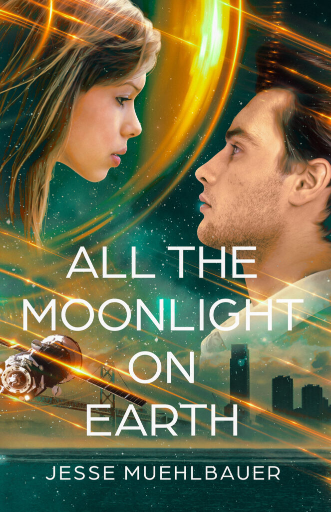
General composition
The first concept includes the characters in close-up where their emotions are clearly visible. Spaceships in the background and the city show readers the environment where the events take place. These images also highlight the science fiction genre.
Colors
The yellow glow of the moon draws attention to the main characters. The green color of the background highlights the necessary contrast. Moreover, yellow-orange lines add dynamics to the cover.
Typography
We chose a simple but clear and elegant font that is perfectly readable against colorful images. It also fits perfectly into the genre.
Book cover concept #2
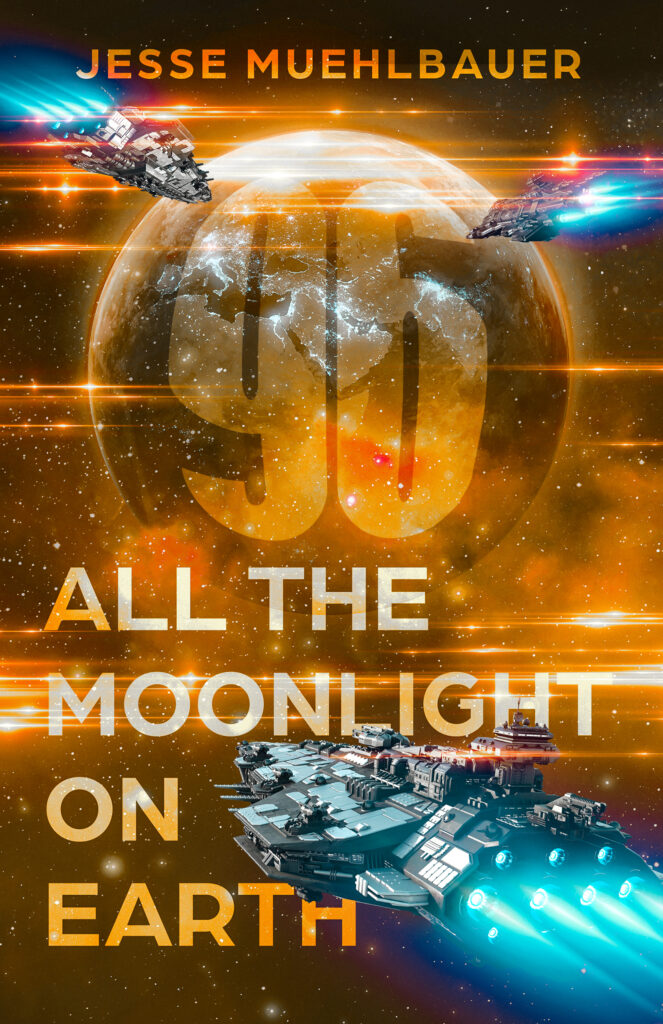
General composition
This version is more stylized and has more hidden meanings. As an alternative, we offered an option without characters at all. In the center, readers can see the number 96 as a symbol of A Sputnik that orbits the globe every ninety-six minutes. This figure fits perfectly into the planet and grabs all the attention.
Colors
Cool and warm hues create excellent contrasts, and spaceships in the background help to immerse yourself in the atmosphere of science fiction. This version contains bright, attractive elements and shining pieces that make it prominent.
Typography
For this cover option, we also chose a sans serif font that is perfectly readable and suitable for the science fiction genre.
What concept did the author choose?
Jesse Muehlbauer and his team liked the first concept. The author also shared what he enjoyed most in this design:
- The female character’s placement and profile are excellent. Also, the concerned yet wondrous look on her face is appealing.
- The action lines streaking across the cover work great.
- The starts coming in and out of the texture is a nice touch.
The writer also offered more recommendations on how he wanted to improve the first book cover concept. So let’s get to work.
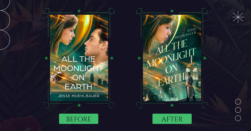
Noir cityscape
We removed the male character and expanded the noir atmosphere by including night city views with skyscrapers. Our designer also added a pair of noir searchlights.
Silhouette of a man
Instead of the male side profile, we added a silhouette of a man in a trench coat. He is looking up at his daughter.
Sphere
Our designer changed the look of the sphere around the girl as it looked like a space helmet instead of the moon.
Typography
Instead of the previous option, we used glowing serif font and placed it diagonally. It fits perfectly into the new composition.
Minor changes
Also, we removed the satellite as it didn’t correspond to the actual image of Sputnik from the novel. Then, our designer added the word ‘novel’ under the title.
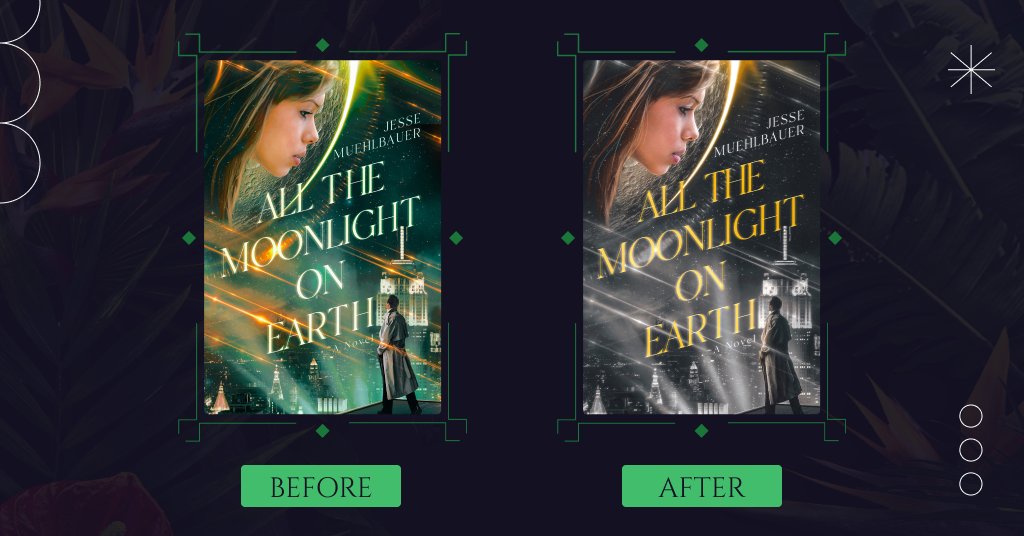
Black and white version
Jesse Muehlbauer asked us to make most of the book cover black and white for the final version. Exceptions are the moon, the girl, as well as the title, and the author’s name. And now you can enjoy the results!
Conclusion
The final book cover version is spectacular. It corresponds to the genre standards and appeals to the target audience.
The concept includes an image of the main female character and a silhouette of a man who appears to be her father. Readers see night cityscapes in the background, which creates a noir atmosphere. The glowing orange title is perfectly readable against the black and white image and harmonizes with other colorful elements.
And what do you think about this book cover design? Share your thoughts in the comments.

