We can’t wait to share this premium book cover design with you as its final cover underwent drastic changes literally at the last minute.
But before we start, we want to remind you that this service provides numerous advantages for indie authors:
- Сonsultation with our creative director
- Two book cover design concepts to choose from
- Free book promo images and discounts from our partners.
Our senior designers use heavy photo manipulation, 3D modeling, and digitally painted elements that will bring your book’s fictional world to life.
It’s time to get to creating a book cover for the epic fantasy novel “Crucible of Lies” by Mitchell Hogan.
The story of the book
- Title: Crucible of Lies
- Author: Mitchell Hogan
- Genre: Epic fantasy
- Plot: It’s a story about the Emperor, someone who’s very much Nero-esque on his throne. He is catered to by his servants and underlings until it’s time for the servants to give their lives to help the Emperor survive an assassination attempt by a magicked-up emissary from a neighboring kingdom. The other main character is Zah, the young man whom we grow to realize will rise, literally, to become the Emperor. Initially, he is a child with little knowledge or memory of his parents, scrounging with his sister in the undercity for food and shelter. Things change when Zah uses the hitherto unknown powers that help him escape the thieves. The book tells about Zah’s journey from the undercity to becoming the Nero-esque emperor.
How did we see this book cover?
Mitchell Hogan said that the mood of his story is reminiscent of the moment when Luke Skywalker joined his father, Darth Vader, at the end of “Empire Strikes Back,” but twice as dark. He sent us many examples of his favorite book covers.
The author also shared the idea of the book cover: It would be nice to have a similar concept to the poster for The Phantom Menace, when Anakin as a boy, is in the foreground with the massive shadow of Darth behind him. But in the case of this book, the Emperor would not be a shadow, and his younger self in front of the looming figure of his older self dressed poorly in ragged clothes.
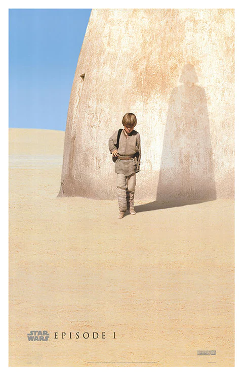
Poster for “Star Wars: Episode I – The Phantom Menace”
Mitchell Hogan also wondered if we could incorporate a brass fob watch with a monogrammed “S” in the book cover design, as this object sometimes features in the story.
After clarifying some more details, we were ready to present two concepts of the future book cover to the author.
The first one has a poster-like effect, similar to the author’s examples. And the second version is more realistic, with an emphasis on the character and his throne.
Book cover concept #1
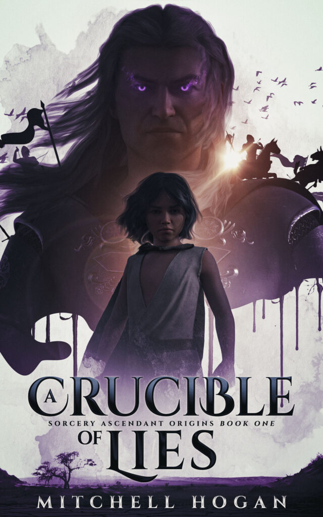
General composition
The first version is more stylized and based on the main characters and the poster example the author shared. There was also a moment in the description when the Emperor won the throne through lies and blood, so we styled it with bloodstreams.
Main characters
We tried to convey the characters’ images as closely as possible to the description. The strong and arrogant Emperor looks like a massive shadow over Zah.
Background
There is a desolate landscape in the background. It’s bright and perfectly highlights the dark characters and the war elements behind them. It creates an excellent contrast.
Typography
The typography fits perfectly into the fantasy genre. Fonts with glyphs highlight the atmosphere. We also emphasized the main words for better comprehension.
Book cover concept #2
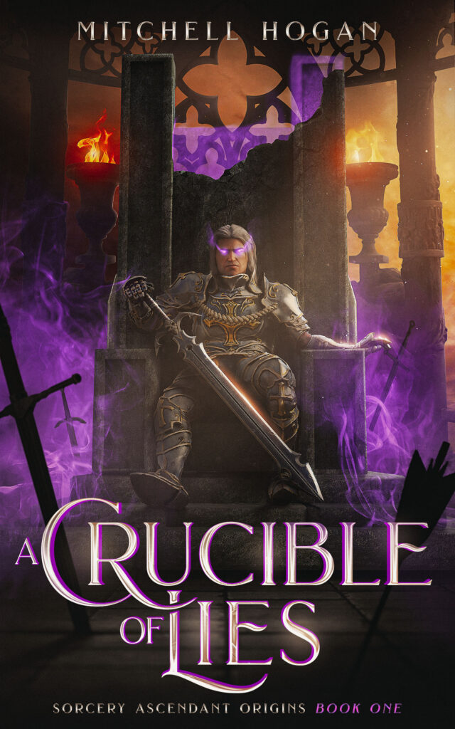
General composition
We made the second version in a realistic style. The main emphasis is on the Emperor. You can see elements with arrows and swords in the background which symbolize the atmosphere of military events and battles.
Protagonist
We decided to depict the Emperor on the throne since this is the main symbol of power. He seems to be towering over the ordinary people. The slightly ruined throne shows an allegory: He remains in authority despite all the attempts and unforeseen circumstances.
Colors
Our designer highlighted the purple magic of the Emperor’s eyes with a cloud of purple smoke. It contrasts beautifully with the fire and yellow-orange light in the background.
Typography
This version features different typography, but it’s also a fantasy style with highlighted main words. We also changed the placement of the writer’s name. Thus, the author could choose what he liked more.
What concept did the author choose?
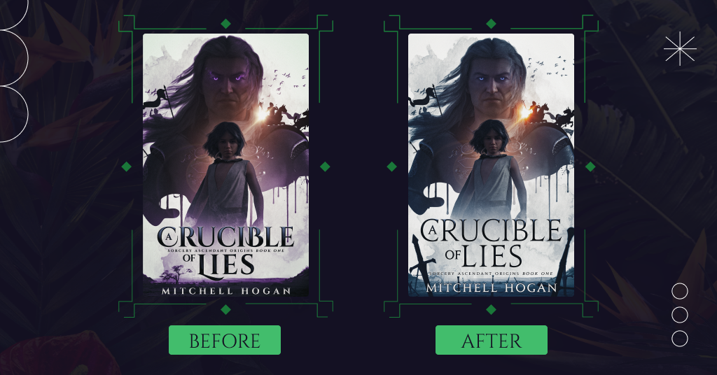
The author liked both concepts. He also noted that it was interesting to follow the designer’s thoughts. After some discussions with fellows, Mitchell Hogan chose the first version of the cover and suggested some changes.
Colors
We made the main characters a little lighter. Also, the author liked the beam of light, so we kept it and gave it an orange tint for expressiveness. Our designer replaced the purple with blue, which offers an epic fantasy feel.
Objects
We used images of the swords from the second book cover concept to emphasize the mood of battles and epic fantasy.
Typography
We used a different font for the book title, similar to the font on the author’s previous book. We also changed the location of the book series’ name.
What did the process of further work with the client look like?
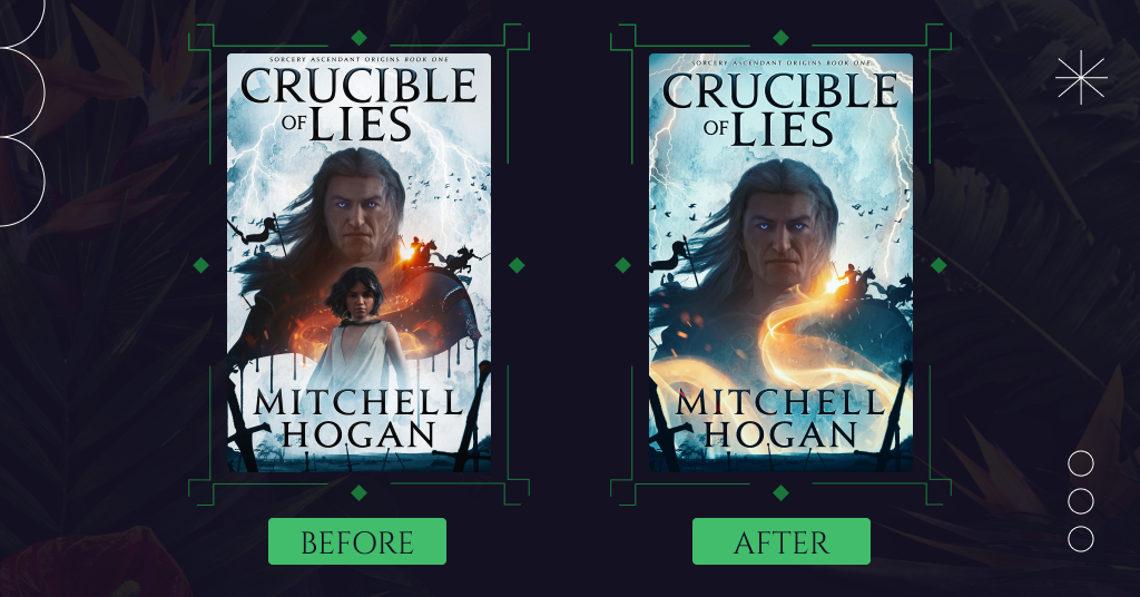
We changed the cover according to the author’s wishes. Mitchell Hogan liked the updated version, but it still needed some changes.
Emperor
We moved the Emperor away from the boy a little. Our designer changed the man’s face: Now it looked thinner and older.
Colors
We have changed the shade of blue and made the book cover brighter.
Objects
The background now includes lightning to add an epic wizarding feel. We also changed the shape of the bloodstream.
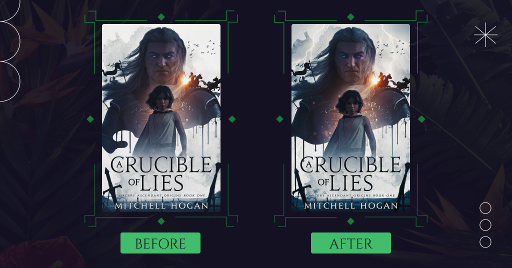
Mitchell Hogan liked the warmest version this time, but the boy was still a bit lost with the muted colors. So we highlighted him with a glowing aura.
The author also removed the article ‘A’ from the title. Our designer changed the typography. He increased its size, bolded words, and moved the book and series title to the top.
What about the final book cover?
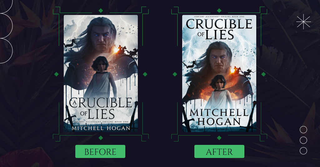
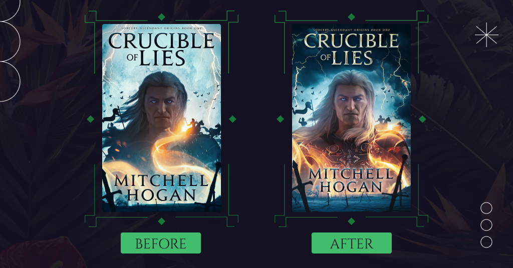
The latest version of the cover already looks professional and eye-catching. However, after consulting with colleagues, Mitchell Hogan decided it needed more clarity for the epic fantasy genre. To fix this, we made the following changes according to the author’s wishes.
Boy
Our designer removed the boy from the book cover because he was the reason that some people associated the book with modern fantasy but not with epic.
Bloodstreams
Now, the hero’s body is smoothly blurred to the bottom of the cover instead of being sharply transited into bloodstreams.
Colors
We added more blue to create a magical atmosphere. Flashes of lightning and a mystical aura have also acquired a golden hue.
Mitchell Hogan enjoyed the updated version, notably brighter and more saturated colors. After discussing this book cover, we made more changes to the final version.
Sorcerous swirl
We changed the shape and placement of the magic swirl so that it does not hide the main character. Now the magical fire wraps around the Emperor’s armor.
Colors
Our designer changed the background from sky blue to dark blue, adding epicness to the overall atmosphere. He also highlighted the emperor’s face to make it contrast against dark hues.
Typography
Since the book cover now has different shades, we changed the color and borders of the typography so that it stood out and read well. The book’s title has acquired a golden color, which stands out beautifully against the background of the dark sky.
Now you can enjoy the final cover, which has been radically changed in the last stage of design.
Summing up
The journey through creating a premium book cover design was filled with unexpected turns and drastic changes. Mitchell Hogan chose the character-based version with the Emperor in the center. But it also includes many details that emphasize the epic fantasy genre: swords, warriors, a thunderous sky with flashes of lightning, and a sorcerous swirl.
What do you think of the final cover? Share your opinion in the comments.