Are you eager to see our new premium book cover design?
We also want to remind you that this service provides a wide range of advantages for indie authors: a consultation with our creative director, two book cover design concepts to choose from, free book promo images, and discounts from our partners.
We create your book cover using heavy photo manipulation, 3D modeling, and digitally painted elements that will bring your book’s fictional world to life.
Now let’s enjoy the process of creating a stunning book cover for the paranormal fantasy romance “Our Satyr Prince” by Dylan Drakes.
The story of the book
- Title: Our Satyr Prince
- Author: Dylan Drakes
- Genre: Paranormal Fantasy Romance
- Plot: Set in a world inspired by Ancient Greece, Calix Viralis, Prince of Ardora and spartan-type soldier, has been cursed by the Goddess of Passion for turning into a Satyr on every new moon. In this world, each of the five gods has this cursing ability, and there are also people all across the country who secretly shift into Gorgons, Phoenixes, Sirens, and Eidolons. The story concerns two friends, a man, and a woman, who don’t know Calix’s secret, with both trying to seduce him for different reasons.
- Settings: Ancient Greece.
How did we see this book cover?
The book’s description fascinated us, so we made two contrasting versions of the book cover.
Our designer used similar colors for both options as, according to the author’s note, they best describe settings. The first version is a realistic book cover with the main character in the center, while the second one is object-based image hinting at the events from the book.
Book cover concept #1
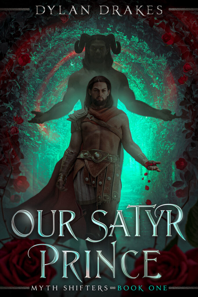
Main character
The protagonist takes the central place in the composition. We tried to reproduce him as much as possible according to the description. But the designer also created a more playful pose for him since it’s a fantasy romance genre. Readers can see the faded Satyr version of the main character behind. It helps to highlight his human appearance in the front.
Background
Rose petals in the protagonist’s hand, as well as buttons, hint at the romance part of the book. Roses also beautifully frame the cover and contrast perfectly with the green background.
Typography
Fonts with glyphs and lights stand out beautifully. The audience can read the title well, even on a thumbnail. This typography fits perfectly into the fantasy genre.
Book cover concept #2
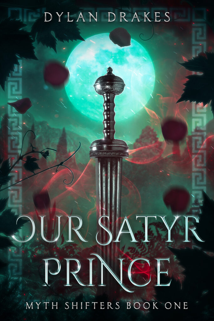
Symbolic object
The main object is a sword in the Greek style. We chose it considering the prince’s Spartan armor. It symbolizes the impending war. The moon behind perfectly emphasizes the sword and hints at the plot line when the protagonist turns into a Satyr.
Frame and background
A beautiful Greek-style frame compliments the book cover. One of the framing effects is grape leaves and branches, as a reference to the flower and vine aesthetic. The magic of red color and rose petals highlights the fantasy romance genre.
Typography
We chose different typography for this version, but it still fits perfectly into the fantasy genre and catches the readers’ eyes.
What book cover concept did the author choose?
Dylan Drakes liked both versions of the book cover. However, he decided to choose the first option, despite all his friends voting for the second.
The writer liked the perfect combination of red and turquoise colors. Dylan Drakes also praised how our designer portrayed the main character’s appearance, although the author did not give many details about it. The writer liked the background and roses. The choice of typography was also to the author’s taste.
What did the process of further work with the client look like?
After finding the right direction, we got some comments from the author on how to make the book cover perfect.
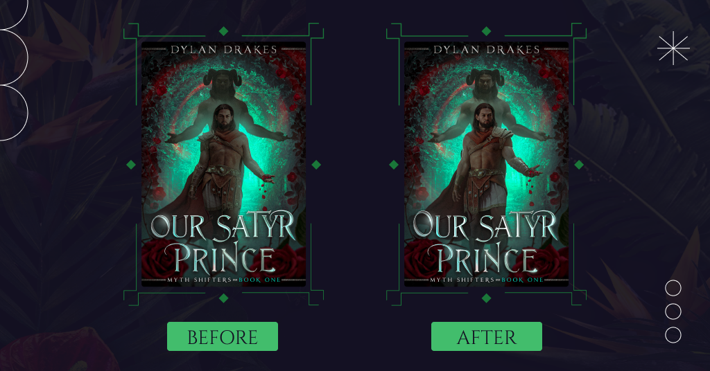
Appearance
Our designer guessed the main character’s appearance by 75%. We just had to slightly improve it by adding more muscularity to the body and masculinity to the face. The author also added a photo of what emotions the prince’s face should express.
Pose
The author liked the idea of a playful pose, so we kept it. However, our designer changed the position of the body, making it more masculine.
Colors
We added brightness to the Satyr figure so that the reader could also see his face.
Typography
Our designer also balanced the font size by making the first letter of the book title larger.
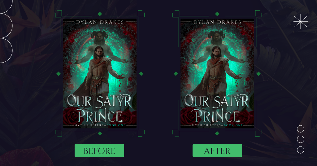
What about the final book cover design?
The improved version of the book cover was almost perfect. It was only left to make two minor changes according to the author’s wishes:
- Make the Prince’s thighs a bit more muscular as they look a bit skinny compared to the rest of his body
- Remove the fragment of the Satyr protruding from the right side of the cloak.
And this is what our final result looks like:
Summing up
This cover turned out fantastic, eye-catching, and extraordinary. We bet readers will want to pick up this book as soon as possible to immerse themselves in its plot. The author chose an option with the main character in the center of the composition. The protagonist stands out beautifully on a green background framed by roses.
Do you enjoy the final book cover? Share your opinion in the comment.