Have you thought about the importance of non-fiction book cover design?
If you believe that it matters only for fiction, you’d better stop misleading yourself.
Be sure, it’s equally important, and I’m ready to tell you how to make it outstanding.
As we’ve already shared ideas on fiction book cover design in our blog post, now we want to guide you to the world of nonfiction.
Ready to start?
Non-fiction book cover design general tips
Show why people should buy your book
What is non-fiction about? It’s a piece of writing that teaches you something and allows increasing your expertise. That is why you, as an author, have to show the reason for your book’s being. And, the cover is a perfect way to do it. Highlight all the relevant information there to show off what value readers will find inside. You shouldn’t be afraid of long titles and subtitles (you’ll learn about them below). It’s beneficial to indicate your qualifications to prove your expertise in this area. Thus, it will positively stimulate readers’ desire to buy a book. Blurbs from other experts and awards will also be helpful.
Place a direct message to your audience
Your cover has to capture potential readers intellectually. While fiction mainly appeals to emotions and heart, non-fiction addresses to the brain. It’s vital to remember that you create a direct message to your audience. As you want your readers to understand you correctly, you have to be as precise as possible in designing a non-fiction cover.
Use minimum graphic elements
Thereby, you have to opt for a rational, linear organization with a minimum of the graphic elements. It’s advantageous to select a central image with something intriguing, which can make your reader stop and think. Solid colors and simple, bold fonts enhance this effect.
Add an extra hook
Add a proof, such as a review, teaser, quote, or subtitle, and place it right on the front. Provide readers with more reasons for choosing your writing.
Search for inspiration
Before ordering book cover design services, don’t hesitate to search for non-fiction best-sellers. Check their covers to get a clear understanding of what works in your genre. You’ll effortlessly come up with the ideas.
With this in mind, we can move on to discovering typography, imagery, and colors suitable for non-fiction.
Non-fiction book cover design typography
When it goes about the creation of the non-fiction book cover design, you should pay particular attention to typography.
What do you have to keep in mind?
Fonts and colors are essential as the title of the book hooks your audience.
Titles and subtitles
There’s no secret in creating a proper title and subtitle for your non-fiction, but there are several rules to make them captivating.
As for the title, it should entice readers to purchase a book. You can use metaphorical, short, resonant, and simple phrases, unlike emotionally evoking and intriguing fiction titles.
Meanwhile, a subtitle is designed to explain to the readers straightforward what problem your book may solve.
The more words you put on your book cover, the better. But, avoid cluttering.
Check out the examples to get what I mean:
- “The War of Art: Break Through Your Blocks and Win Your Inner Creative Battles”
- “Sapiens: A Brief History of Humankind”
- “Into Thin Air: A Personal Account of the Mt. Everest Disaster”


You can find out more useful information in Jane Friedman’s article “Secrets to Developing the Best Title for Your Nonfiction Book.”
All in all, what is the best for title and subtitle in non-fiction?
They should feature keywords, give people a promise, evoke trust, and capture attention mentally, not emotionally.
Popular fonts for non-fiction book cover design
What is non-fiction about? Right. It’s about simplicity, clarity, and order. So, you should choose the fonts that match this concept the best.
The following are the points to consider when selecting the font for non-fiction book cover design:
- Opt for bold and simple typography.
- Avoid fancy fonts as they will look misleading in the design of your non-fiction cover.
- Choose one or combine two fonts. And what’s important – they should differ but complement each other. Combining two similar fonts like Arial and Calibri won’t serve as a decent choice. Because of sharing identical features, they won’t induce your book cover with a wow-effect. If you still want to mix three or more fonts, – it’s just for you to know – they’ll look crammed.
- Select fonts with similar characteristics. For example, they may be stroke and shape. Anyway, it’s always good to communicate your ideas to designers because you’ll receive a professional viewpoint and to get the desired outcome.
So, what are the characteristics of the fonts for nonfiction?
The success formula behind the top-notch design includes minimalism and laconism.
Look at the list of the popular fonts for non-fiction book covers:
- Garamond
- Futura
- Caslon
- American Typewriter
- Montserrat
- Criticized
And one more essential thing – try to create an interaction of the text with imagery. It sounds tricky to implement but undoubtedly results in correlating cover design when done right.

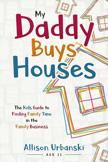

The covers above are examples of MiblArt nonfiction designs. You can find other works in our portfolio.
Font colors
Mind the choice of colors, and it always should go without saying. A proper color palette can both allure and repel the readers.
What’s the best mix of colors for non-fiction book cover design?
- Use the main tone for your cover image and accentuate colors for title, subtitle, and author’s name.
- You might think of vibrant hues because they draw the reader’s’ attention and make the title noticeable. But, it’s better to avoid using it for every part of typography.
- Highlight the key message on the cover with a bright color, but remember that the font should be readable and appealing.
- It’s essential to choose a mild palette for an eye-catching visual image. Bright hues irritate the sight. In this term, it’s significant to find the balance.
So, let’s have a glance at the colors that work best for non-fiction:
- It’s a good idea to create a contrast between the title and subtitle with different colors.
- If you’ve decided on the dark backgrounds, opt for light text colors.
- And vice versa, combine dark text with a light background.


- Highlight the keywords in the title or subtitle to express the key message of your book.


Eventually, play with the colors smartly and combine them to create exquisite design. With these simple tips, you’ll help a reader to grasp the idea of your writing and easily distinguish your book, among others, in a bookstore. What’s more important, people won’t need to enlarge a thumbnail cover when buying online. It would be so thoughtful of you.
Non-fiction book cover design imagery
Use images as another significant element of nonfiction book cover design. Thus, you have to select a matching color scheme and an appealing picture.
Color palette
Similar to fiction, color refers to the feel and look of a non-fiction book cover design. You may experiment with colors either to create a desirable mood or draw attention to some contrasting points in the concept of your writing, which should be presented on the cover. White and black are always a great option as they relate to simplicity and power. Yet, you may try and strike a balance with two or three colors to create an outstanding cover.
Don’t be afraid to use white space
Non-fiction is about new knowledge and information and not about evoking emotions. White space endows the cover with a restrained look and doesn’t interrupt from the prime elements of the cover – a book title.
Select proper colors
Still, everything depends on the feelings you want to generate. Non-fiction is not so boring to use only black and white. You’re welcome to combine complementary colors with sharing energy and giving a punch to the person who holds or sees the book. If your writing is about harmony and tranquility, it’s more appropriate to use tints of the same color.
You must be wondering what palette is the most popular for non-fiction. Authors prefer yellow, orange, blue, and red due to the meaning they convey.
Yellow is associated with happiness and well-being. You can use bold yellow for motivational books and light yellow for self-help, feel-good books.
Orange symbolizes energy. It communicates positivity and optimism. If your writing is all about it, orange is a great option.
Blue refers to mental engagement. It conveys trust and calm. You can choose this color for both memoirs and thought-provoking non-fiction.
Red promotes excitement although it may sometimes symbolize aggression.
Image size and layout
Try to go photo-less and use a smart design
A non-fiction cover may look great without images. You just have to focus on the mix of tints and shades, proper fonts, layout, spacing, and colors. Experiment with these elements to get the desired result.


Don’t provide your designer with not-professional and amateur photos
It’s a must to use professional photos with high resolution. It will be easier to resize them for a print book and ebook cover design. Moreover, amateur and unprofessional photos are not capturing. Your book cover will look inept when creating a design with such imagery.
Don’t use cliched images
As non-fiction is about factual information, designers frequently neglect the figurative approach to the creation of a book cover. They use cliched photos, which are meaningless and carry no desirable positive message. I mean handshaking men for the book covers about business, celebrities’ photos for memoirs, and so on.


What alternatives will work out for non-fiction today?
First thing first, don’t be predictable. Illustrations make a statement about the concept of your writing. They don’t look childish and don’t have to contain so many elements as for fiction cover. Yet, illustration is a good option for the banal stock photo.
Of course, I don’t mean that it is untrendy to customize the stock photo. It’s also a decent idea. But, you have to break out of the grid to draw attention to your book. So, it’s better not to be literal. You can choose and stylize images to convey the ideas of your writing in an indirect way.
Conclusion
At last but not least, non-fiction cover design seems simple to create because it doesn’t require much craft. But, the hardship lies in an accurate interpretation of your book’s message in colors, images, and fonts.
Do you use any of these ideas? Feel free to tell us about your experience in the comments!


KazyKing
5 years agoThanks for the insights. These are awesome.
Thank you for kind words!
GW911
7 years agoGreat outline. I have filled out your form and excited to see your vision.
Many thanks to you.