How to Create a Back Book Cover that Hooks Readers

05.05.2025

People say you only have about 8 seconds to catch someone’s eye with your book cover, and the same goes for the back cover. That’s not a lot of time to make an impression!

So let’s not waste a second. In this blog post, you’ll learn how to create a back cover that quickly grabs attention and makes readers want to know more.

Why does back cover design matter?

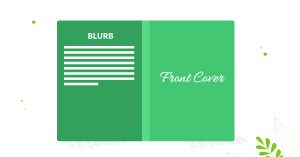
When designing a cover, it’s easy to focus only on the front. After all, that’s the part that grabs attention. But don’t overlook the back book cover. While the front draws readers in, the back is often what convinces them to make the purchase.

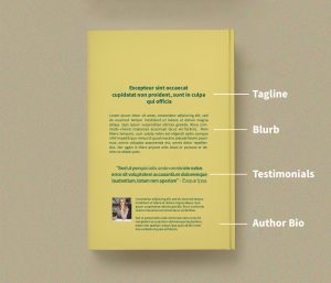
Think of the back cover as your final pitch. If a potential reader is on the fence, this is where you win them over with:

  • A book blurb that offers more details about your story and characters

  • A tagline that sparks curiosity or emotion

  • Testimonials, reviews, or awards that build trust

  • A short author bio, as sometimes a personal connection makes all the difference

  • Key technical info, like ISBN, pricing, or website/social links for further connection

Beyond its informative role, the back cover also contributes to your book’s visual appeal. It can complement the front, extend the design, and create a cohesive look that enhances the reading experience from the outside in.

So, do you agree that a back cover is super essential?

Elements of the back cover

5 key elements every book back cover needs

Now, let’s break down each key element that can improve your back book cover design and make it work harder to sell your book.

A marketable book blurb

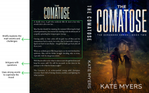
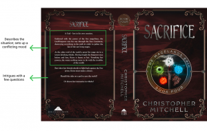
Your blurb is the heart of your back cover. It should quickly hook the reader, give a glimpse of the story or main idea, and leave them wanting more. It takes up most of the space on the back cover, but it must meet certain aspects to be effective. Here are some tips:

  1. Aim for a blurb length of 100–150 words. This brevity ensures that readers can quickly grasp the essence of your story without being overwhelmed.

  2. Begin with a captivating sentence that immediately grabs attention. This could be a provocative question, a bold statement, or an intriguing scenario that piques curiosity.

  3. Briefly present your protagonist and the central conflict they face. This helps readers connect with the character and understand the stakes involved.

  4. Provide enough information to intrigue readers, but refrain from revealing major plot twists or the ending. The goal is to entice them to read the book to uncover the full story.

  5. Ensure the book cover blurb’s tone aligns with your book’s genre. For instance, a thriller should have a suspenseful tone, while a romance might be more emotive and passionate.

You can find more secrets on writing a selling blurb in our blog post.

How to write a selling blurb

A compelling tagline

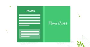
A tagline is a short and punchy sentence that intrigues readers and gives them a quick idea of what your book is about. The goal is to make the reader want to learn more.

Here are examples of taglines from some bestselling books:

  • “Do not touch the sword. Do not turn the key. Do not open the gate,” — Quicksilver by Callie Hart

  • “Welcome to Phantasma. There are only two rules to the game. Stay alive. And don’t fall in love” — Phantasma by Kaylie Smith

  • “Ten children, abducted in broad daylight—and buried alive” — Such Quiet Girls by Noelle West Ihli

  • “She thought she had her life back. She was wrong.” — That’s Not My Name by Megan Lally

  • “When you’ve been set up to lose everything you love, what is there left to fight for?” — Sunrise on the Reaping by Suzanne Collins

So, to write a strong tagline, keep it short. Ideally, it should be under 15 words. Make sure the tone matches your book. 

If it’s a romance, you might use something emotional. If it’s a thriller, go for something tense or mysterious. Stay away from vague or overused phrases. Instead, focus on what makes your story unique. Think about your main character’s problem or the biggest twist.

Your author bio

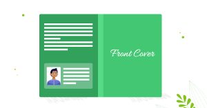
The author bio is your chance to introduce yourself to potential readers. It gives a human touch to your book and can help build a connection. 

Keep it short, like just a few sentences. Say who you are, what kind of books you write, and maybe something interesting about you. If you’ve written other books or won any awards, mention that too. This little section can make readers feel more connected to you.

You can also add a photo of yourself. It’s not a must, but it makes your book feel more personal. Just pick a nice, clear photo where you look friendly and confident. It doesn’t have to be super formal, but something that fits your style as an author.

Testimonials and awards

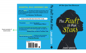
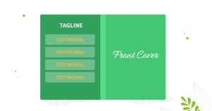
If someone has said great things about your book, show it off! A short quote from a reader, blogger, or another author can make a big difference. It tells new readers that others liked your story. Pick 1–2 quotes that sound exciting or meaningful.

If you’ve won any awards (even small ones) add them too. Awards make your book look more professional and trustworthy. Just a short line about them is enough to catch attention.

The necessary details

These are the technical parts that every printed book needs. The ISBN is a special number that helps bookstores and libraries find and track your book. The barcode, usually placed in the bottom corner, holds that number so it can be scanned easily during sales.

You can also add other small details like the book’s price, your website, or social media links. A smart idea is to include a QR code that leads directly to your website, online store, or Instagram. Just one quick scan, and readers can connect with you right away.

Tips for creating an effective back cover

Now that you know the basic elements to include on your back cover, there are still some things to consider before creating a back cover.

It’s time to take a look at them.

Tips for creating an effective back cover

Research what works in your genre

Before you design anything, check out popular books that are similar to yours. Look at how their back covers are laid out. What kind of blurbs do they use? Do they have a tagline, quotes, or a short bio?

Tip: Save a few examples you like. Use them for inspiration so you know what works for your type of book.

Focus on a clean and smart book cover layout

Don’t cram everything together. Make sure there’s enough space between your blurb, bio, reviews, and other details. Use easy-to-read fonts and break text into short paragraphs.

Tip: Use bold text for headings like “About the Author” or “Reviews” and don’t place anything too close to the edges.

Use design to enhance your book’s theme

The back cover should feel like part of the same book. Use similar colors, fonts, and design elements. If your front cover is dark and mysterious, the back should feel the same, not super bright or playful.

Tip: You can add a soft background image or a texture that fits your book’s mood, but make sure the text stays easy to read.

Don’t overlook the spine design

When your book is on a shelf, the spine is what people see first. It should clearly show the title and your name. If it’s hard to read or badly aligned, readers might skip it.

Tip: Use a simple font and center everything. If your book is thin, keep the spine design very simple so it doesn’t look squished.

Consider hiring a professional

If you want your book to look professional, it might be worth getting help from a book cover designer. They know how to make everything fit properly and prepare files for print.

Tip: Choose someone who has worked on books like yours before. Ask to see full covers they’ve designed, not just the front.

Back book cover design ideas to stand out

Now, let’s take it further! These simple but smart design ideas will help your book stand out, look more professional, and grab readers’ attention.

Extend the scene across the back

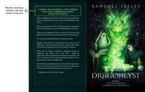
Instead of using a plain background, you can stretch the main cover image across the spine and onto the back. This works especially well for illustrated covers or covers with rich scenery. It gives readers a better feel of your story’s world and makes the book feel more complete and immersive, like they’re stepping right into it.

Book cover design by Miblart

Create contrast that pops

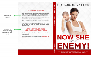
Make sure the text on your back cover is easy to read. A dark background with light text (or the other way around) can help your blurb and tagline stand out. This contrast not only improves readability but also makes your book look more eye-catching on a shelf or screen.

Book cover design by Miblart

Use textured paper as a visual element

Adding texture, even just a visual one, can give your cover a special touch. For example, a background that looks like old paper or worn parchment can set the mood, especially for magical, historical, or adventure stories. It helps your blurb pop and gives the design a bit of character.

Book cover design by Miblart

Boost author brand recognition with a logo

If you have a personal author logo, use it! Adding it to the back cover reminds readers who you are and helps them remember your name. It’s a small touch that can make your brand feel more professional and consistent across all your books.

By the way, we can design a custom author logo and branding that reflects your unique style and creativity, and helps you stand out to readers.

Book cover design by Miblart

Reflect the front cover

Try to match the style of your front cover on the back. Use similar colors, fonts, or graphic elements. This creates a smooth, balanced look when someone flips the book over. It also makes your book feel polished and well-designed from front to back.

Book cover design by Miblart

Back cover design examples by genre

And finally, theory is grand, but nothing beats seeing it in action! Let’s wrap things up with a look at back cover designs across different genres. Who knows, one of them might just spark your next big idea!

Romance

Training Hearts has an illustrated back cover that continues the scene from the front, making the design feel cozy and complete. The text is placed on a light part of the image so it’s easy to read, and the whole cover matches the sweet, romantic tone of the story.

Dirty Job uses a dramatic photo-style design with a dark and moody background. The white text stands out clearly, and the overall look feels intense and emotional, fitting the romantic suspense vibe.

Book cover design by Miblart

Thriller

Discrepancy has a cinematic design with a photo-style cover. The back continues the gritty atmosphere with a dark tone and clear white text over a muted background. The red tagline pop against the cold colors, grabbing attention. The blurb is intense and fast-paced, fitting the thriller genre.

The Kid from California uses a vintage noir look, with textures and colors that feel straight out of a retro crime novel. The back cover has a lot of text, but it’s well-organized with bold subheadings and a strong author presence, including a photo and a short bio. The barcode and social links are also neatly placed.

Book cover design by Miblart

Horror

Milly’s Room uses an eerie hospital hallway that stretches across the front and back, fully immersing the reader in the setting. The glowing blue text and shadows add to the spooky vibe. The back cover blurb is laid out in short, clear sections with bold headings, making it easy to read.

Zzyzx has a moody design with a foggy road and a scratched, weathered road sign as the central visual. The image continues across the back, with the blurb floating on the cloudy sky. The crow, faded sign, and overall darkness set a mysterious tone. The minimal layout and realistic style make it feel intense and polished.

Book cover design by Miblart

Science Fiction

Nebula’s back cover blends seamlessly with the front, continuing the cityscape and cyberpunk tones. The bold purple title grabs attention, and the blurb is packed with action and intrigue, split into short, readable sections. The design creates a futuristic vibe that matches the book’s tech-heavy story.

Sins of the Saviors also uses a full-wrap design, with a war-torn future landscape stretching across the back and front. The title is large and glowing, with a cool-toned palette that feels both futuristic and bleak. The blurb is centered and easy to read, balancing story setup with emotional depth.

Fantasy

When Dragons Dream has a classic fantasy look. The dragon scene from the front continues across the back, creating a full magical world. The blurb is short and centered on a foggy background, making it easy to read while keeping the mood mystical and adventurous.

Sing Me Awake uses a dark, floral, and mystical design. The back book cover design is filled with glowing purple flowers and swirling vines that match the fantasy-romance tone. The blurb is poetic and dramatic, fitting the book’s mythological feel. The typography and decorative elements make it visually rich and atmospheric.

Book cover design by Miblart

Gregor’s Contracts has a gritty, adventure-game style. The back cover continues the fiery lighting and rugged setting, immersing the reader in its brutal world. The blurb feels like a game mission briefing and matches the action-packed design.

The Death Curse blends modern urban fantasy with ancient magic. The back has a clean layout with glowing red lines and symbols to match the curse theme. The blurb is easy to follow, and the color scheme creates a sense of danger and mystery.

Cozy Mystery

Murder, Lies and Chocolate uses a playful and humorous design with bright colors and cartoon-style graphics. The back cover includes chocolate pieces and splashes of blood, blending murder with fun. The blurb is light and quirky, matching the tone of the story. It also includes bonus content (chocolate recipes), which is a fun touch that adds personality and reader appeal.

The Casualty at Crystal Beach has a seaside design with a pastel color palette and peaceful scenery that wraps from front to back. The blurb is clear and structured in short paragraphs, making it easy to read. Despite the relaxed look, the text hints at deeper mystery and danger, creating a nice contrast between the visuals and the plot.

Book cover design by Miblart

Non-fiction

Escape the Medical Matrix’s back cover continues the green and digital-style background from the front. The blurb uses bold red and white text to highlight key points, making it easy to scan. The content focuses on uncovering hidden truths and empowering the reader, which matches the book’s rebellious tone. There’s also a small author photo and a bio, giving a personal touch.

Wide Publishing for Authors uses a modern layout with strong branding. The back cover is clearly divided into sections: a bold hook at the top, a short blurb explaining the book’s purpose, and an author bio with a photo. The use of orange and navy keeps it visually sharp and professional. It includes social media icons and a handle, which is great for connecting with readers.

Book cover design by Miblart

Children’s Books

The Ruby Warriors’ back cover design continues the outer space landscape, filled with planets and debris, keeping the reader in the same immersive world. The blurb is well-structured and introduces the characters and stakes clearly, matching the adventurous tone. A short author bio and seal of recognition at the bottom add a professional touch.

A Child’s Dream has a wintery theme with a snowy background that flows from front to back. The blurb uses a fun and friendly tone, full of holiday spirit, fitting for a children’s Christmas story. There’s also a smiling author photo and short bio that makes it feel warm and personal.

Book cover design by Miblart

We hope this blog post gave you both practical tips and brought inspiration to create a standout back cover. Whether you’re working on your first book or updating an old one, a strong back design can make all the difference.

What did you like most about these book cover design tips? Which back cover stuck out to you the most? Share it with us in the comments.

FAQs about back cover design

What should be on a back cover?

Your back cover design should include a short blurb that hooks the reader, a catchy tagline (if you have one), a short author bio, any reviews or awards, and the necessary details like your ISBN, barcode, and maybe even a QR code.

How do you design a back cover?

Start by matching the style of your front cover. Keep the fonts, colors, and style consistent. Make sure your text is easy to read, use clear sections, and don’t forget the spine! If you’re not confident in your design skills, a professional book cover designer can help bring it all together beautifully.

Is the back cover really that important?

Absolutely! While the front catches the eye, the back cover is what seals the deal. It’s your chance to tell readers what your book is about and why they should care. A good back cover can turn curiosity into a sale.

Enjoyed the Post?
Subscribe to our newsletter and get a detailed checklist on HOW TO GROW AN AUDIENCE AS A NEWER AUTHOR!
We respect your privacy. You can unsubscribe at any time
You're In!
Check out your email to confirm the subscription and get ready for amazing staff in your inbox!
Close
Article Rating
0 comments
0 0 votes
Article Rating
Subscribe
Notify of

Access is denied.

guest
0 Comments
Inline Feedbacks
View all comments