A lot of the principles I’ve shared in my previous post on Tips for DIY Book Covers also hold true for designing your promo graphics, but when it comes to marketing design versus product design, we need to think a little differently.
While your book cover may catch eyes on retailer websites, your promotional graphics are what lure in readers from social media platforms, signings, or conferences. And unless you are a big-name author, your book’s marketing package is what sells it most to readers. The more it hits the mark, the quicker the target reader will click to buy or learn more. Keep reading for tips on designing your own promotional graphics…
Match Your Book Cover
Your book cover design should already convey genre expectations, so keep it up in your marketing materials. Readers subconsciously gravitate towards graphics that speak their genre language. This is especially important if you are running ads. You don’t want to waste paying for clicks when a reader is sensing one genre from your graphics, and then you’re actually delivering another.
If you write romantic comedy, for instance, don’t use a dark city backdrop in your teasers. Bright, primary colors and vector illustrations mark this genre more often than not. If you write horror, don’t use imagery or colors that convey light and happiness. Keep it gritty and suspenseful.
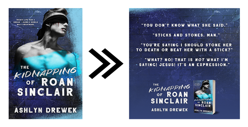
Keep to the color palette and fonts used on your book cover, especially if you are featuring a 3D book or tablet. Ask your cover artist if they can provide a copy of the book design without text so you can use it in promotional materials. Or if you design for yourself, save a copy without text. In the example below, I brought the blue brick background from the cover over into the teasers. This helps convey the brand of the book, keeping things seamless and professional.
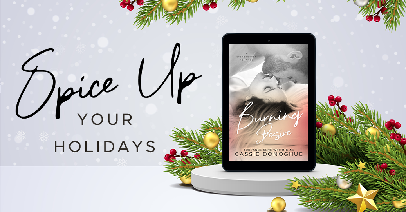
This isn’t always the case, however. For example, promotions for holidays would match those holidays more than your book’s branding. But I would still use the same fonts at least to tie things in nicely and keep them cohesive even if you’re bringing in colors associated with a specific celebration.
Less Is More
Quality matters. Clutter overwhelms viewers and can give a less-than-professional vibe. Clutter also gives you less room (in the design world we call this “negative space”) to work with, and your main information (release date, retailers, blurb, review, etc) needs to be legible. Approach book graphics with more of a minimalist versus maximalist mindset. Streamline your look.
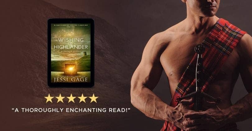
In the example below, not only does the shirtless, kilted man convey the genre of steamy Scottish romance, but the inclusion of just a short little endorsement (at a legible font size) leaves room for the book cover and star rating. The background is also muted in opacity, giving a hint of the Highlands without overpowering the things atop it.
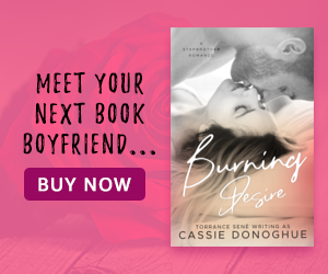
Keep your fonts readable. If you use a decorative font (this includes handwritten, brush, display, and script fonts), make it the largest and only use it once. Beyond that, simple serif or sans serif works best and is the most accessible to all readers. Anything that resembles a button should always be in a sans serif or serif font, as shown in the example below. Also note the muted background here as well, giving the hint of romance.
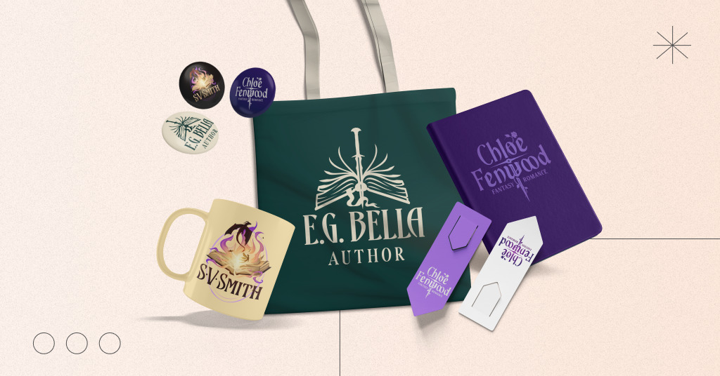
Cohesiveness Across Platforms
When designing your book’s promotional graphics, think in terms of designing a collection. You want all the social media platforms you share on to have matching graphics. In the example below, all the graphics I made for this author used the same background from the print edition of her book as well as the title font and author fonts. This creates seamless book branding across all platforms.
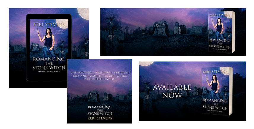
You can also do this with your printed promotional materials (“book swag”), such as bookmarks, stickers, coasters, postcards, mugs, business cards, and more. Also, if you have a logo, be sure to include that on things to keep your author branding consistent and familiar to readers. Remember: We are looking for uniformity. Check out these examples for inspiration!
Contrast Is King
Keep things accessible, legible, and make them pop by prioritizing contrast. Contrast is defined as the difference between two or more elements in a design or layout. The bigger the difference, the easier it’s to read or understand.
Think stark white text on a black background, a bright red against a dull, dark green, or a deeply saturated blue on a pastel yellow. Or, as displayed below, a bright yellow on deep purple. The difference in the shades makes it easy to read, and the text leaps off the graphic.
You want to avoid pairing two or more highly vivid colors together as these will clash and be difficult to read. If possible, test your graphics’ contrast with a colorblind test. You can find more information on that here and, you can check complementary shades on a color wheel here.
Use Visual Cues
In a world of constant information, we pay less attention to random information. Cater to this in your designs by using visual cues. In the example below, I used a bright blue arrow against a dark background to draw the eye to the call-to-action.
In this case, I want people to swipe up, but you can use this idea with a plethora of actions (click here, subscribe, register, join, buy, follow, etc). You can also use visual cues to draw their eye to something like sale or free. If the reader takes in nothing else in your design, at least they will look at the most important bits.

Ideas for visual cues can be buttons, shapes, arrows, underlining, bullet points, frames, borders, or icons.
Remember, your book’s packaging and promo graphics are not for you. They’re for readers. Tap into what they respond to—not what you prefer. You want your designs to be as amazing as the book you’re promoting!
Bio: Teresa Conner

Teresa is a freelance cover designer and lead Graphic Designer here at Book Brush. When not creating graphics for Book Brush or book covers for indie authors and traditional publishers, Teresa can be found writing erotic romance under her pen name Torrance Sené.
You can find her social media accounts and learn more about her at Wolfsparrow Covers or Torrance Sene.