As the audiobook market continues to grow, an audio edition gives authors another way to reach readers, expand where their book is available, and fit their stories into moments when regular reading just isn’t practical.
Sure, audiobooks are all about listening, but before readers press play, they still see your cover first. So today, we’ll talk about how to create a cover design readers will notice.
Why should indie authors consider audiobooks?
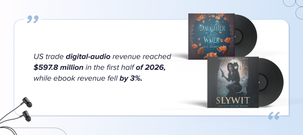
Audiobooks are becoming an increasingly important part of the publishing market. The numbers show how strong the format has become. US trade digital-audio revenue reached $597.8 million in the first half of 2026, while ebook revenue fell by 3%. These figures don’t mean audio is replacing ebooks, but they do show that audiobook publishing is a market worth paying attention to.
One reason for its appeal is simple: audiobooks fit easily into everyday life. In a 2026 US consumer survey, 86% of audiobook listeners cited multitasking as a benefit, while 84% valued listening on the go. Readers can enjoy a story while commuting, exercising, cooking, walking, or doing things that make picking up a physical book impossible.
For authors, that means a chance to reach readers in moments when an ebook or paperback simply can’t.
But there’s another important point: an audiobook may be made for listening, but readers still choose it with their eyes.
In a survey conducted in the Czech Republic, 42% of audiobook listeners said a book’s cover influences their choice. So turning your book into an audiobook isn’t only about narration and production. You also need artwork that grabs attention, communicates the genre, and makes your book recognizable in an audiobook store.
So yes, readers will eventually listen to your audiobook. But first, they need to notice it.

What makes a good audiobook cover?
Let’s look at what to focus on when getting a marketable cover design for your audiobook.
1. Keep your branding consistent
If your book already has an ebook or print edition, the audiobook should be instantly recognizable as the same title. So, keep the elements that define the original design: color palette, typography, central imagery, atmosphere, and overall genre mood.
You don’t need to redesign the cover just because the format changed. In fact, changing too much can work against you. A reader who has already seen your book on Amazon, Instagram, Goodreads, or your website should recognize the audiobook edition right away. Think of it as adapting your existing branding, not building a new one.



Audiobook cover design by Miblart
2. Design for the square format
This is one of the most significant differences between an ebook and an audiobook cover. A standard book cover is vertical. Audiobook platforms typically display square artwork, which entirely changes the available composition.
Simply cutting the top and bottom off your ebook cover can remove important details, create awkward spacing, or make your title compete with the main image. Instead, rebuild the composition for the new proportions. That might mean repositioning the character, extending or replacing the background, moving decorative elements, or adjusting the typography and scale of the central object.



Audiobook cover design by Miblart
3. Check how it looks as a thumbnail
Your cover might look great at 3000 × 3000 pixels. But readers usually won’t see it at that size. On audiobook stores and apps, covers often appear as small thumbnails among many other titles. Details that look impressive at full resolution can disappear completely when the image shrinks.
Try shrinking your cover and ask: Can you still read the title? Can you identify the main focal point? Is the genre still clear? If not, simplify. Small decorative elements, complicated backgrounds, thin fonts, and subtle contrasts are the first things to get lost at thumbnail size.



Audiobook cover design by Miblart
4. Prioritize the title
Audiobook artwork has limited space, so the visual hierarchy needs to be clear. In most cases, the title should be one of the first things a reader notices. It needs enough size, contrast, and breathing room to stay readable even when the cover is small.
This matters especially if the original typography was designed specifically for a vertical layout. You may need to resize the title, change line breaks, or reposition it for the audiobook version.



Audiobook cover design by Miblart
5. Don’t overload the cover
Less space means every element has to earn its place. Trying to keep every character, object, ornament, tagline, and background detail from the print cover can quickly make a square design feel crowded.
Instead, build a clear hierarchy:
- One strong focal point
- Readable title
- Author name
- Secondary details.



Audiobook cover design by Miblart
6. Keep genre cues clear
Readers should be able to guess the kind of story they’re getting before reading the description. A cozy fantasy shouldn’t suddenly look like a dark epic fantasy just because you rearranged the artwork. A thriller should keep its tension. A romance should keep the visual language that connects it to its audience.
Color, imagery, typography, lighting, and composition all communicate genre. When adapting your cover, protect the elements that tell readers what kind of experience your book offers.



Audiobook cover design by Miblart
7. Check your distribution platform’s requirements
Don’t finish your audiobook cover until you know where you’ll distribute it. Platforms and distributors often have specific requirements for dimensions, resolution, file format, color profile, and text. These specifications can also change over time.
Check your distributor’s current requirements before exporting the final file, rather than relying on an old template. That way, you won’t end up with a great cover that needs redesigning right before upload.



Audiobook cover design by Miblart
To wrap up
Audiobook covers may work a little differently from ebook and print covers, but their job is ultimately the same: catch readers’ attention, communicate the genre, and make your book recognizable.
By the way, do you already have an audiobook, or are you thinking about creating one? Let us know in the comments.
And if you’d rather leave the adapting to professionals, we’re always happy to create an audiobook cover that fits your book and its branding.